I'm travelling into a new way of working, a new country, a new language, and a new hobby which I'm passionate about. Come with me for some of the journey...

Thursday, 23 August 2012

The Dark Side of Whitewash

Hello, so happy you found some time to drop in here at Words and Pictures.  I warn you, today's card is a little off my usual beaten track... a walk on the dark side!

And it's kind of strange, since I was working on the challenge over at the lovely Linda Ledbetter's Studio L3 where, this week, we're working on the Whitewash Stamping technique.  (I can't go into details, but you'll find it on page 47 of Tim Holtz's Compendium of Curiosities II.)  So you would think it would be all la-la-la, light and weathered and whitewashy...  but no, (PG13 certification) here it is:


I'll be honest, I had some trouble with this one (that's why I'm so near the deadline) - and I'm still not sure whether I like it.  

I was playing with the text stamp from the TH Papillon set.  I've coveted the set from first laying eyes on it, and finally found it at a price I could swallow, and it's going to be a big favourite!  I can't say much because of the challenge rules, but let's just say that as I tried it out with different colours, I liked it better a stage before the final stage each time.

So in the end, I thought I'd try a much darker version.  I took Black Soot Distress Ink and, a colour I almost never pick up,  the Aged Mahogany.  Before I knew where I was, it had come over all Sweeney Todd, Jack the Ripper, Gothic Parisian, Vampiric - name your poison!  Here it is before layering my top elements - do you see what I mean?

So then, of course, my busy brain started whirring.  I loved the look, but I needed to build something around it.  


I remembered the Haunted Design House challenge I'd seen in passing, Who are you calling a Succubus?  A succubus, as defined on their site: a female demon or supernatural being appearing in dreams, who takes the form of a human woman in order to seduce men.

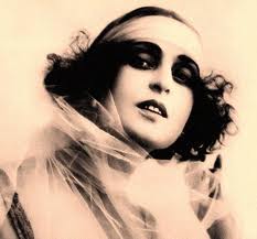
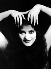
And my brain, being what it is, went straight to my favourite 'vamp' of all time, the first femme fatale of silent film - Theda Bara. 


She was the first movie star to whom the word 'vamp' was applied (it was a shortening of vampire, based on the predatory female roles she so often played); born Theodosia Goodman, the publicity people came up with her new name as an anagram, it was rumoured, of Arab Death.

Check out the quotes at the end for more reasons to love Theda!


So there we were: black and white silent films, Gothic background, a mist of blood red across it - now to build the card...

The main image was an easy pick, and I edged it with embossing ink before applying black embossing powder for texture. 

I used the Fired Brick Distress Marker to redden her lips in all the images.


The three smaller images I'd found I made all plain b&w, shrank them within the computer document, printed, and embossed the TH film strip stamp around them.

In the end, I also used the side of the TH film strip stamp all the way around the edge of the whole card as a border, and embossed it with clear embossing powder for some added shine and dimensionality to match the film strip element within the frame.


It was an obvious choice to pick the tissue tape to match the stamp. 


I wrapped it around some die-cut Sizzix hearts, edged them with Aged Mahogany and smothered them in Rock Candy Crackle Paint.  


I love the 'now you see it, now you don't' gleam of them in the sunlight!


The sentiment bubbled up from her eyes!  I'm not sure what it is with romantic statements... somehow I seem to feel the urge to pervert them, or at least make them ambiguous, as you may remember!


It's stamped using Black Soot and Aged Mahogany, edged in the black and given a light coat of crackle paint, so as to get a very fine crackle.


It still needed something, so I started playing with the ribbons in clashing red and pink, edging it with the black Distress Marker, but once it was on, I found it too frivolous.

It needed grunging down in some way... which is when another challenge I'd seen butted in - Our Creative Corner want to see Office Supplies with a Twist.  I attacked the frivolous ribbons with a stapler immediately... "take that, frivolous ribbons"... better!  And then the rest...

And there you have it - probably the darkest Valentine you'll see today!


Thanks so much for joining me on this little journey into the dark side of whitewash.  I seem to be having a culturally inspired spell... Shakespeare on Saturday, Sherlock Holmes (or Sherlock Holtz as he's now known round here!) on Monday, off to the ballet on Tuesday, and now the world of silent film... what next, I ask myself?  You'll just have to come back to find out!!

I'm entering this in:
Challenge 18, Whitewash Stamping over at Studio L3
Who are you calling a Succubus? at Haunted Design House
Office Supplies with a Twist (and plenty of red) at Our Creative Corner 

The reason good women like me and flock to my movies is that there is a little bit of vampire instinct in every woman.
Theda Bara

I have the face of a vampire, but the heart of a feminist.
Theda Bara

During the rest of my screen career, I am going to continue doing vampires as long as people sin. For I believe that humanity needs the moral lesson, and it needs it in repeatedly larger doses.
Theda Bara

Wednesday, 22 August 2012

WOYWW 168 Leftovers and Winnings

No, no, no... it's not possible that it's Wednesday again!  Over at the Stamping Ground, our wonderful hostess Julia Dunnit is already amassing the linky list of workdesks from Craftyblogland.  After having a snoop around here, hop over there for a chance to snoop around workdesks from around the world.  

Here's What's On My Workdesk this Wednesday...  As I said in the title, it's a combination of leftovers and a lovely prize package.  There are some half-made projects lying around, off-camera, drying or waiting for the next stage - but they're not fit to be seen yet!


In the centre is the card I made yesterday with my first Stampsmith stamp, and which you can get a closer look at here, if you're interested.  
Lying around it are some of the trial backgrounds I'd had a play with in the planning stages, and discarded.  

Well, not discarded, because they'll stay in my scraps-stash awaiting some sort of life in a future project.  I'm thinking some die-cut flowers could be pretty... not that I like making flowers of course!


Then there's this package, which arrived yesterday and which I'm very excited about playing with!  I was lucky enough to win the Gentlemen challenge over at the Vintage Page Designs blog with my album A Proper Gent.  

The prize was a voucher for Ali Manning's wonderful Etsy shop, also called Vintage Page Designs, so I was able to take the plunge and order the Vintage Gentleman kit I'd been drooling over...

And Ali included some delicious extras: gorgeous pastel seam bindings, some embroidered ribbon, and yummy buttons of all sizes and colours.  Look out for them on a project coming to this space soon...


Thanks so much for stopping by, and if you're playing along at the Stamping Ground I'll do my best to see you very soon over at your Workdesk...

Far and away the best prize that life has to offer is the chance to work hard at work worth doing.
Theodore Roosevelt
But crafty goodies come a close second!!

Tuesday, 21 August 2012

La Sylphide

Hi all, thank you so much for stopping by... and a big welcome to the new followers - thank you for joining the gang!

I'm sharing a new stamp today - very in love with it - it's from The Stampsmith.  Their main focus  is on photo-real images, so it's pretty new for me, and I'm still experimenting with the best surfaces and inks to get the best possible stamped image.  But my experiments have been hanging around on my desk, so inevitably I started to slide papers and ink colours towards them, gathering ideas around them ready for the first card/project... and here it is:


Isn't she gorgeous?!  Ballet was my first love, so I'll understand if not everyone goes head over heels in the same way I do whenever I look at her!  I originally stamped her in Coffee Archival, but she's had some Victorian Velvet blended over too, to get that wine coloured depth.  The Paper Distresser came into its own giving some dimensionality to the edges of the thickish cardstock.

I wanted a really romantic background for her, but also one drawing on nature, given I feel she's a wood or water nymph of some kind.  From very early on, the ink pads which came out to sit round her were Vintage Photo, Weathered Wood, Stormy Sky and Victorian Velvet, and eventually I decided to just sling'em all in there!

I created the first layer of background using Tim Holtz's wrinkle-free distress technique: swiping the inks in patchwork direct onto my craft sheet, spritzing with water, and then laying and tapping the paper into the pools of colour until I had an effect I liked.  I cut it to frame my Sylphide, and then used the TH Paper Distresser to give some life to the edges.


I did mean to take a picture before I stuck the whole thing together, but I forgot - sorry! - so you'll have to make do with peering around the sides of the dancer.  


Next, I added possibly my most used stamp of all - one of the branches from the Autumn Leaves set, Silhouette Blossoms.  It's just the right amount of thorny, so not too florally sweet.  I put both some Coffee Archival and some Victorian Velvet onto the stamp, and used it to add a framing element in all four corners of the background.

The second background layer is the Tattered Angels texture stamp from the Architectural set applied in Coffee Archival to some Kraft paper, inked with Vintage Photo and Victorian Velvet, and subjected to the Paper Distresser too!


The leftover background trimmings got pressed into service too, as I so liked it.  First I stamped the tiny manuscript music from the Pink Paislee London Market set on the back of what was left.  Then one strip was left quite broad to create a 'ribbon' of music under her feet.

The rest I cut into very thin strips to create some fine paper ribbons for the embellishment in the top left of the card.


I do like doing this, as it means you can really co-ordinate your ribbon to the project.  You may remember other examples from previous projects.  


I curled some inwards and some outwards, so you get some with music showing and some with the ink colours.


I used two long attachers to loop some natural twine around and tied it in a simple bow, running along the line of the music.

The whole thing is mounted on white card, with a very fine, delicate edging of Stormy Sky.


I'm very happy with this card - I think there's quite a lot of me in it.  The colours really please me; I adore the random element in creating one of these inky backgrounds; and, as I said, I think this stamp is really beautiful - down to the sheen on her satin pointe shoes!  

I hope you've enjoyed sharing it even half as much as I enjoyed making it!!  Thank you so much for dropping in - I so appreciate your company and hearing your feedback.

I'm entering this for the following:
The Stampsmith Challenge - it's an Anything Goes, as long as you use at least one Stampsmith stamp
Make Your Own Background over at the Anything Goes Challenge Blog
And since we're on an Anything Goes hatrick... this goes in as another No Rules entry at Simon Says Stamp and Show
That Craft Place are having a Vintage fortnight

Dance is the hidden language of the soul, of the body.
Martha Graham

We should consider every day lost on which we have not danced at least once.  And we should call every truth false which was not accompanied by at least one laugh.
Friedrich Nietzsche

Monday, 20 August 2012

Sherlock Holtz

Hello all, and welcome (back) to Words and Pictures on this sunny (here at least!) day...

I'm participating in the Tim Holtz 12 tags of 2012 for the first time.  Each month, the great TH (I may have mentioned him once or twice..!) produces a tag full of gorgeous ideas, techniques and possibilities and invites us all to play around with the inspiration provided.  It seems that you can stick quite close to the brief, or you can take the idea and run with it...  Well, I found myself LOVING the August tag, but without lots of the equipment to reproduce it, so improvisation became the name of the game.

Let me give you a quick look at TH's tag - it was inspired by the silhouette artists at DisneyLand, so the central silhouette is the main feature.  With my love of Vintage, you can see why I was pretty smitten from the off. 

But I have a confession - I'm not that wild about using flowers in my projects... controversial, I know, and maybe it's just because I'm not very good at them yet!  The challenges were piling up thick and fast!!

The first thing was to locate a silhouette which made my heart dance.  This stamp TH is using is just gorgeous - but I haven't got it, so I went on one of my Google Image trawls... and something slightly different caught my eye.  Let me show you what I ended up with and then, if you're interested, you can stick around while I take you through some of the alterations and adaptations I found myself having to make, and in the end wanting to make, to add to the story of the tag... (Oh, and if you do nothing else, I'd love you to have a look at my magnifying glass before you go!)


Ladies and gentlemen, I give you: Mr Sherlock Holmes... or should that be Sherlock Holtz?!

I'm completely in love with the latest TV adaptation of the Holmes stories, Sherlock,  created by Steven Moffat (creator of new Dr Who amongst many other things) and Mark Gatiss (of The League of Gentlemen fame), and starring a supremely fine double act at the helm: Benedict Cumberbatch (there's a name to conjure with) as SH, and Martin Freeman as Dr. Watson.

It's updated to present day London yet sticks to the stories, riffing off them, and adapting, with genius, elements within the stories.  If you haven't seen it, I urge you to seek it out.  (Two series on DVD so far...)

Anyway, once I'd spotted the Sherlock Holmes silhouette, it wouldn't leave me in peace, and the other elements of the tag started to work their way into my mind and onto my craft table - combining SH and TH!

Improvising round the lack of certain products became a positive pleasure... can you spot the SH references?


No Mini Leaf and Branch die... so I used the keys from the TH Hardware Findings die, because SH is always seeking the key to the mystery.  I still used the Kraft Core cardstock, as TH has... sanding the edges of the brown card to reveal the paler Kraft within.


For the leaves, I traced round some Tattered Leaves die-cuts I got ready cut off ebay... I coloured them with Bundled Sage and Peeled Paint Distress Markers and stamped them with the little music manuscript stamp out of the Pink Paislee London Market set. Voilà - the leaves of sheet music from which SH learns his violin pieces (though he prefers to play from memory once learned of course).

I didn't have the lovely frame stamp, so instead I used the one from TH's Urban Grunge set.  Now, some of you will know that it's really a horizontal frame and not the same top and bottom.  You're right - so instead of inking the whole thing with Ranger Embossing Ink, I just did two thirds of it, and then the same two thirds again the other way up, to complete a symmetrical frame around my printed silhouette.


And having embossed once with Detail Black embossing powder, I then threw some UTEE at it while still hot, to get a really thick glossy frame.


No Book Covers embossing folder, but by now I wanted to represent the brick-built houses of Baker Street, so it had to be the TH Bricked embossing folder instead.  

One problem with that is that it doesn't have a natural flat area in the centre, so I tried an experiment, creating a shim frame (extra layer when cutting) that should have protected my central area.  It did to a certain extent... the embossing is not nearly as deep in the middle, but I didn't quite pull it off as I'd've liked.

I used sand-coloured acrylic as my resist layer, then inked with Tea Dye, Vintage Photo and Walnut Stain towards the edges, wiping some away to reveal more of the opaque acrylic again.  I played with inking and wiping for a while until I got a brick look that pleased me.


I have cut the bottom of the tag with an On the Edge die, but mine's the Brackets one, and added the little 221b reference to the house number in Baker Street where Holmes and Watson share rooms.


No Tattered Pinecone die to make the flowers with, but I do have the TH Vintage Lace Decorative Strip die.  I wanted another SH element, so I decided to cut them out of vintage newsprint from The London Times of the 1890s (Google Image Search again - I love you!).


Rolling them around the toothpicks as TH suggests with his pinecone made life a bit easier (and I even tweaked each 'petal' before starting as the video tutorial recommends), but since it's not a flower-specific die, I have got slightly tighter rosebuds, rather than open flower heads. Still, I rather like what I've ended up with. 


The paper was aged with Old Paper Distress Ink and Vintage Photo on the edges, using a blending tool.  And they benefited, of course, from the final spritz of Perfect Pearls in Heirloom Gold which the whole tag received...


I like to "read" them as crumpled balls of newspaper that SH has hurled across the room in frustration when one of the adverts he has placed to flush out Moriarty has somehow gone astray!

I had some brown and cream ribbon, which I coloured with TH's Bundled Sage Distress Stain, and then used the Peeled Paint Distress Marker too for a slightly richer green, to hint at the tweed material of SH's famous hat, the Deerstalker.

The initials are pretty obvious; they're littering this post, infact!  They're taken from a set of fridge magnets shaped like old-fashioned typewriter keys.  Perhaps in preparing the stories for publication, Dr Watson might have used the still relatively new-fangled technology of a typewriter (invented 1867 - for the nerds amongst you...).


And the pearls, prompted by the TH inspiration tag, can also be read as referencing the SH story: The Adventure of the Six Napoleons, in which a pearl has been secreted inside a plaster bust of Napoleon, and subsequently mislaid!


The fabulous TH Chitchat stickers don't include the particular words I needed for my tag, so I had to print them from the computer myself.  The font?  Baskerville.  If you spotted that you get double points!!


Finally, my last little touch was to create another extra little 'twig', or branch of detection - the magnifying glass.  It's made out of one of those very cute, bulbous, pear-shaped safety pins, slightly squeezed together.  


I wrapped some leftover brick-embossed card, inked with Walnut Stain for a slightly leathery look, around the fastening end as the handle.  Then I dolloped some Glossy Accents onto a piece of card and scooped it into the circular end to create a 'bubble' of glass.  


It took a couple of attempts before I did it at the right moment of the Glossy Accents being liquid enough still to spread across the gap, and on the way to drying enough to stay there.  Rotating it like a spit-roast helped a bit.  

Okay, so it doesn't magnify very much, but I'm dead chuffed with it, nonetheless...  And I even quite enjoyed making the flowers too!


So glad you could join me on the case here at Words and Pictures today.  If you head over to Tim Holtz's blog, specifically August where I'm entering this, you can see amazingly creative versions of this tag from all over the world - reinvented, reinterpreted, recreated and really special!  I love seeing the variations on a theme as they arrive throughout the month.  Thanks so much for dropping in, and I hope to see you again soon - here or elsewhere in Craftyblogland!

I'm also going to throw it into the ring at Simon Says Stamp and Show: since I've broken almost every rule in creating it, it should fit well in their No Rules challenge this week!

It has long been an axiom of mine that the littlest things are infinitely the most important.
Sherlock Holmes

Our highest assurance of the goodness of Providence seems to me to rest in the flowers.  All other things, our powers, our desires, our food, are all really necessary for our existence in the first instance.  But this rose is an extra.  Its smell and its colour are an embellishment of life, not a condition of it.  It is only goodness which gives extras, and so I say again that we have much to hope from the flowers.
Sherlock Holmes

When you have eliminated the impossible, whatever remains, however improbable, must be the truth.
Sherlock Holmes

All taken from The Memoirs of Sherlock Holmes by Sir Arthur Conan Doyle

Saturday, 18 August 2012

Parting is such sweet sorrow...

Hello again!  Hope you're all having a lovely August weekend - weather permitting!  Thank you so much for choosing to spend some of it here at Words and Pictures... it's great to have you stop by.

I've been having a glorious time distressing and ageing to create some leaving cards I'd been commissioned to make.  It was a slightly strange experience...  a colleague from the Royal Shakespeare Company (where I worked for nearly eight years until going freelance earlier this year) is now also leaving, and asked if I could make some farewell cards for her to distribute.  So I found myself making Farewell cards on someone else's behalf, for people I know very well, and with whom I'm just about to start working again, as I'm going back in as a freelancer at the beginning of September!!

In any case, you'll now understand the Shakespeare theme when you see the cards.  And my colleague had selected specific 'thank you' quotes for each person, so the cards vary slightly according to the play from which the quote is taken.  Take a look...


When I knew I'd be making several cards, I wanted to work with a technique I really enjoy!  I did enjoy getting a vintage patina and lustre onto the embossed background, but my absolute favourite thing to do at the moment is the ageing and distressing... I love using inks, the Tim Holtz Paper Distresser, rubbing, rolling, ripping, tearing and curling to give the papers an antique feel, and some dimensionality on the page...


Each card has the first page of the First Folio (my absolute desert island book) text for the relevant play for its quote, inked, ripped, rolled and so on to get some sense of the nearly 400 years which have passed since its publication (1623 for the curious amongst you...).


Then the quote itself is printed, grunged with a Tim Holtz texture stamp, inked, Paper Distressed on the edges, and finally rolled around my useful bit of wooden dowelling to get the wave effect, and the curly edges.

(I'm sharing mainly the Twelfth Night one here, but you'll get glimpses of some of the others.)


The background is medium weight Kraft cardstock, embossed with the Tim Holtz Patchwork embossing folder.  I then blended Vintage Photo, Walnut Stain and a bit of Black Soot onto it, and finally gave it a good spritz with the Heirloom Gold Perfect Pearls Mist, for a lovely lustrous finish.

The nib, of course, is there for the writer, and you'll see that I've used the Prima French Script stamp to provide a background on the cream card base.


I printed some tiny Williams to put in the little jewellery findings frames I got from the Bead Shop online, and filled them in with Glossy Accents... then attached them with a TH Idea-ology long attacher.

You can see in this photo that I've also taken the Paper Distresser to the edges of the embossed background layer to get that extra texture.


Just another little shot trying to really capture the movement in the quotes (this one the Henry VIII card).

You can also see below the inked mesh and ribbon added for texture and for some strong horizontal detailing, which I felt it needed to anchor all the higgledy-piggledy layout and distressing.


And finally a shot of the whole lot, awaiting delivery to their commissioner - who was, thankfully, very very happy with them.  I look forward to finding out how they went down with the recipients soon!

Thanks so much for spending some time here at Words and Pictures... it's great to have your company along the way in this crafty journey... and I look forward to meeting again here or elsewhere in Craftyblogland very soon!

I'm entering these in the following:
Favourite Technique (ageing/distressing) at Simon Says Stamp and Show
The Allsorts challenge to add something metal (nib and picture frame) with their Heavy Metal challenge

The remarkable thing about Shakespeare is that he is really very good - in spite of all the people who say he is very good.
Robert Graves

Wonderful women!  Have you ever thought how much we all, and women especially, owe to Shakespeare for his vindication of women in these fearless, high-spirited, resolute and intelligent heroines?
Dame Ellen Terry