This week the theme is Stencil It! Once again the amazing Design Team at SSS have knocked it out of the park. It's an honour to be invited to create alongside them for this month.


You can check out all their stencilled inspiration over at the Simon Says Stamp Monday Challenge by clicking on any of the logos - it's well worth the trip! - but let me share my offering with you before you go.

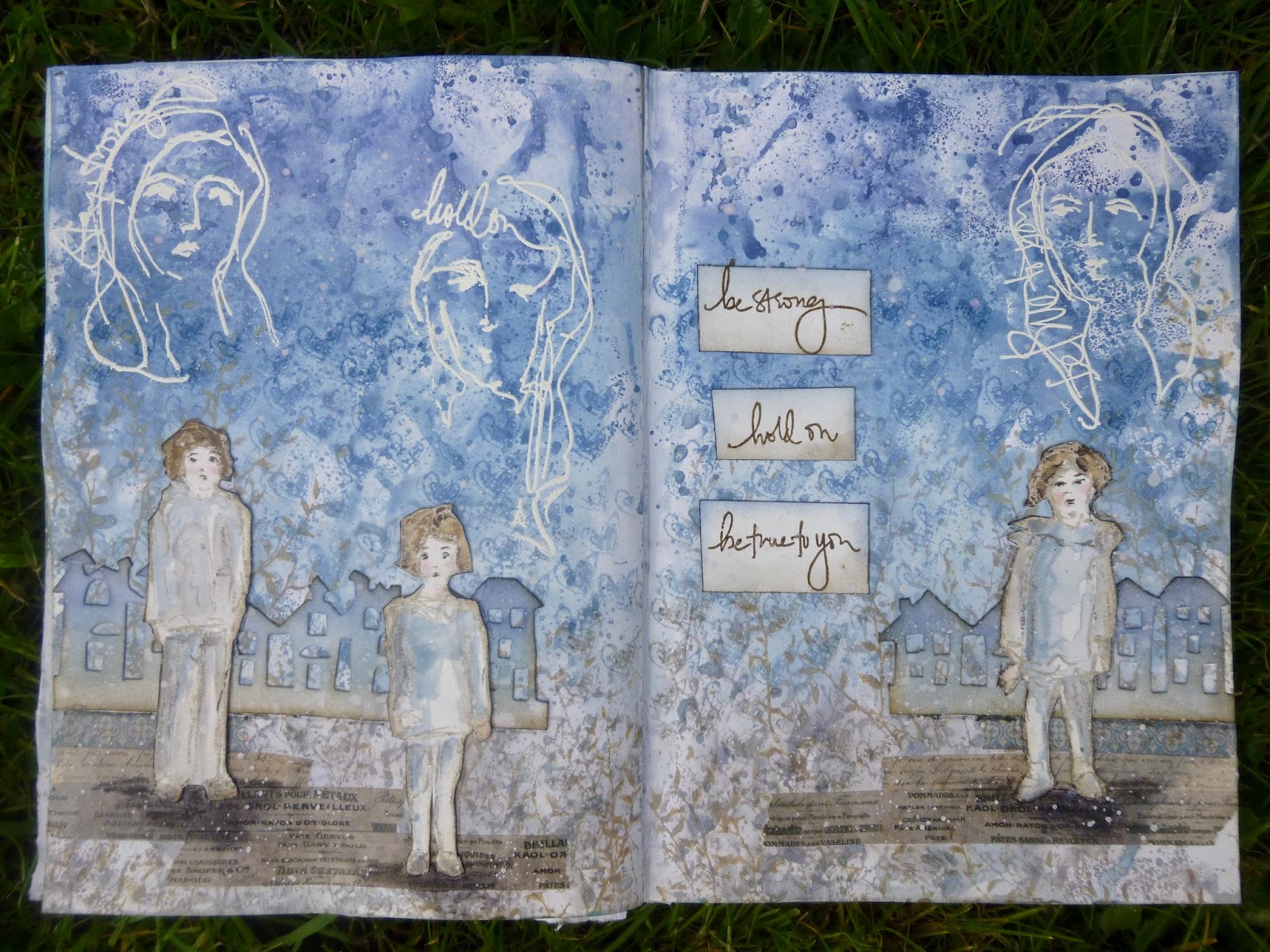
For a while now, I've been irritated by the cover of one of my favourite journals. It happens to be the one in which I created last week's Hold On, Be Strong spread for last week's SSS theme.
It was a bright red hardback book - left over from work - and, as regulars will know, red really isn't one of my go-to colours.
I thought it was about time I did something about it, and this challenge theme kicked me into action. Here's what it looks like now...
And it also looks pretty good when you open the whole thing out flat too. I used Tim Holtz's Layering Stencils, and put all sorts of different media through them - Distress Inks (used with embossing powder), PaperArtsy Fresco paints, and some Finnabair Plaster Paste...


I'm afraid I haven't got a picture of the original red - I forgot to take a proper "before" photo.
This is when it had already had a coat of DecoArt chalk paint in the soft green Enchanted (already a big improvement - I can't imagine why I didn't do this ages ago).

I applied a layer of Crackle Glaze with a plastic palette knife, and then over that a combination of Stone and Chalk Fresco paints. Look at that weathered crackle!

I used the Leafy Layering Stencil to lay down some Distress Inks across the crackled background. It's Peeled Paint and Stormy Sky in action.
Since I know the book will be handled regularly and spend time on the craft table, I needed to "fix" the Distress Inks so that a) they won't rub off or fade, and b) they won't be vulnerable to water and wet media in the future. So I added clear embossing powder over the inky patterning.

Now they have that lovely light-catching glossiness which makes me so happy.

The next stencil into action was Numeric. Through this I sponged Fresco paints, combining Sky, Limelight and Green Patina in a fairly random manner.
The PaperArtsy paints have a chalky matte finish which contrasts really nicely with the sheen of the embossed inks.

The third and final stencilling medium was some texture paste. I started with some Prima Light Texture Paste, but I wanted a little more from my meadow flowers.
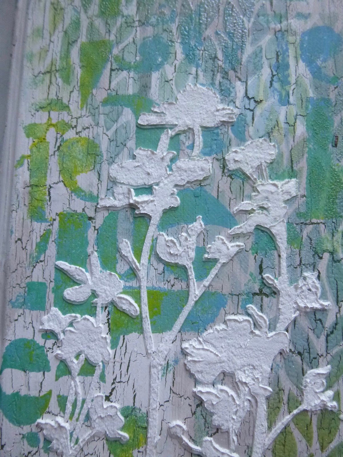
So I re-positioned the stencil (not entirely precisely as it turned out, but we're embracing imperfection), and applied some of Finnabair's new Plaster Paste over the previous texture once it had set.
It's a firm, opaque paste, so it gave the flowers just the pop of presence I was after.
So this is where we've got to so far... the V of Numeric going across the whole spread, the inverted V of the Leafy pattern going the other way, and the dimensional white flowers awaiting developments. And I'm afraid that's where the process photos stop!

From there on, I was inking and painting, focussing entirely on how the journal looked, and the camera ceased to exist for me.

I couldn't resist starting to apply some brown inking to the edges of the covers - Vintage Photo, Gathered Twigs, maybe some Walnut Stain in there.
Inky edges are almost inevitable round here. This is the back cover, of course.

For a long time, the flowers stayed white, as I was enjoying them, but eventually I decided they might look good with some colour on.

I started by experimenting with Distress Inks, which meant I could spritz with water and lose pretty much all the colour if I decided I didn't like it.
But I enjoyed the change, so I made it permanent with the help of some DecoArt Media Fluid Acrylics.

These have a lovely glow and translucence which means you can blend and layer them with great subtlety.

The warm tones of the Quinacridone Gold tempted me towards increasing the depth of the inking around the edges, and I shifted from using Distress to Archival inks to help with permanence.

I also decided to intensify the look by using clear embossing powder on the very edges. As I continued to play, I also used Distress Crayons in darker colours - Walnut Stain, Ground Espresso - to deepen the shadows.

I love the gnarly textural effect of the crayons over the embossed areas - it's very cool. (Click on this photo or, even better, the one above for a closer look.)

I sought out a couple of Idea-ology Quote Chips to provide additional inspiration.
I'm doing a lot of dwelling in possibility at the moment, and it seems that there's another major step in the journey in the offing - so these are important words just now.
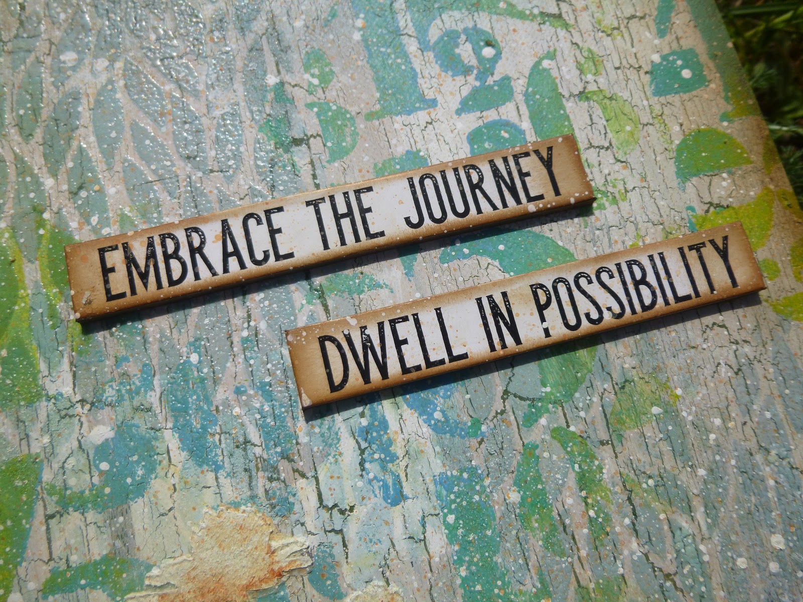
The Quote Chips are inked with Coffee Archival ink so that they tone in with everything else that's going on.

There's spatter in both white acrylic and a touch of Quin Gold to echo the flowers.

I love the shine of the embossed leaves...

... contrasting with the matte chalkiness of the numbers.

And of course under it all there's that scrumptious crackle breaking through.
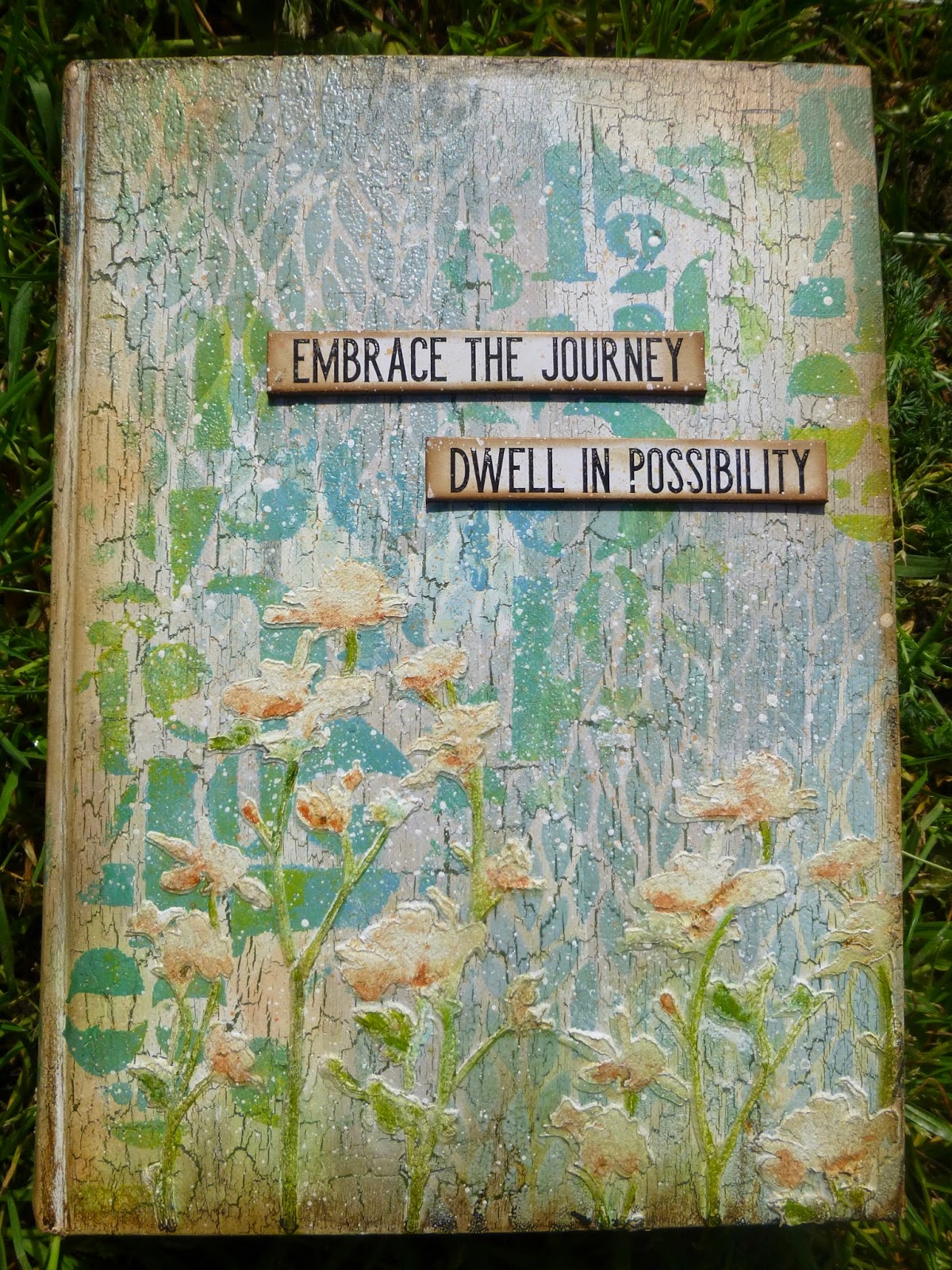
I hope my altered journal cover will inspire you to get out your stencils and Stencil It this week. If you need a further nudge then do hop over to the Simon Says Stamp Monday Challenge where there is plenty more inspiration on offer from the team.
As always, there's a $50 prize voucher on offer. Who wouldn't want the chance of a Simon Says Stamp shopping spree? Or the possible honour of being picked out by the DT as one of their favourites? So do come along and play.


Isn't it mysterious to begin a new journal like this? I can run my fingers through the fresh clean pages but I cannot guess what the writing on them will be.
Maud Hart Lovelace
Find these products at Simon Says Stamp:
Tim Holtz Layering Stencils - Leafy, Numeric, Wildflower
Distress Inks - Stormy Sky, Peeled Paint
PaperArtsy Fresco Finish Chalk Paints - Stone, Chalk, Limelight, Sky, Green Patina
PaperArtsy Crackle Glaze
Prima Marketing Plaster Paste
Idea-ology - Quote Chips
Ranger Clear Embossing Powder
Archival Inks - Coffee, Sepia
Distress Crayons - Gathered Twigs, Vintage Photo, Walnut Stain, Ground Espresso