I'm travelling into a new way of working, a new country, a new language, and a new hobby which I'm passionate about. Come with me for some of the journey...

Thursday, 10 August 2017

Journal Treasury Launch

Hello all, and welcome to a very special post.  I'm delighted to be part of the launch of the Journal Treasury - an e-book containing more than 75 journal projects using Eileen Hull's brilliant journal die.  The book includes detailed, easy-to-understand instructions, tips and techniques for creating your own journal, and fabulous photos of design ideas for journals from artists and crafters around the world... including me!


If you would like to find out more and/or order the Journal Treasury, you can do so by clicking below.   Eventually, it will retail at $16.99 (around £13), but for the duration of August there's a special price offer of 30% off, making it only $11.87 (around £9). So now's the time to buy!

It's an affiliate link, so it won't cost you anything extra, but it will give me a little cut of the profits!  You can also catch Eileen in action on Facebook Live today as part of the book launch, and with news of an exciting new Maker Challenge in association with Sizzix.  Check out Eileen's blog for all the details.


I'm very proud that the journal I created for the Journal Treasury is featured on the cover (there it is - right there in the middle!).

It's been a while since we announced that the e-book was on its way.  I promised you at the time that I would share some of what's been going on inside my Nature Journal when we got to the launch.

But I've also been getting busy with the die since I got home, so instead I thought I'd share a couple of quick pictures of my new projects. 


These two are not in the book, but I'll share them in a bit more detail in due course (I do like my close-up detail pictures, as you know!), but for now here are a couple of teaser-tasters...


It really is such a fantastic die - especially if you're someone who enjoys creating handmade books, journals and albums.  It gives you the basic structure, and then it's over to your imagination to travel as far as you want...


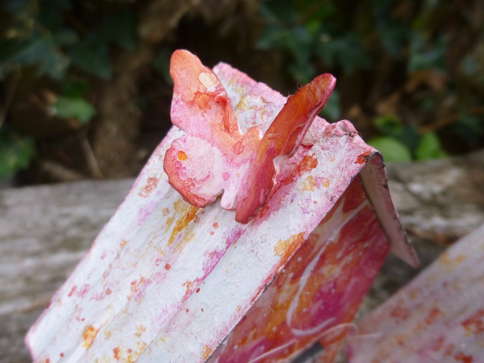
... to an autumn watercolour album, perhaps - with Oxide dawn colours and some of the new Tim Holtz dies...


... and plenty of watercolour pages inside ready to capture autumnal words and pictures.


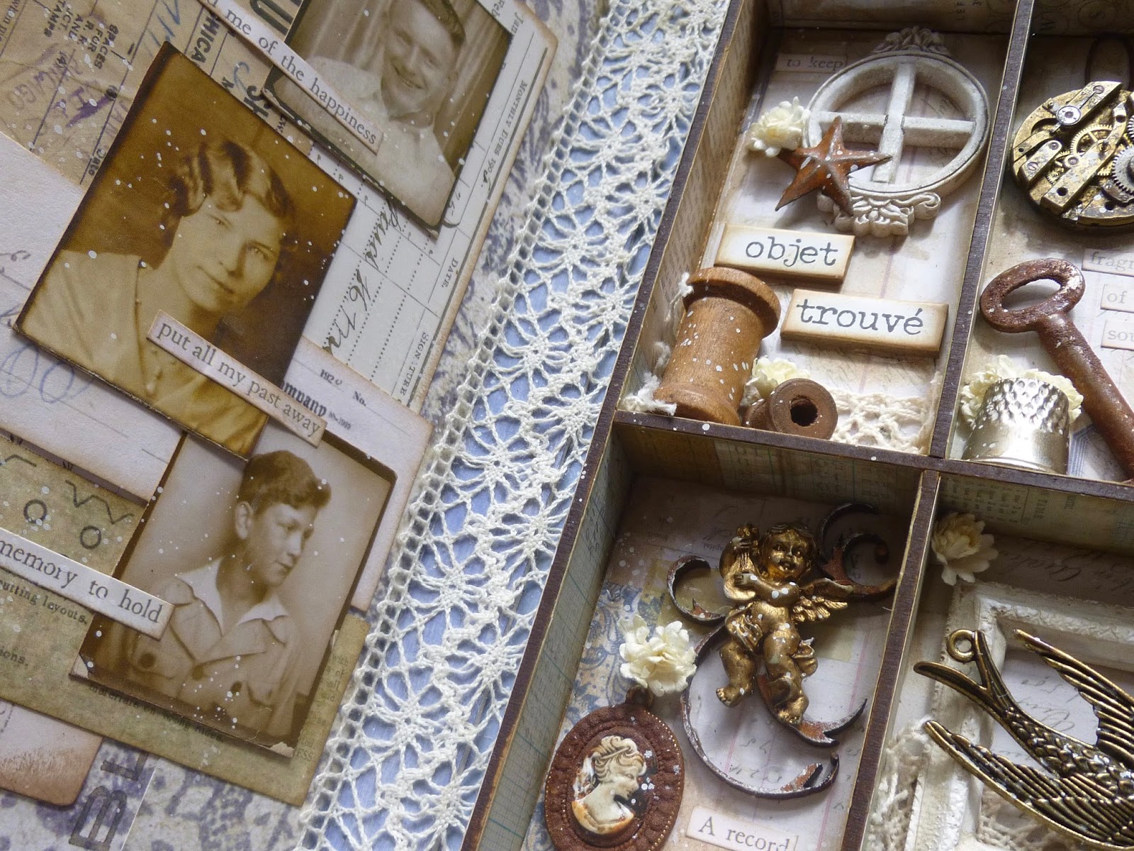
Or perhaps you'd enjoy a journey into the lost and found fragments of a life...


... collected and preserved in a Calico Craft Parts printer's tray - a perfect fit inside the journal cover.


There are so many possibilities.  Even as I write this, I'm itching to get back in the craft room and cut another journal and carry on playing!


The Journal Treasury has oodles more inspiration for you - gathered from around the world of Craftyblogland.   And remember that bargain 30% off for August to celebrate the launch...


If you decide to purchase the e-book, you will be sent an email with a link (if you don't get a link please check your Spam box).  It is a large book and it may take a few minutes to download.  Once you open the e-book you can scroll through the pages and if you want to find out more about a project, just click on the Designer's name.  There really are some amazing journals gathered here to enjoy.

Thanks so much for stopping by today.  I'll be back very soon with some more pictures and how-to details of the latest journals.

The ideas can come from anywhere and at any time. The problem with making mental notes is that the ink fades very rapidly.
Rolf Smith

Tuesday, 8 August 2017

A 100 Year Old Rose


Hello all!  Thanks so much for your lovely comments on my bright and dark posts - from the Sunshine Watercolour Dwellings to the Glint of Moonlight on Broken Glass.

We're moving from those brights and darks back into the gentle, natural colour palette which is more usual around here.  But the project itself is a rarity at Words and Pictures...  it's a card.

Not just any card, but the card I made for our next-door-neighbour, Rose, for her 100th birthday.

With a name like that, the choice of subject for the card is easy (just as well, since I find making cards really difficult for some reason).  If you follow Cestina's Dollshouses, you'll have seen the lovely miniature rose arbour she created for Rose's 100th birthday present.  And there's lots of rose-related music, trivia and ephemera in the post too.


Rose's favourite colour is green, so that took care of some of the decision making too.

The background panel is made with Tim Holtz's Floral layering stencil.  And it started out as a tag before I trimmed it.  (I've found that starting with a tag is a pretty good way of tricking my brain into card-making.)


I applied texture paste through the stencil and then spritzed some Tattered Angels sprays over it once it was dry... mainly English Ivy, but there's some Patina and some Shade in there too.


I'm pretty sure those are wild roses on the stencil (or dog roses as they are also known for some reason).


The paper roses are from my stash.  I needed the card almost immediately on my return from New York, so I'm afraid there wasn't time for handmade flowers.


But I did manage to squeeze the foliage punch onto the trimmed off top part of the tag to get a few leaves to add to the open bloom.


And I couldn't resist adding the Stein quote from my stamp set PaperArtsy EAB01 Trees and Flowers... well, it was inevitable really, wasn't it?!


It's stamped in Olive Archival to tone in with the background.


Tim's Simple Saying stamps earn their keep again, with the greeting stamped and embossed in Bright White Wow powder both outside... 


... and inside.


And plenty of white spatter finishes the whole thing off.

A fairly simple card, but I'm happy to say it's standing on the mantlepiece right next to the one from Her Majesty the Queen!

I'll be back in a couple of days with an exciting post, so I'll hope to see you again soon.

The first fact about the celebration of birthdays is that it is a good way of affirming defiantly, and even flamboyantly, that it is a good thing to be alive.
G.K. Chesterton


In a bit of pretty serendipitous timing, the Simon Says Stamp Monday Challenge is celebrating its 7th birthday by playing Happy Birthday this week, so I'd like to share Rose's 100th birthday card there

Friday, 4 August 2017

Glint of Broken Glass

Hello all!  It's nice to be slightly more back in the swing of things - for the first time in a long time it's a double post day today at Words and Pictures!  Earlier, you may have encountered my rainbow-bright watercolours for the new Vintage Journey challenge, and this evening I'm delighted to be tempting you over to the PaperArtsy blog where I've created an inspiration piece for the current theme, Dark to Light and Contrasts.


I took my inspiration from one of my own word stamps.  It's one of the quotes from EAB02 Darkness and Light... I'm guessing you can see how the thinking came together there!  I hope you'll be able to hop over to PaperArtsy and catch the glint of light on broken glass. 


I hope you'll also have a chance to take a step into the sunlight with my Sunshine Watercolour Dwellings too, if you missed them.  I told you we were getting back in the swing of it!  Have a great weekend everyone.

When you look at a piece of delicately spun glass you think of two things: how beautiful it is and how easily it can be broken.
From The Glass Menagerie by Tennessee Williams

Sunshine Watercolour Dwellings


Hello all!  It's time for the new challenge at A Vintage Journey.  The theme chosen by our fabulous host, Amanda, is Watercolour, so I wasn't going to miss that one!

As most of you know, I've been experimenting and dabbling in watercolour this year, but for this I've been using them in a more mixed media kind of way, and here's what I came up with.

If you've been visiting recently, you'd be forgiven for thinking that I only ever deal in blues and browns and soft neutrals.

Not so - there have been occasional departures from the neutrals, blues and greens in the past (try this, or this, or this, for instance!), and I've done it again for this project.

I'm always inspired by vivid colours - Andrea Ockey Parr, Marjie Kemper, and our own Tracy Evans all use brights in ways that really excite me, with a freshness and a life and a positive energy.  And when I have dabbled in the past, it's often been to this contrasting colour world of pinks/reds/oranges.


Believe it or not, this is made with just two watercolour paints... Daniel Smith's Quinacridone Lilac and Aussie Red Gold.  Then of course there's some gesso and white acrylic paint involved too.


But one of my chief delights with the watercolours, as with inks, is watching how they blend and play with one another, and the unexpected tones and shades which appear as a result of combining pigment with another pigment with water.


For these tiny houses, I started by adding gel medium through the Tim Holtz stars stencil onto a 12x9 inch sheet of watercolour paper.

Once the gel was fully dry, I started to add washes of colour, enjoying all those moments where the water and the pigment dance together.


It makes me so happy... the splatters and edges and washes and brilliant clashes of colour which make the senses tingle.


Of course when it dries, watercolour always becomes much paler, so I went in with a second application (a glaze, in official watercolour terms, though a glaze is very different in mixed media/acrylic world).


I'd fallen in love with the full on vivid colour tones, so that's what I wanted to build with the extra layers.


Once I liked the effect, I ran the sheet through the BigShot with Tim's Tiny Houses die a couple of times to get my walls.


I stamped the tiny text from the Stuff 2 Say set in Snowflake Fresco paint.  I generally just "paint" a bit of the paint onto my craft mat and press the stamp into that to get my impression.


I used a couple of differently sized lids to add gesso circles... one was from a mini jam jar which appeared on my craft desk while I was away (!?), and one was a Distress Paint lid.  And of course there's some white spatter too.


For the roofs, I cut some corrugated cardboard with the die and applied a couple of coats of gesso and one of watercolour ground.  I love this stuff - it turns any surface into a watercolour-suitable surface, and it has a lovely grainy quality which gives great textural detail.


I added spatters and splotches of my same two watercolour paints - some pure and some mixed for a nice range of colour tones.

And I sponged up some of the spare paint washes to blend onto the edges of the roofs.


I used Tim's large butterfly punch to punch out a few butterflies from some of the leftover starry sheet.

It's symmetrical enough that you can glue two butterflies back to back.


That means you get a) colour on both sides and b) a much sturdier butterfly.

(I know that butterflies aren't meant to be sturdy, but it does help when they're perched on a rooftop.)


Now's the time when going for the really vivid watercolour tones pays off - the white is all the more dramatic against the brights.


Some wild threads add extra movement, tucked behind my two selected Idea-ology Quote Chips.


I do feel so lucky to be able to spend my life creating art - whether in my working life with words, or here on the blog with pictures (and some words!).


As a final finishing touch, I added some tiny wooden Scrapiniec stars (you also saw them in action along with some Neutral Blues very recently).


They've had a touch of the watercolour ground for texture.  I love how they echo the gel resist stars in the background.


And if you just want the full-on colour effect without any interruptions you can take a trip round to the back of the houses!


Thanks so much for stopping by today.   I hope you've enjoyed this trip to the other side of the colour wheel... I know I have!


If these sunshine watercolour dwellings haven't already fired your imagination to play with Watercolour this month, you'll find lots more inspiration over at A Vintage Journey where my fabulous team-mates have once again provided an incredible range of glorious projects for your delectation.


There's a prize voucher on offer from the brilliant Craft Obsessions online store for one random winner, and you might be picked as one of our Pinworthies by the Creative Guides.  We hope we'll have the pleasure of your company on the road some time this month.  Happy crafting all!

The nature of watercolour... Its unpredictability, its sensuousness, the textures it seems to make of its own accord, and its legendary luminosity are some of the qualities often lauded.
Rachel Rubin Wolf


I'd like to share this at Stamps and Stencils where they are hosting a Technique School for this month's challenge.  You need to share at least one process photo - mine are about using using watercolour paints and watercolour ground in mixed media work
At That's Crafty Challenges they are looking for Anything But Cards - I'm always happiest when it's not a card!
And I'd like to play along with the August Watercolour Challenge over at Happy Little Stampers

Tuesday, 1 August 2017

Newsie Blues (or Neutral Blues IV)


Hello all!  I've one more excursion into blues/browns/greys before I offer up something completely different.  This is still part of the series, I'd say.

Even though there are no Oxides involved this time, we are back to the Paper Dolls.

The crackle background, created with PaperArtsy Fresco paints and crackle glaze, had been hanging around for a while wondering what to do with itself, so in the end I got out some bits of ephemera and collaged away to my heart's content.

Of course, the unexpected little stories started to bubble up as I was creating...


This rather dourly dapper chap, buttoned up so smartly and holding himself tightly in check, immediately won my sympathy because he has his dog with him.

I felt there had to be something behind that rather stern expression.  Anyone who cannot bear to be parted from their canine friend can't possibly be as self-important as he appears at first glance.


Clearly he's concerned in commerce, perhaps - given the ephemera which surrounds him - in the trade of advertising, still in its early days.

He's always in search of the authentic, though too often caught up in that old conundrum of knowing the price of everything and the value of nothing.


But, in fact, he does know about value.  He remembers earlier days, when he was far from prosperous.


He started life in one of the tenements of New York city, making a few cents a day as one of the "newsies".  And Charlie Conlon was one of the sharpest newsies out there.

As a newsboy, you were always in competition with the gangs trying to sell competing newspapers and broadsheets.


You had to look out for yourself in order not to have your meagre day's takings pinched or, worse, the papers you had spent some of the previous day's carefully hoarded money on might be snatched and thrown down into puddles so that you'd be left without the means to earn anything at all that day.


So to have a dog with you, as a companion, as a lookout, as protection, was a huge boon. And the slightly lop-eared street mutt which attached itself to him one day, and whom he nicknamed "Eyepatch", became Charlie's dearest friend in the world.


One of Charlie's best sales techniques, and one which gave him great pleasure, was to make up little rhymes or ditties about one of the headlines in the day's paper.  And it was thanks to that habit that he got a break.

One of the Wall Street gents stopped to listen to him one day as he was selling on the corner of Wall Street and Broadway just opposite Trinity Church - a prime spot won and defended against competing newsies by Eyepatch's ferocious growls.

The businessman asked who'd given him those rhymes to say, and when Charlie replied that he'd made them up out of his own head, the man bought up the rest of his day's papers and took him to one of the new Hot Dog Carts for a frankfurter.


The man's business involved writing advertising copy, and he had spotted the value of this street smart urchin with his scrappy sidekick.  He offered Charlie a job on the spot as an office boy.  From there, it was a short step to writing copy, and becoming one of the most valued staff writers.

But Charlie never forgot where he came from and, for all his success, he was never quite comfortable in the smart suits and natty hats.


Next to all the college-educated chaps who swanned in and out of the advertising offices, he always felt he had to stand tall and defend his patch, keeping himself to himself and not sharing secrets.

Eyepatch had seen him through the tough early days, and after his faithful defender died, Charlie made sure never to be without a canine companion.  His dogs were the only creatures he ever really trusted, with whom he could just be Charlie Conlon, without worrying what they thought of him.

That was authentic friendship.


So those are today's words and pictures.  I hope you enjoyed the journey through the neutral blues series.  Here they are all together - definitely a series, I think, don't you?  An itch that needed scratching once I found myself back in my craft room.  If you missed the details on any of them, check out Part I - the reluctant portrait-sitter, Part II - the pairs of radiant children, or Part III - the miracle of light and dark, for the full encounters.


Thanks so much for all the lovely comments.  It's been nice to be posting so regularly again, and I'm back in a couple of days with - a rarity round here these days - a two-post day.  Hitting the ground running, you see.  Got to make up for lost time!

And you won't believe your eyes when you see what colours are coming up next (clue: no blue, no brown, no grey).  See you soon!

"Headlines don't sell papers. Newsies sell papers. Without newsies, nobody knows nothin'."
From the musical Newsies by Alan Menken, Jack Feldman and Harvey Fierstein

I'm going to make this one final entry at Tag Tuesday, where the lovely Chrissie has chosen My Favourite Colour Combination as the theme.  Don't get me wrong, there's still plenty of time to play along - it's just I know I'm taking a break from blue & brown for a bit!