I'm travelling into a new way of working, a new country, a new language, and a new hobby which I'm passionate about. Come with me for some of the journey...

Wednesday, 8 March 2017

Windswept Grasses


Hello all!  I'm here with another grassy creation, this time playing with mostly PaperArtsy goodies - some of Lin Brown's gorgeous stamps, Fresco paints, and one of Seth Apter's Wood Chip shapes.

It was a pleasure to bump in to Seth himself at the PaperArtsy stand - lucky timing as I was heading off for the day and only stopped in a second time for a quick goodbye.

He wasn't demo-ing at that point but we did have a lovely chat (mainly about New York), and I was extremely happy to head home clutching a set of his Wood Chips to play with.

(There's another project coming up using some of the rest, but it's for a specific DT commitment, so I can't share it for a little while yet.)

We're photo-heavy today, so pull up a chair...


This is created on one of That's Crafty's MDF tags - a regular size #8, so it's 6.5 x 3.25 inches, or 16 x 8cm if you prefer. 


Having the hard surface means you can layer on paint and mediums to your heart's content, which is just as well, as this went through several mutations before I was happy!


There were a couple of layers of Fresco paint just to start with - French Roast underneath and then mostly using Green Patina, Midnight and Key Lime from Seth's paint sets (thought I should, since I had the wood chip to play with!).

Then I thought I'd use some PaperArtsy Crackle Glaze, so that was another couple of layers.


And then it was all a bit too bright so I softened it with some Snowflake and Buff washed on quite lightly.

In the end, I'm absolutely thrilled with the soft weathered crackle look, especially with the sanding around the edges to reveal some of the previous layers.


I've been aching to play with Lin Brown's fabulous grassy stems.  I've stamped this one in Olive Green Archival.

And I've combined it with some of Sara Naumann's detail images. 


I love the numerals stamped in Snowflake.


The Postcard lettering is done in Broken China, I think (I went through several stampings).


In the end, it has softened away into the background, but there's an echo remaining.


The chipboard grass stem - so delicate, and a lovely 3D echo of Lin's beautiful stamp - is by Polish company Scrapiniec.


They have many gorgeous designs, so be warned - temptation abounds if you visit.  (Many designs are also available at Noor Design and from the Mixed Media Place if you don't fancy tackling the Polish site.)


I've left it basically unaltered, though I did make sure it caught a touch of white spatter right at the end.


So, to Seth's wood chip circle frame... This also went through a number of layers but being wood, obviously, it can take it!


It had the Green Patina and the Midnight Frescos in the mix somewhere early on...


.... though I finally ended up with Snowflake and Buff with some DecoArt Crackle Glaze over the top...
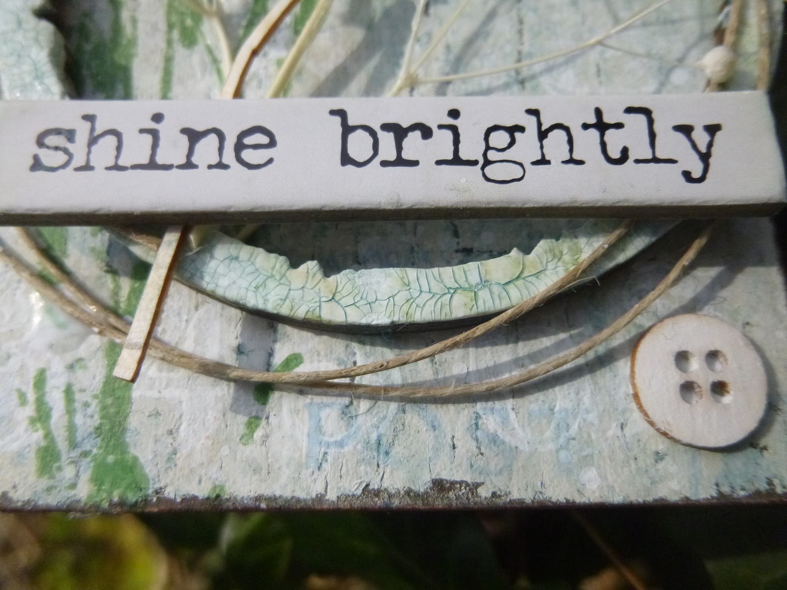


... and then a touch of Antiquing Cream in Patina Green added, dried and wiped away to define the cracks even further.


You'll see that my favourite dried stems are providing a third version of meadow grasses to the piece.


I'm finding them hard to resist at the moment.  (They were clambering all over my Tiny Greenhouses too.)


Some fine twine echoes the circular frame in a loose, rustic way.


And some delicate buttons (also, I think, by Scrapiniec)...


... do the same in miniature.  The recurring circles create a pleasing harmony for the eye amidst all the windswept grasses.


The same fine twine adorns the top of the tag.


I did have an Idea-ology Word Band in place originally, but happily my lucky prize package from Simon Says Stamp arrived just in time for this Quote Chip to take its place... much more satisfactory for the lighter than air look of this windswept tag.


I hope you like it.  I certainly had a lovely time creating it, and working with MDF and wood gives the whole thing a lovely sense of permanence despite its ethereal appearance.

I did have real trouble trying to work out which photos to share though... I love it in the bright sunshine as you get lots of life and depth from the shadows.  But it's difficult for the eye to see what's going on if you're meeting it for the first time.


In the softer light, you get to see far more of the crackle detail on the hoop and in the background, as well as seeing each of the grasses more clearly.  I couldn't decide, so you're getting it both ways to finish off the post!!

Thanks so much for stopping by today.  I hope your week is going well, whatever you're up to.  I'll be back soon with something completely different!

When they would return to one another from their solitariness, they returned gently as dew comes to the morning grass.
From The Address of Happiness by David Paul Kirkpatrick


I'd like to play along at Frilly and Funkie where the aim is to "Welcome, Spring!"
At the Simon Says Stamp Monday Challenge they'd like us to Make Your Own Background
At Mixed Media World this month Anything Mixed Media Goes, so I'd like to share this there too

Sunday, 5 March 2017

Fungus Foray


Hello all!  I'm glad you enjoyed touring the Tiny Greenhouses.

I'm back today with one of my watercolour experiments... and it's of something you might just find tucked away in the mulch behind the greenhouse.

Cestina is always complaining there aren't enough mushrooms to be found here at Words and Pictures (as a Czech by blood, she's an avid fungi forayer), so this appears with the aim of keeping her quiet for a while!

As you know, I'm still playing with the watercolours - learning how to use them and exploring different styles, and I'm not entirely sure about these.

Even though I'm in two minds about them, I wanted to share these mushrooms in time to play along with the Handpainted theme at Moo-Mania and More.


This is a much more precise effort than my loose Watery Florals or the Two Tree Doodles.


It was fun making the attempt, but I'm not sure I'm ever going to be botanically accurate, especially as I made this species up out of my head!


I almost wish I'd left it at the earlier "sketch" stage.


There's a fresher look to it (though it was a duller day when I took these photos).  They do say one of the great risks with watercolour is overworking a painting...


... and I think I may have fallen into that trap here, losing some of the lightness of touch.


Though I must confess I like some of the detailing on the mushroom caps in the "finished" version.


I'm pleased with the stalks too - using a flat brush on its side to create the shaping and dimension, and taking those strokes down to create the first outline of the earth in which they're embedded.


I kept the background very soft and loose.  I like that the imagination fills in the gaps and shapes of what might be there.


used the other end of one of the paintbrushes to add some grassy texture amongst the stalks.

And a touch of splatter always makes me happy, as you know.


I think some of the shading works quite well in creating dimension and shadow.


I hope you like this little foray into the world of imaginary fungi, another watercolour adventure.


Let me know what you make of it - it's always great to hear your feedback, and every comment is very much appreciated, especially when I'm daring to share these handpainted creations.  I hope you're all enjoying a restorative weekend, however you are spending it.

Každá houba je jedlá, některé však jen jednou.
Every mushroom is edible, but some only once.
Czech proverb

I'd like to share this at Moo-Mania and More where they are asking to see something Handpainted

Friday, 3 March 2017

Tiny Greenhouses

Hello all!  I'm glad you enjoyed taking your Hats Off To Distress Oxides!  There's plenty more to come as I'm having great fun playing with them.

But right now it's a special day at A Vintage Journey.  We've reached the milestone of our third anniversary, and we're welcoming some wonderful new Creative Guides who will be travelling alongside us.  We're celebrating with an anything goes challenge, so it's All Aboard! for March.


With my dollshouse sideline, it was inevitable that Tim's new Tiny Houses die would be at the top of my list of the new releases (well, alongside the Oxide inks, obviously), and here's my first little outing with it (already claimed by Cestina for Small Worlds).


I cut my houses out of some paper from the French Industrial paper stash and used Distress Inks to add some springtime washes of colour. 


No making of photos, I'm afraid.  I forgot all about them, but you can probably most of what I'm talking about round the back of the houses.

I backed the paper onto some waste cardboard to give it a bit more solidity and stability.


This Tim Holtz grasses image is one of my all-time favourite stamps... it probably gets inked more than almost any other stamp.

Some book page strips add just a little extra touch of interest.


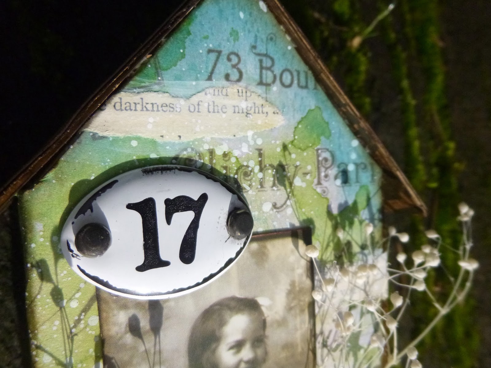
One of the Photobooth photos takes pride of place on the large house.


And she's living at number 17 - which was a happy accident... a serendipitous reference to 2017, for A Vintage Journey's third anniversary this year.


On the smaller house, I've used one of the mini-plaques and again, believe it or not, it was chance that I chose this particular one.


It wasn't until I was taking the photos that I realised that 48 is the age I'm going to reach in 2017, in a couple of months' time, in fact - so there's another birthday reference for you... albeit unintentional!


I chose a specific bit of the design to be used for the roof on each house (yay, something I did actually plan!).


And that got inked with Gathered Twigs rather than the blue/greens.


The paper flowers are unadorned, though I did take off one round of petals to make the smaller version look better on the little house.


I'm a little obsessed with these real dried grasses at the moment.  They've been on some of my favourite makes in the past (both in simplicity and in extravagance), and they're coming up on at least a couple more projects in the near future.


I love their delicate fragility.  And with those little heads on the stems, they're a bit like having white paint splatter in three dimensions.  Of course, there's lots of actual white splatter too!


Obviously, I can't manage without a couple of words, so there are some ChitChat stickers to fulfil that need.


They're tucked in behind the flowers, so that you can just catch glimpses of them.


I hope you've enjoyed this little tour of my tiny greenhouses.  Yes, I know that really they are green houses not greenhouses, but I'm sure you'll forgive me the little play on words... and they are fairly full of flowers as a greenhouse would be.


There's lots more inspiration over at A Vintage Journey and, as I mentioned, two fabulous new Creative Guides have joined our travelling troupe, so do hop over to welcome them on board.

We hope everyone will respond to the invitation - "All Aboard" - for our anything goes theme, celebrating this third anniversary.  We can't wait to see what you bring along for the ride.  And as well as our top three Pinworthy places, there's our randomly drawn prize on offer - this month from the fabulous Country View Crafts.

Happy Crafting all!

Who loves a garden loves a greenhouse too.
William Cowper


I'd like to play along at Frilly and Funkie where the aim is to "Welcome, Spring!"
And at Emerald Creek Dares, the March dare is to Splatter Some Fun... with my white paint splatters and 3D dried flower splatter, it seems like the perfect fit!
I'd also like to share these in the Anything Mixed Media Goes challenge at Mixed Media World

Wednesday, 1 March 2017

Hats Off to Distress Oxides!


Hello all and a very happy March to you!

As promised, and squeezed in between lots of other stuff, here's the Distress Oxide tag I teased you with the other day.

In between watercolours and Infusions and Destination Inspirations (Destinations Inspiration?) and I don't know what all, I shared some results from my first Distress Oxide playtime in XOX Oxides.

There's no accident in that title... I do love them, and I'm really excited to keep exploring their possibilities.

And today's title is not just about that fabulous bowler hat, but a big, congratulatory "Hats Off!" (or "Chapeau!" as the French have it, or "Klobouk dolů!" from the Czechs) to Tim Holtz for this newly developed dye/pigment fusion.


For the central panel of this tag I used the middle background from the first photo in that post, and inked up some of the stamps I bought last year and never had time to play with during my year of many travellings.


The gears are clear embossed over Potting Soil Archival ink.

With a background like this, the clear embossing helps give the image extra definition against all the detail.


The inks in that background are a combination of Distress Oxides and Distress Stains, so that you get the opacity from the Oxides and the translucence of the Distress dye inks playing off each other.


The not-there-man is stamped in VersaMark and embossed in Bark powder by Wow.


If you get the angle right, he shimmers delightfully in the light (a real now-you-see-him, now-you-really-don't which I like a lot).


The text stamping is just plain Potting Soil - that's fine as it belongs in the background.

I love these stamps of vintage advertisements and bits of ephemera and always, of course, text and lettering and fonts.


The "Repairs Receive Constant Attention" along the bottom definitely tickles me!  


Once I had my panel done, I decided I wanted to set it on a tag, so I created the large tag also seen in XOX Oxides.  I deliberately kept a lot more white space so that there would be a contrast between the tag and the central panel.


Then I had a lovely time playing with arranging my cogs and gears to echo those in the stamped image.  Some of them are Idea-ology; some are from a cheap job lot from China.


I used alcohol inks and Distress Paints to alter some of them for a verdigris distressed look to echo the inky panel and tag.


I used a Small Talk sticker inside my Idea-ology Label Pull.  It's been slightly stained with Pumice Stone Distress Stain so that it wouldn't be too glaringly white inside there.


I enjoyed creating a little chainful of adornments to hang from the Hitch Fastener.

I usually use these as doorknobs or folder fasteners, so it's fun to do something different.


I love how it looks layered over the cog.


Again, the alcohol inks and Distress Paints came in handy to create the weathered metal look on the numbers, whether it's on the figure 3...


... or the smaller figure 2 (I mean it's smaller in size as well as in value - it's one of the Idea-ology Mini Numerals, as opposed to the larger Numerals which have those helpful holes pre-drilled).


So that's one of my first little plays with Distress Oxides turned into a tag.  And it was such fun playing with all those Tim Holtz stamps and bits and bobs.

Tim and his Distress Inks really were at the heart of the start of my crafty journey, so it's really exciting having new Distress ingredients to add to the mix.

There's a new and very special challenge due to start at A Vintage Journey on Friday, so I'll hope to see you again soon.  Happy crafting all!


There is an interest in that which is hidden and which the visible does not show us. This interest can take the form of a quite intense feeling, a sort of conflict, one might say, between the visible that is hidden and the visible that is present.
Rene Magritte (talking about his painting The Son of Man which features a man in a bowler hat with his face hidden by an apple)

The timing is just too perfect, so I'd like to play along at my old stamping ground Country View Challenges where the theme is Inspired by Tim Holtz