
Encore Posts
Projects which made their first appearances elsewhere for Design Team duties or Guest Designer opportunities, but which only had a sneak peek here, are being gathered together in the pages of my virtual scrapbook while I'm away. Please don't feel that you have to comment all over again!
Hello all! I've just arrived back in the UK, and there's lots of unpacking and unopened post to be dealt with before I can settle down at the craft table, so in the meantime here's another little encore or two for you. After the farewell to Country View Crafts, let's enter the sombre tones of the Inevitable Dusk! These pages were created for The Artistic Stamper in June 2013 (that's almost three years ago - good grief, Charlie Brown!) and here's what I wrote back then.
_________________________________
Hello all, I'm here today with something that - for me - is a little different. In fact, when I saw the new Artistic Stamper texture stamps, I wasn't sure that they were for me - very geometric - but I thought I should stretch myself. And I have to say, I had huge fun layering them up to create the background textures in these pages.

There are some things I'm really pleased with about this, and some that I might do differently another time... I really like the texture on the main brother and sister image.

I mixed some drops of Chipped Sapphire and Salty Ocean re-inkers into texture paste on my craft mat, and then smeared it through Andy Skinner's brilliant Children mask. I'm also really pleased with the highlighting, done with white acrylic paint, and some pencilling. And I made sure to give them some solid "ground" to stand on.

I started out by gessoing some pages in my Concise Encyclopaedia (same book as my previous layout) and used Dylusions sprays to lay down the first layer of colour.

I started to layer in the texture stamps using Archival inks, Distress Inks, Distress Paints and Picket Fence Distress Stain.

It was at this point that I forgot to take any more process photos - sorry! - but I'm really pleased with the effects of layering the products.

You get some resist effects from the paints, so there are areas of translucence and great textures.

Obviously there's some inking for definition of the resist and shading at the edges of the pages, as well as to create the twilight path for the siblings. The quote is by Susan Scarf Merrell.

It's stamped onto watercolour paper and inked with Chipped Sapphire.

Certain words got a touch of Salty Ocean too to highlight them.

As with some of the background chevrons, I used a white pencil to add some texture and help embed the words into the page.

I'm also really happy with the twilit path leading to the smaller sibling pair, travelling off to who-knows-where...
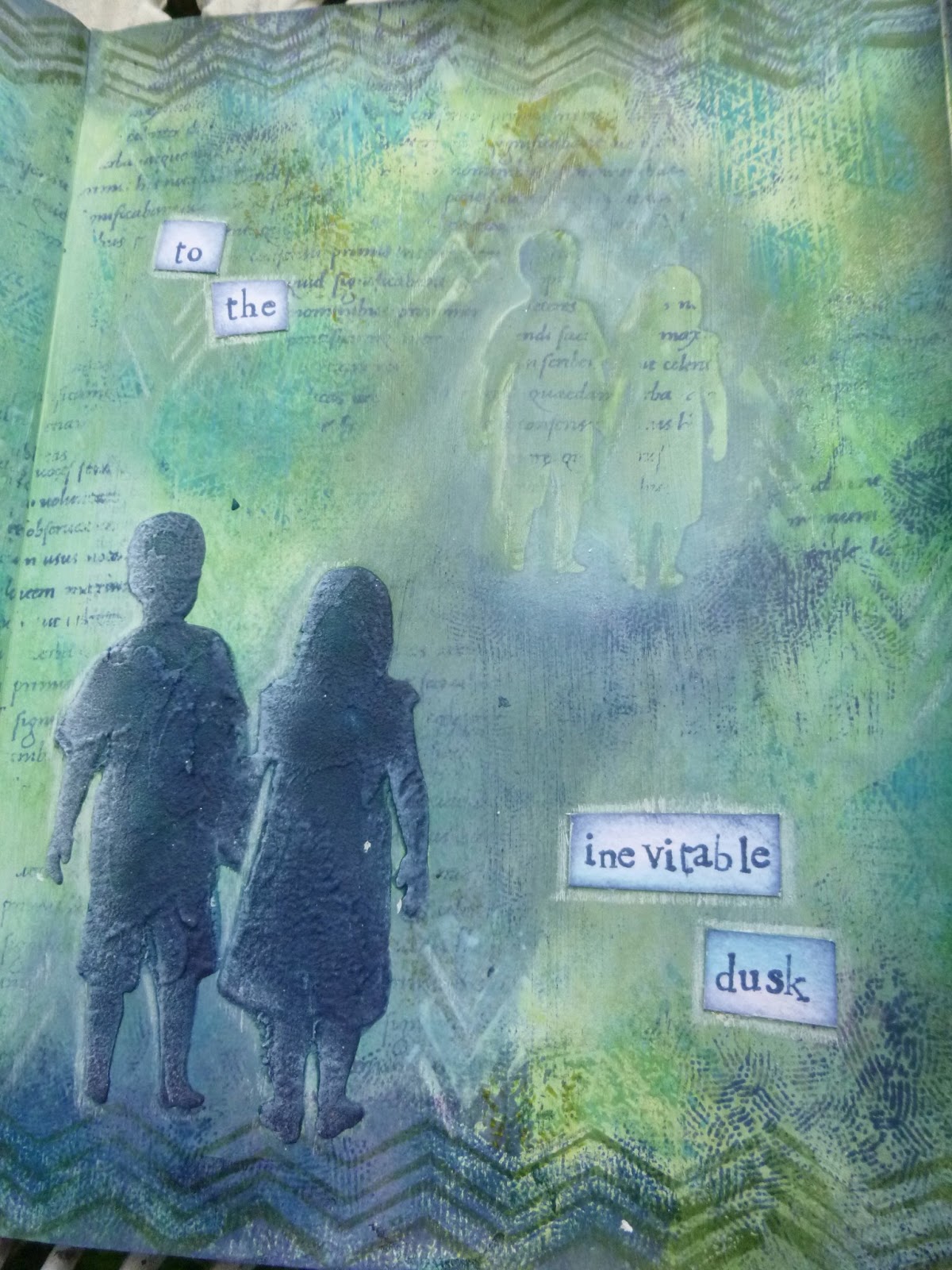
... though I'm not sure I didn't go a layer too far with the pair themselves. I liked them better one step earlier - but I haven't got a photo of that, so you'll just never know!

So there you have it... To me it feels as though it has a different flavour from normal, but I don't know. Is it typically "butterfly" after all? I'm curious to know what you think!

Thanks so much for taking the time to stop by, and I'll see you soon.
_________________________________
So there you have it. Actually, my question still stands about whether this is "typically butterfly" or not. I think I would probably do the wording differently these days... those white panels seem a bit stark against the softer tones of the background, but I know I was thinking of echoing the white highlighting. And I'm still not sure that chevrons are really "me"! Ah well, it's all part of the learning curve, isn't it? I hope you're all well, and I'll be back with something new for you in a few days.
Our brothers and sisters are there with us from the dawn of our personal stories to the inevitable dusk.
Susan Scarf Merrell


