I'm travelling into a new way of working, a new country, a new language, and a new hobby which I'm passionate about. Come with me for some of the journey...

Tuesday, 31 October 2017

Nosferatu ATC

Encore Posts
Projects which made their first appearances elsewhere for Design Team duties or Guest Designer opportunities, but which only had a sneak peek here, are being gathered together in the pages of my virtual scrapbook.  I'm calling them "Encore" posts and they're formatted differently (all the way down the centre), so you can spot them easily.
Please don't feel that you have to comment all over again!

Yes, it's another Encore, and this one is making its appearance more than two years after its original performance over at the Calico Craft Parts blog.  I think he's a suitably creepy presence to let loose on you all for this All Hallows' Eve... looming large even though he's only in a tiny ATC.  Here's what I wrote over at Calico back in September 2015.
____________________

Hello again!  After my massive spooktacular He's Behind You, I'm back with a much shorter post but - in my opinion - a more genuinely spine-tingling creation today.  The Spooky Shrine had a sort of Scooby Doo pantomime scare-factor.  Today's ATC taps in to genuine creepiness, leaning heavily on the amazing 1922 film, Nosferatu - the original vampire thriller... perhaps all the more eerie for being a silent black and white film.


Max Schreck plays Count Orlof, and the lighting, the ambience, the sheer creepiness of Schreck as the vampire has stayed with me ever since I was lucky enough to see it on a large screen at the NFT in my twenties.  There are images and scenes which have haunted my imagination ever since, and Calico Craft Parts have designed a piece which captures exactly one of those images.

How he looms over you there from the deck of the ship... with those claws of hands ready to reach for you...  Meet the Nosferatu Wood Vampire Shape.


I didn't feel I needed to do much - just a crackle background - DecoArt Crackle Paste on one of the ATC Blanks, the moon masked off while I added Prussian Blue Hue and Paynes Grey...


I just used a circular punch and some self-adhesive paper, and then peeled it away when I was done, leaving a ghostly penumbra which glows palely around the figure of Count Orlof once he's stuck in place.


Nosferatu himself has also been very simply tinted with Paynes Grey and Prussian Blue Hue for extra shading.


If you're still not quite in the Halloween mood, do check out the rest of the amazing spooky designs in the Calico Craft Parts Halloween sections - from owls perched on branches, to Haunted Houses, to the skeletons and zombies you met in my Spooky Shrine, to fabulous Gothic words to put on pages and layouts.  I promise there's something for everyone.

That's pretty much it for today.  Sleep well won't you!
__________________________

And a happy All Hallows' Eve to all of you. If you celebrate it, I hope you have fun, and if you don't I hope you are left in peace by the sprites and hobgoblins. Tomorrow is All Saints and, of course, the beginning of a new month so I'll be back to haunt you then with some fresh Design Team inspiration. Good night all!

Nosferatu. Does this word not sound like the midnight call of the Bird of Death? Do not utter it, or the images of life will fade - into pale shadows and ghostly dreams will rise from your heart and feed your Blood.
Title card from the 1922 silent film, Nosferatu

Sunday, 29 October 2017

He's behind you!

Encore Posts
Projects which made their first appearances elsewhere for Design Team duties or Guest Designer opportunities, but which only had a sneak peek here, are being gathered together in the pages of my virtual scrapbook.  I'm calling them "Encore" posts and they're formatted differently (all the way down the centre), so you can spot them easily.
Please don't feel that you have to comment all over again!

There are a couple of Calico Craft Parts Halloween projects which have been patiently waiting to put in a full appearance here at Words and Pictures.  Since I've been visiting friends, I thought I'd take the opportunity to pop in a couple of Encore posts for this spookiest of seasons.  So here's the first of them - a haunted shadow box of a shrine that I had so much fun with - and here's what I wrote over at Calico back in September 2015.
____________________

Hello all, I've been enjoying getting spooky - so much so that this is a bonus extra project.  I'm not supposed to be here until Monday - but BOO... surprise!!  And here's what I've been playing with.


There are so many amazing designs in the Halloween sections - and some of them, like some of the bare trees for instance, will work on non-Halloween projects too.  I've been playing with just a few of them, and came up with this haunted house - I'm just not sure who's haunting whom!


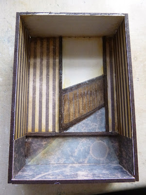
I started with the Spooky Shrine Kit, and I knew I wanted to try to get a zombie as well as a couple of skeletons in.  Given their relative sizes, I needed to pretend the zombie was in the background.  And given their relative shapes, I needed him to be part way up the back wall!  So I had to create a bit of a trompe l'oeil... a corridor for him to come walking down.


I plotted the basic position and laid in the doorway and the light spilling out of it.


I wallpapered and laid flooring, adding more light over the top.


I extended the papers onto the side walls and the floor.  I also did some distressing with the DecoArt Media Fluid Acrylics.  Turns out Transparent Yellow Iron Oxide, Quinacridone Gold and Raw Umber are perfect for creating a tobacco-stained look!


Putting in the corridor - hand-drawn dado rail and panelling - I had to cheat the perspective lines a bit, so now it looks as though the corridor arrives at a slight angle.  And I created a door frame with matchsticks painted in Raw Umber.  Once all that was done, I glued it all together.


Once glued, I cut papers to cover the back of the shrine.  I find it best to leave this until after the gluing together, as then you can work right to the edges of the walls, covering up the interlocking edges.


I had lots of fun painting my Craft Parts with more DecoArt Fluid Acrylics.  (You can see how they look "naked" in that first making-of picture above.)  The Zombie Style 2 is done with Green Gold and Viridian and maybe a touch of Paynes Grey, and the fabulous Carved Pumpkin has Red Iron Oxide, Quin Gold, Raw Umber, Transparent Yellow Iron Oxide and Green Gold.  They each got a bit more touching up after this stage.


My somewhat depressed seated skeleton needed something to help him sit further "downstage" in the room.  In the end, the simplest solution was to glue his pelvis to a small wooden reel.  As you can see, he's now self-supporting, so I was able to glue him in his position quite easily.


And here they come... the Zombie in the doorway...


Skeleton Style 1 a little further forward, supported partly by the matchstick doorframe...


And Skeleton Style 3 slumped in the foreground.


I think he's so exhausted with the whole haunting business that he can't even be bothered to warn his pal that "he's behind you"!


You'll see that the spooky old portrait on the wall has changed position - it was just getting lost behind Skeleton 1's head.


Around the back and sides, the Halloween fun goes on.  The Carved Pumpkin sits on the back under the excellent advice to "Scream".  I shaded the papers using Quinacridone Gold, Green Gold, Viridian and Raw Umber so that it would all tie together.


On the sides, there are some bats hanging about - of course! - very simply painted with Paynes Grey.


I'm really happy with the look of the pumpkin - I think he's one of my favourite Jack o'Lanterns I've seen, even before you get the paint on him.  I'd happily use him "naked" on cards or tags too.


I love the sheen you get using the translucent DecoArt paints on the Craft Parts - very cool.


And because the Craft Parts are of such good depth and quality, the bats cast their own spooky shadows.


And finally, the Spooky front panel... same paints in action and then some DecoArt Crackle Glaze, Raw Umber rubbed into the cracks and wiped back, followed by a coat of Ultra-Matte Varnish because for once I didn't want it too shiny.


The Spooky word is done in Raw Umber with Paynes Grey - and the spider and his webs are basically Paynes Grey too.  It looks really cool over the dark wood of the basic Craft Parts.


So I hope I haven't spooked you too much...


No, I hope I have!  Mwaah hah haahhh!


I certainly hope I've inspired you to check out the Halloween offerings at Calico Craft Parts - there's enough inspiration there for even the most avid Halloween fiend.  As I said, I'll be back again on Monday - til then, sleep tight and mind the bugs don't bite!
________________________

Back to the present day, and it's not Monday, in fact, but Tuesday that I'll be back.  Yes, that's All Hallows Eve and I'll be here with a creepy little creation just for the Halloween fans amongst you.  For now, just keep an eye out behind you...

You know what they say, when the going gets scary, the scared gets scarce!
Shaggy from Scooby Doo

Thursday, 26 October 2017

Falling Leaves

Hello again!  So today we really are at the last of the launch night samples using EAB04 The Autumn Edition.  And along with the Fabulous Fungi I think these are my favourites out of the autumn samples (the Haunted Churchyard and All is safely gathered in make up the rest of the Autumn Edition sample collection), and maybe out of the whole lot.


It's another trio of tags... triptyches and pairs turn up a lot round here.  It's how my creative brain seems to work very often.


The backgrounds here are Distress Oxide and Distress Ink combinations from some of my earliest experiments with the Oxides.


You can see more of how they were made in Drip, Drip, Drop, Little Oxide Showers, posted back in April.

They've been hanging around ever since waiting for their moment in the sun, and now their time had come!


For the leaves, I sprayed a piece of off-white cardstock with Distress Sprays in various autumnal colours.


I'm guessing Rusty Hinge and Vintage Photo are involved, and maybe some Spiced Marmalade, Wild Honey and/or Gathered Twigs.  It's a while since I made these!


I then stamped the gorgeous Scrapcosy leaf from ESC05 multiple times - some in Sepia, some in Coffee, some in a combination of the two...


... and clear-embossed the image for added definition before cutting them all out.


I played with the leaf positioning - two and one, one and two, two and one again.


And then had a fiddly time coiling and twirling some thread around underneath as I stuck them down.


I also played around quite a bit with the words.  The middle tag has the whole of Cornelia L. Tuthill's lovely quote, sliced up into phrases and positioned between the falling leaves.


The other two tags have John Burroughs' glorious words divided and overlapped between them.  So the first has the first two sections of the three part thought...


... and the final tag has the middle section repeated, and then the final part added on.

As you see, you can use these quotes in their entirety (as I did with this Burroughs quote over at A Vintage Journey recently), or just pick the parts you really want to use.


The wild cotton thread weaves its way in and around the falling leaves.  (Click on the photos for a larger view.)


I hope it adds a sense of whirling movement to the leaves tumbling through the air.


The matted frame is made from kraft card spritzed with some more of the same Distress Sprays (and this is what left the leftovers from which the frame of All is safely gathered in was made). 


The dark frame provides contrast for those shabby edges as well as giving the tags a nice sharp look for the display boards, not to mention the sturdiness you get with another whole layer stuck on behind.

Simple rustic twine finishes things off again, and we're all done with The Autumn Edition samples.


Just one more sample post to go - the last of The Winter Edition makes.  There are a couple of festive tags still to share, but I think they can go together in one post.  And I might leave that one until we're just a little bit closer to Christmas... let's finish with Halloween first, shall we?!

I've been catching sight of the word stamps around Craftyblogland and it's an absolute thrill to me to see how they are inspiring other crafters.  I haven't got time to be quite such a diligent visitor as I used to be, so if I've missed a project where you've used the quotes, do give me a nudge - I love seeing them in action in other people's hands!

Thanks so much for stopping by, and I'll see you again soon.

Now Autumn's fire burns slowly along the woods and day by day the dead leaves fall and melt.
William Allingham

Tuesday, 24 October 2017

All is safely gathered in


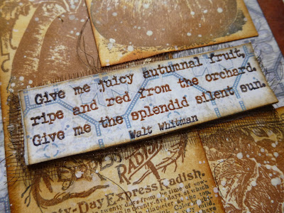
We're on the final stretch with the EAB04 The Autumn Edition samples - there are two in quick succession over the next couple of days.   First up, a harvest celebration pairing Walt Whitman's wonderful words with some of the brilliant Scrapcosy pictures.

No process photos for this one, I'm afraid, as it really was a case of throwing together some leftovers from other samples with some simple stamping and inking.

It's all done on a 5x7 inch format - so a sort of journalling page, or a picture for a frame.

The background is some Tim Holtz paper from one of the stashes - I think it's from Wallflower... I'm sure someone out there will know!


And I used a snippet from the same piece to make the panel for my quote-stamping.  I inked up the stamp with Sepia Archival and then dabbed on some Jet Black around the edges.


I've always enjoyed this sort of two-tone stamping, and some clear embossing powder gives it glossy dimension into the bargain.

The panel is layered over some rusty mesh - love this stuff!


Scrapcosy's vegetables were the closest my stamp collection could get to fruit - how weird is that?  Not one piece of fruit in all the PaperArtsy stamps I own!


But they're still the "fruits of the earth", right?  So if we assume Walt is referring to fruit in that wider sense, then we're fine...  Okay, yes, the orchard bit is slightly stymying that argument, I concede.


I do love these vintage vegetable advertisements from ESC02, so I'm going to stop making excuses and just enjoy them!


The frame is made with some Distress Spray-spritzed kraft card which was leftover from one of my leafier samples (the one coming up in a couple of days).


I just liked how it finished the whole thing off nice and rustily.  You can't beat a bit of brown and blue!


So just a quick one from me today... well, there is the harvest to be got in after all.  Hope you're all having a good week, and I'll be back soon with those krafty leaves.

The true harvest of my life is intangible - a little star dust caught, a portion of the rainbow I have clutched.
Henry David Thoreau
(who was also responsible for the glorious words on Winter Sunlight a few days ago)