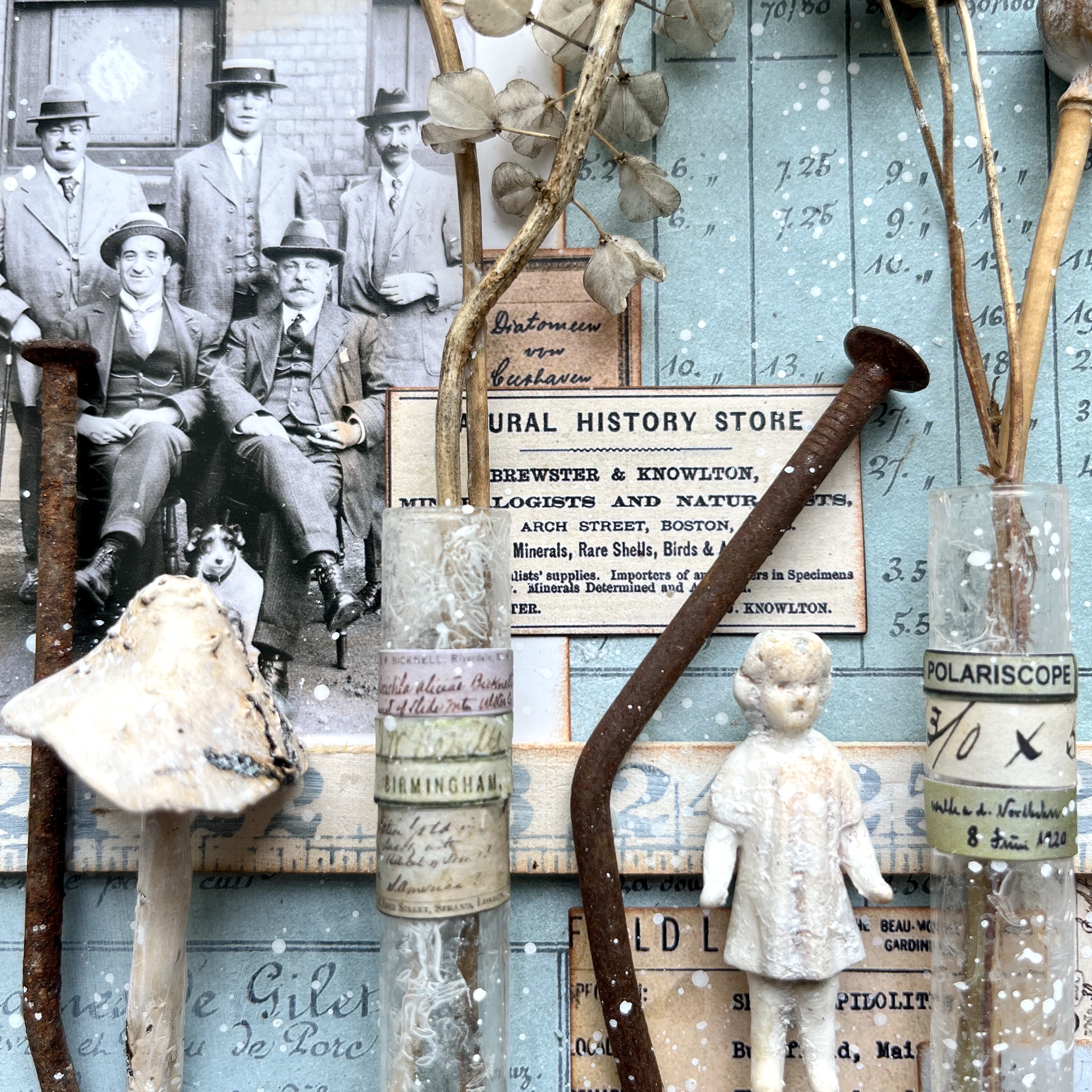
Dollshouses are in my blood - my mother's collection is open as a museum, Small Worlds, here in the Czech Republic... you can see lots more in her blog, Cestina's Dolls Houses, or find links the work I've done myself on the houses in the museum here on the Dollshouses page here at Words and Pictures. This project wasn't made for the museum, and it was also done in the UK when all the miniatures supplies were already in the Czech Republic, so it was very much an improvisation! Here's what I wrote back then...
_____________________________________
Hello all! I've been tempted into the world of miniatures by this Tiled Patterns topic. Some of you may know I have a sideline of working with dollshouses, using my craft supplies in a slightly different way. (If you are curious, you'll find links to some of that work here.)

If you say "tiles" to me, the first place my head goes is to dollshouse tiles - floors, bathrooms, fireplaces. And I immediately thought that Scrapcosy's botanical stamps stamp (yes, I do mean that) would make lovely Delftware tiles around a fireplace. Well, one thing leads to another, especially when I'm playing with dollshouses, and so this is what I ended up with. (You might want a cup of coffee for this post!)

The original idea was very simple. Aren't they always? Just a nice tiled surround for a fireplace. I googled "Delft tiles fireplace surround" just to make sure I wasn't imagining things, and then started to create my tiles.
I stamped the lovely stamps from Scrapcosy ESC 15 in Cobalt Blue Archival onto some card which I'd smooshed with Antique Linen and Weathered Wood Distress Stains.

On the same inky card I stamped some of the crackles from Courtney's ECF 04 in Hickory Smoke, so that I could have some cracked or marbled plain tiles to go in between the Delftware ones.
I cut out my tiles and started arranging them in a fireplace sort of a way on the craft mat...

... before sticking them down onto some sturdy grey card torn from the back of a large, used do-not-bend envelope (waste not, want not) and cutting them out again.

Next, a bit of work with UTEE (ultra thick embossing powder) to create a look of ceramic tiling. Love how it gives you dimension as well as that lovely surface sheen.

Once I had all my tiles embossed, I started trimming some coffee stirrers to create a wooden frame for them. (I always pick up a few extra whenever I'm in a coffee shop.) At this point, I was thinking I'd probably stick it all down flat to a piece of card and fill in the space around them with drawing or pictures.

But I think below the surface my brain was already plotting something more elaborate - a little teasing thought kept bubbling up of how nice it would be to have a properly deep hearth in the centre of the frame. As I was looking for something else, this bit of packaging surfaced (not sure what it's from - looks like maybe an iPhone or something, but there are two of them, and I definitely haven't got two iPhones!).

It was exactly, but exactly, the right size to go behind my tiled frame, and so my fate was sealed. Because once you've got a proper fireplace, well... you have to have the mantlepiece to go with it, don't you? And once you've got a mantlepiece, you need things to go on the mantlepiece.

And if you've got a fireplace and a mantlepiece with things on, then you really need a wall for them to go up against. And if you've got a wall over a mantlepiece, then you have to have things to go on that wall, don't you?

You see what I mean about one thing leading to another?! So I started gathering bits and bobs, at first thinking it might all go on a jumbo tag, until I found an 8x8 inch canvas board tucked away, still wrapped in its cellophane... perfect.

I wallpapered the canvas board with some paper by Maja Design. These two designs, above and below the dado rail (more coffee stirrer snippets) are the front and back of one sheet - clearly perfect for dollshouse-makers.

The interior of the hearth is painted with Fresco Finish Chalk Acrylic paint in Slate, with just a touch of Little Black Dress mixed in. And most of the logs are trimmed from some lawn edging intended for (full-size) gardens.

I used an Idea-ology Metal Gate to create the grate, with a couple of MDF hinges from Calico Craft Parts at either end to give it a more Gothic look. They're painted with Little Black Dress and have just a touch of Treasure Gold in Pewter for a metallic gleam.

The mantlepiece itself is just some more of the envelope card, painted white, and I found some very elegant Bo Bunny brads deep in the stash, bought maybe five years ago. which make for great little picture frames. Slightly unusual pictures in them, I know.

The frustration of setting out on a piece like this is that there is a huge dollshouse stash in the Czech Republic, where my mother's collection of dollshouses is open as a small museum, Small Worlds, in the summer months. There are so many brilliant bits and bobs there which would have been just right for this, but that's rather a long way to go, so I had to get creative with what I had...

There are some more Bo Bunny trinkets up on the wall, plus a little butterfly book ring embellishment I made right at the start of my crafting journey with some UTEE. Maybe not what your average Victorian would have in their picture frames, but there you go...

I should think most crafters have some of these little glass jars somewhere in their stash. These were quite cheap ones (from The Range, I think - you can see them in their naked state in the photo with the bare canvas board above) filled originally with bits of glass glitter. I had the brainwave of creating some Delftware jars to go with the tiles.

I stamped the ESC15 flower stamp in Cobalt Blue again, but this time onto tissue paper. Once I'd given the jars several coats of Snowflake paint, inside and out, I glued on the tissue paper to create the floral design.
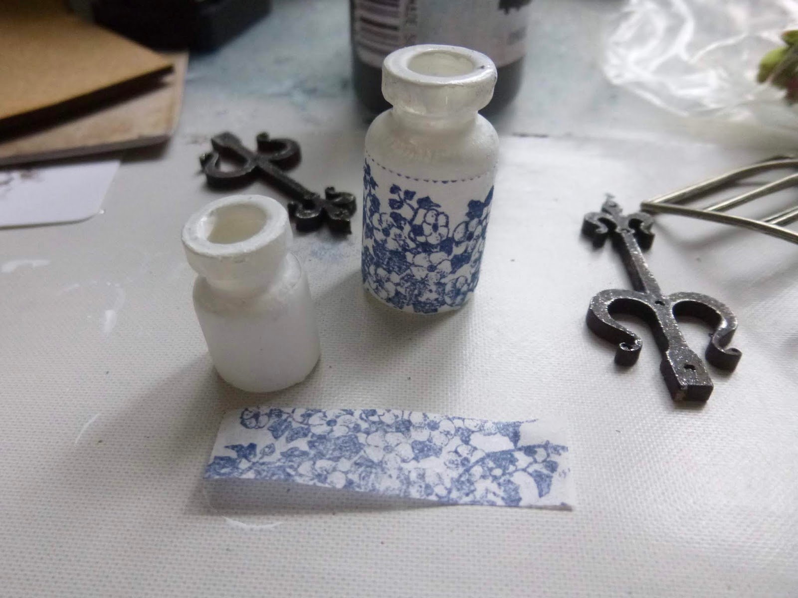
I sort of wish I'd left it there, but I'd seen some lovely jars with words on when I googled "Delftware jars", so I decided to add a couple of the words from the same stamp to make them into antique tea jars. (The stamped words were left over from the original stamping done for the tiles - if I'd been thinking straight, I'd have stamped again onto some thinner paper so that the labels didn't stick up so much. Ah well... next time. No, there will be no next time!!)

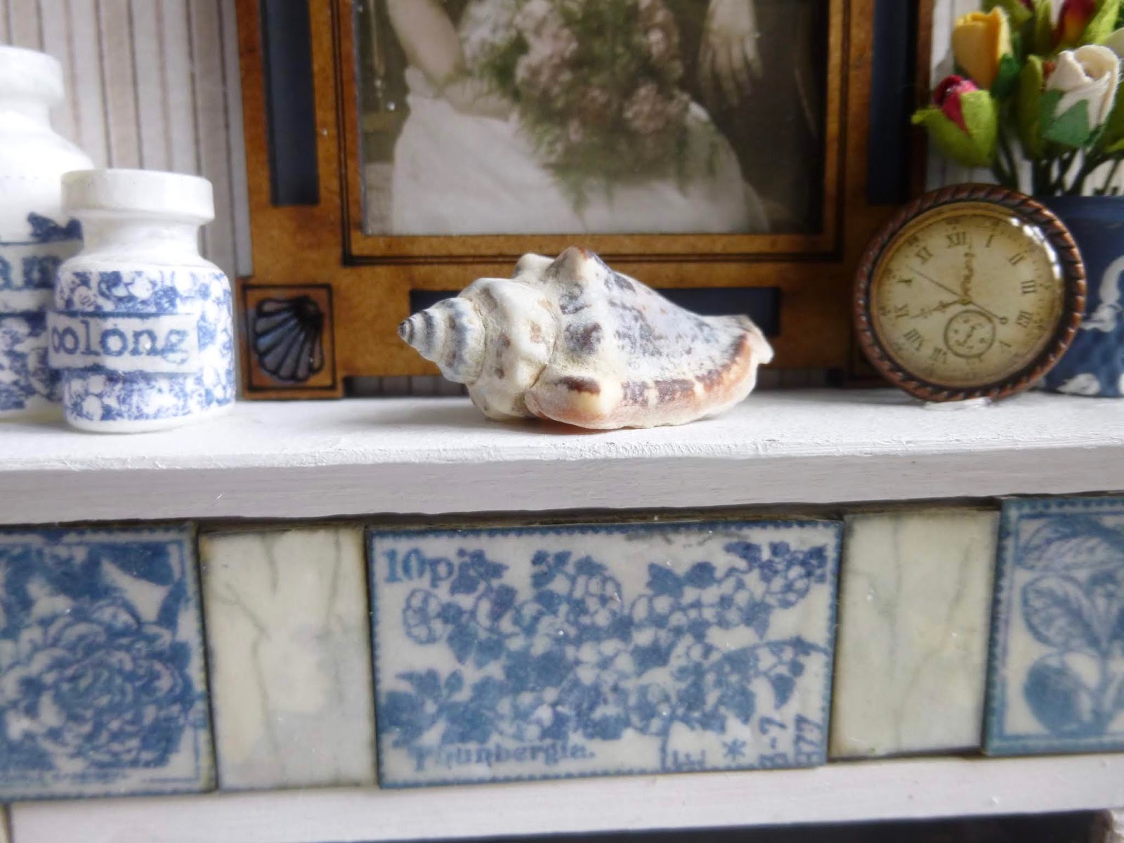
The large picture frame is an ATC design from Calico Craft Parts, and one of the new Idea-ology Found Relatives fits perfectly into the slot. I wanted to have some more echoes of the Delft blue around the place so that, despite everything going on, the tiles would still draw the eye, so I used Double Denim in the apertures around the edges. (You can put in the picture and paint the apertures before sticking down the top layer of the frame, so that makes life easier!)

The shells on the picture frame also got a little touch of Double Denim, and reminded me that I had some shells tucked away in the stash somewhere. I suspect this is just one of the extensive collection of seashore treasures hoarded by the owner of this fireplace.
Nearly there, I promise... I found that the Double Denim was also the ideal colour to create a faux Wedgwood vase. I painted the metal thimble with a couple of coats, before applying a very simple design with toothpickfuls of Snowflake paint.

I tucked in some rosebuds from the stash, and that was ready for displaying. Oh, and the little clock is one of those Bo Bunny brads too.

So that's pretty much that, I think. I really like my Delftware tiles (and matching Delftware jars). I'm so happy I was right about the Scrapcosy stamps working in that way!

They catch the light very nicely, and have that aged look I was after with the crackled plain ones in between. I think it's pretty effective... another lovely crossover of craft supplies into miniatures work.

I know this might look like a lot of work. Well, let's be fair, it is. But taking it one step at a time, it's honestly something anyone could do, and it's all done with things most crafters probably have tucked away somewhere, and with plenty of recycling and upcycling too.

You needn't go full-on dollshouse, of course... you could just create some miniature "ceramic tiles" to use on tags or journals or layouts. That basic technique is really versatile, and gives you some unusual tile embellishments you can use any way you like.
Thanks so much for stopping by today, and persevering through this long post. I wanted to share all the ins and outs so that you might be inspired to try some of it for yourselves. Happy crafting all!
_________________________________________
So there you have it... I think we can safely say that I've restored the tradition of extremely long posts, what with this one and the altered frame from the start of the week. I hope this gives you some inspiration over the weekend, or maybe just something to read!!
Thanks so much for stopping by and I'll see you again soon.
“It might interest you to know," Tully says, "that there's a reason people build miniatures. Doesn't matter if it's guys laying out model railroads or women decorating dollhouses. It's about control. It's about reinventing reality." [...] "Some people get a lot of satisfaction in creating a little world they can escape to. In making things turn out the way they want, at least in their dreams.”
From The Bette Davis Club by Jane Lotter