
Really these posts are for my own virtual scrapbook records. I like being able to trace the steps on the journey. If you care to join me on the way, that's a lovely bonus, or you can just go for a quick scroll if you prefer...

I was very happy when my short trip to New York for work at the end of January coincided with a 40% off coupon at Blicks, a favourite art supplies shop. Once the work was done, I was straight on the subway to go and see what they might have to play with.
I did have an idea of what I wanted. About two years ago, I got some Qor watercolour paint tubes (made by Golden) on an offer and had a tiny dabble with them then. I knew there was a newer sampler collection of 12 tubes around, and that was on my hit list.
Happily they were in stock so I grabbed them, and some large 9x12 inch Canson watercolour pads which were on offer, as well as a cheap set of brushes. I did, of course, have brushes at home, but I wanted to play right then, that evening, in my hotel room!
I really just did some mixing and daubing, to see what sort of colours they were and how they played together.

I started with a fairly formal colour chart of just two colours - Nickel Azo Yellow and Ultramarine Blue. The two left-hand columns are the colours unmixed.
It's not too formal - my pencil boxes got a little tipsy as they went across the page. It's great fun to see how many shades and tones appear with different mixes and water washes.
And as you can see I used up some of the extra paint on some words...

But I decided that was too formulaic for the mood I was in that day (though I'll definitely do the same with other colours another time), so for the next page I allowed myself four colours - Paynes Grey, Phthalo Blue (Green Shade), Permanent Alizarin Crimson and Yellow Ochre - and just dabbled.

I love letting the colours run in to one another to see the mixing possibilities.

And because it's just playing and learning, loose and free, I even found myself really enjoying the red zone (and on into pink and orange too...)

A couple of my usual doodles made their way onto the page.

The cheap brushes turned out to be rather nice to use, creating shapely strokes to turn into leaves.

Back down to a trio - Paynes Grey, Permanent Alizarin Crimson, Phthalo Blue. I had so much paint on the brush (unintentionally - lesson learned now!) that the first dark blue sweep took up half the page by the time I'd spread the pigment out.

A little more writing practice, just using up paint on the brush. My brushwriting turns out to be similar to but not the same as my handwriting.

I had a play with how light a wash I could use. There's so much pigment in these paints that you can really use loads of water and still get a beautiful effect.

I wanted to see some of my green options, so I tried out a page with Nickel Azo Yellow and Phthalo Blue, mixing both on the lid of the paint box and on the page as I went.

The blob at the top formed itself into a clump of leaves without my even really thinking about it, so I gave it some rough sort-of-dandelion heads (though I know they're not really dandelion leaves), and added texture with the end of the brush handle.

Then I found myself playing with stems and grasses over the rest of the page too.

I'm fascinated by how many colour tones you can get with just two paints.

I carried on with those two colours on the next page, but added some Paynes Grey into the mix too - complete change of atmosphere.

Again, the doodling led me to plants and trees.

I like the cooler blue/greens of this page very much.

And I enjoyed painting water on first and allowing the paints to bleed into it - really cool effects.

So those were my hotel room daubings. I was back home for the next few. I'd planned to get back into the craft room properly, but I found myself unable/unwilling to stop playing with the watercolours. Besides, I can do that in the living room where it's much warmer!
There's a whole page of Dioxazine Purple, experimenting with brush strokes after watching some videos on youtube.
Lots of lovely possibilities here, and slightly better brushes to accomplish them with.
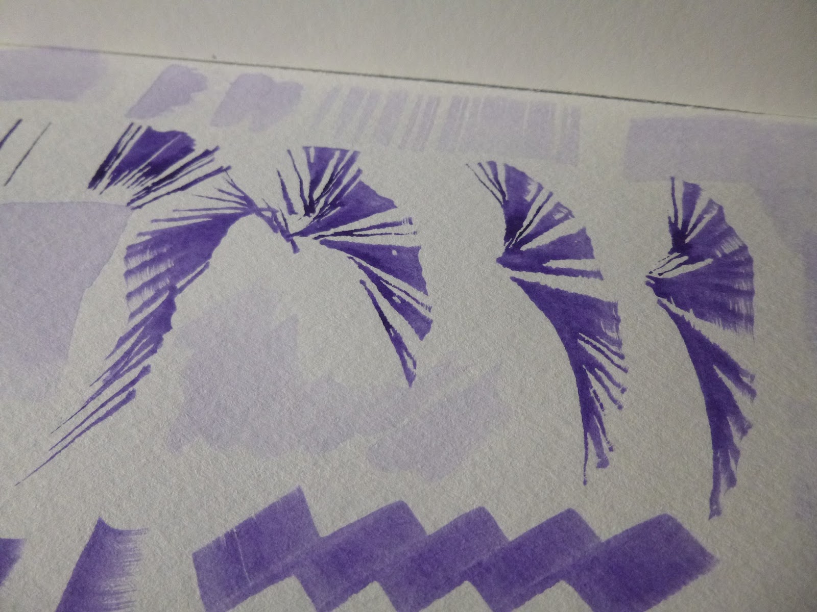


(They're still not mega-expensive, I assure you. I swoon at the prices of some of the brushes you can get!)

I added Quinacridone Gold Deep into the mix for the next page.
I'd been looking at videos about how you get neutrals when you use contrasting colours, and I love the browns and greys I got with these two.

Business as usual with the trees and grasses...

But I also tried out a couple of little figures, very impressionistic, not detailed. It's mostly chance, but with a little bit of control.

I intentionally created the pairings, but I love how alive they seem to be in their conversations, which I didn't really have much to do with.

I really loved the neutrals I got with mixing, but the purple was maybe a bit much for me, so I retreated to my blues and greens for the next page of playing.
I think this is Sap Green and Indigo in action together.

Continuing to try out brush shapes and strokes and positions...

Some more of the inevitable grasses...

... and some more painting with water and then adding pigment strokes and letting them just do their thing.

Finally for today, some more colour combinations (which I stupidly didn't write down, but there's Payne's Grey and Quin Gold in the bottom half of the page, and I think the Alizarin Crimson again, but the rest is up for debate), and a bit of circle practice.

I was also playing with dropping colours into other colours, wet on wet.

I completely understand why people become obsessed with watercolour as a medium!
So that's enough experimentation for one day. I'll be back soon with some watercolour florals... Florals? Yes, florals - well, flowers are basically glorified grasses, aren't they?! Thanks for stopping by, and I'll see you again soon.
All life is an experiment. The more experiments you make, the better.
Ralph Waldo Emerson


