I'm travelling into a new way of working, a new country, a new language, and a new hobby which I'm passionate about. Come with me for some of the journey...

Monday, 13 June 2022

Frame It

Hello all!  I'm delighted to be back with another inspiration offering for the Simon Says Stamp Monday Challenge, and I think it's up there with my favourite things I've ever made.  (And in return to Words and Pictures tradition, this is a l-o-o-o-n-g post... cups of tea or coffee, or a glass of wine recommeneded!)

It's an honour to play alongside the amazing Simon Says Stamp Monday team for the month of June and, as always, they've got a wealth of inspiration to share with you.

The new theme for this week is Frame It.

I've framed a whole collection of gathered items, presented by members of the botanical research team from Cambridge University (or Harvard, if your imagination prefers it), and surrounded by their academic notes and observations. 

It's an upcycling of a home decor frame which was about as uninspiring in its original form as it could possibly be.  But it's a lovely deep frame, which set my creative mojo whirring.

I started by gathering some things I thought I might want to use in the frame and playing a little with the composition.  Some little glass test tubes, rusty nails retrieved from old pieces of wood removed in the house reconstruction and now doing service in the garden in various ways, my trusty poppy seedheads and other dried flower heads from the garden, and so on...

I was enjoying the neutral colour palette, but as I was flicking through the Backdrops Volume 3 paper collection, this gorgeous vintage aqua/turquoise panel caught my eye, and once I'd seen it I couldn't let it go.

So I selected some more Tim Holt paper from one of the older 12-inch stashes to go behind, mounted them both on scrap cardboard to make them more sturdy, and set about adding all the details which make me happy.

I started with making the panels look a little rusted and worn.  Some Hardware Heads and other metal toppings "screw" the panels together...

... while Grit Paste smeared onto the metal as well as in places around the edges of the panels gives me some rusty texture to work with.

Then I had a little play with various Distress Crayons (Vintage Photo, Ground Espresso mostly), Archival Inks (mainly Sepia) and a little Quinacridone Gold Fluid Acrylic to get the aged rusty tones I wanted.


The new Snapshots have lots of great new characters to fire the imagination.  These Cambridge (Harvard) chaps are looking very pleased with themselves and their academic pursuits.


I hadn't originally planned on including any photos, but things were changing direction from that original minimalist look, and I let them have their way.


Oh, back to texture for a moment... I wanted to age my glass test tubes a bit, so I started by dabbing on some of the seasonal Icicle crackle medium which Tim Holtz and Ranger brought out last Christmas.  


It's perfect for making glass look a little bobbled and aged.  I spritzed them with Picket Fence Distress Spray Stain, wiping a good deal of it off again afterwards, so that it subtly highlights the texture.


Regular followers over at Instagram will be well aware of how obsessed I am with the tiny labels from the Halloween Snippets collection.  I find them completely enchanting, and they get added to almost everything I'm making at the moment!  So here, as well as a starring role on the test tubes along with some Snippets Number Strips...


(Someone's clearly been on a fungus foray too, and got lucky with this Idea-ology Toadstool!) ... the tiny labels also form little collage clusters around the panel - above the snapshot and to one side...


(having the labels on two sides breaks up the straight edges of the snapshot, which I love)...


... and also tucked down behind the test tube rack.  Don't ask me how the Frozen Charlotte got in there... these Salvaged Dolls have a way of just appearing from somewhere without you really noticing.  Haunting.


The rack itself is one of the wooden Ruler Pieces, slightly softened with a wash of gesso, and inked with Ground Espresso Archival to help it tone in with everything else going on.


The seedheads the team have been collecting don't really seem like anything out of the ordinary to me (poppy, aquilegia, grape hyacinth), but who am I to throw doubt on this important academic study?


But the challenge is to Frame It, so "where's that frame?", I hear you cry!  I'm afraid I failed on the process photos for the frame - sorry.  All I can give you are some close-ups and some details about what I did to get there.


There's Grit Paste and Crackle Paste applied over a first wash of gesso, and then I layered various PaperArtsy Fresco paints (Seaglass, Waterfall, and Azure) along with Speckled Egg Distress Paint to find a blend that echoed the panel in the centre.  And at the end, I used a blending tool to apply some Pebble Beach and Ground Espresso Archival inks to create a more distressed look.


And I may not be done yet.  I think the turquoise colour may be too full-on, so I might change it to something more neutral to let the turquoise panel shine out.


Almost there - just a few odd angles to try to give you an idea of the depth and dimension...


... and we're done!  I hope you'll find something and Frame It this week to join in with the challenge theme.  If you're in need of further inspiration, the brilliant Simon Says Stamp Monday Challenge Design Team will definitely provide it.


And don't forget the whole thing is generously sponsored by the Simon Says Stamp store...


... so there will be one lucky random winner of a $25 gift voucher, as well as spotlight projects selected by the team members.


Thanks so much for stopping by to take a look, and I hope I haven't exhausted you! 


Have a great week and happy crafting all!

Is this not the collector's exquisite pleasure, that his desire should know no bounds, should reach out into the infinite, should never know full possession which disappoints by its very completeness. O what joy to be able to postpone the fulfillment of desire to infinity!
From The Bells of Bruges by George Rodenbach

Monday, 6 June 2022

Bright and Cheerful

Hello all!  I'm thrilled to be the guest designer for June at the Simon Says Stamp Monday Challenge and here's my project for their new Bright and Cheerful theme this week.

It's always such an honour to feature alongside the phenomenal design team there, and I'm really looking forward to the month ahead.

The new challenge theme this week is Bright and Cheerful...  regular followers of mine will know that's not exactly my usual mode, but it's always great to step outside your comfort zone.

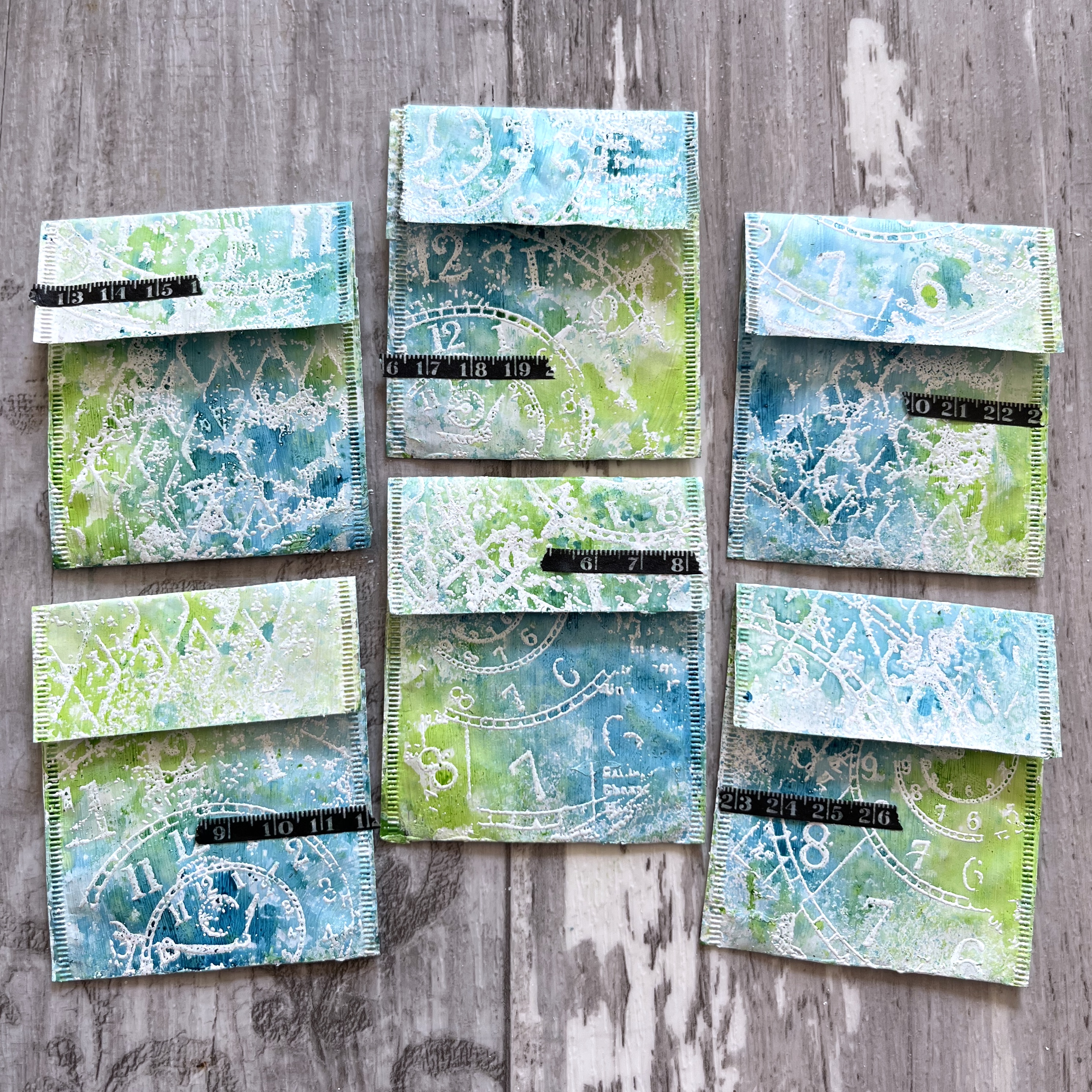
In some ways I stayed very much in my current comfort zone.  I've been really enjoying altering these teabag sachets lately, and I figured if I stayed small, I should be able to find at least a little bit of brightness and cheeriness!  

Recycling too... and that's definitely something to be cheerful about.  I should just say that I'm generally pretty bright and cheerful myself - it's just not my usual crafting style!

Let's take a quick look at the process, and then there are plenty of close-ups later on in the post.  Here are the not-very-attractive naked sachets.  (I'm a coffee drinker apart from the occasional spiced chai, but Cestina of Small Worlds, is helpfully a drinker of many kinds of teas - she's on a Rooibos kick just now!)

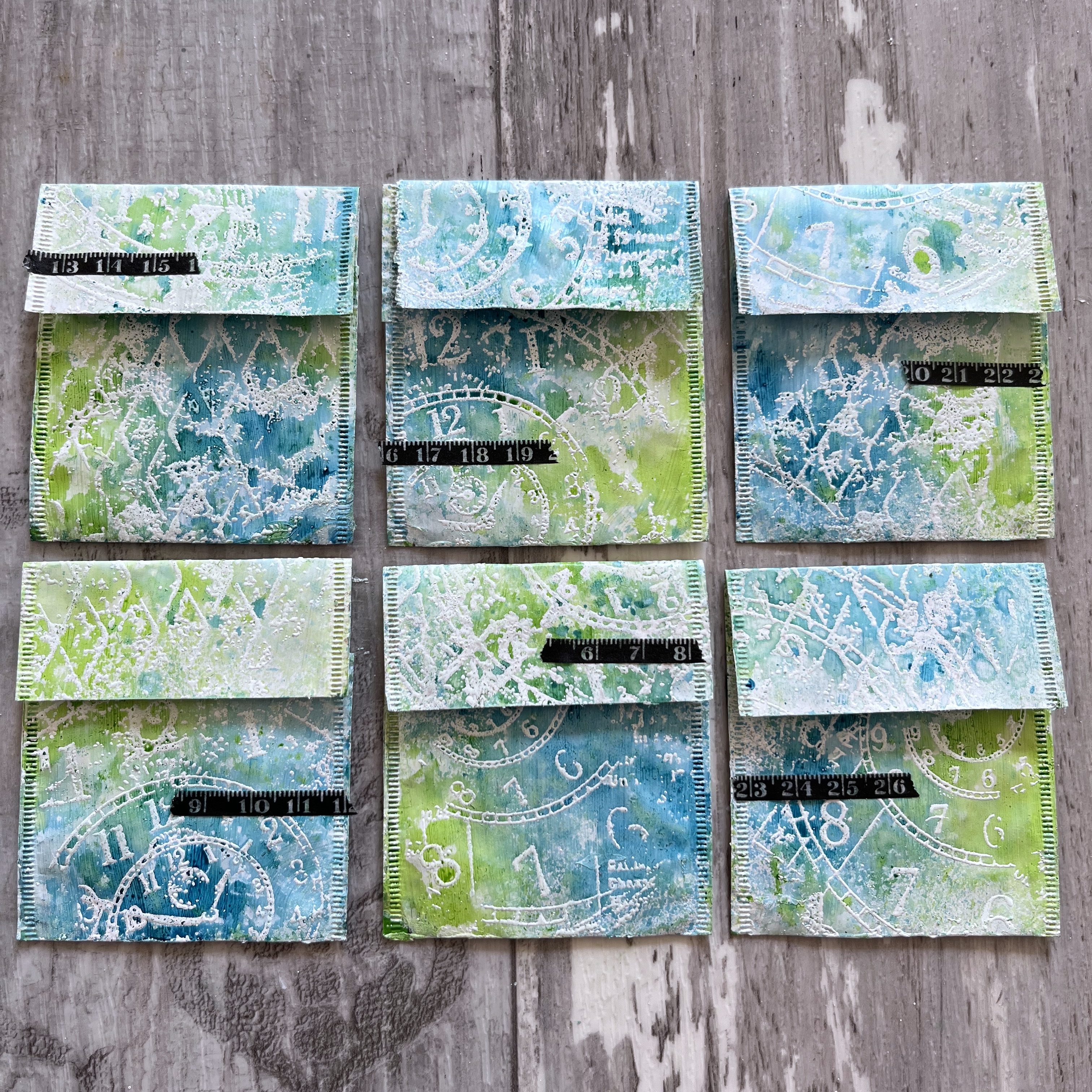
The first step is to give the sachets a rough coat of gesso to create a blank canvas.

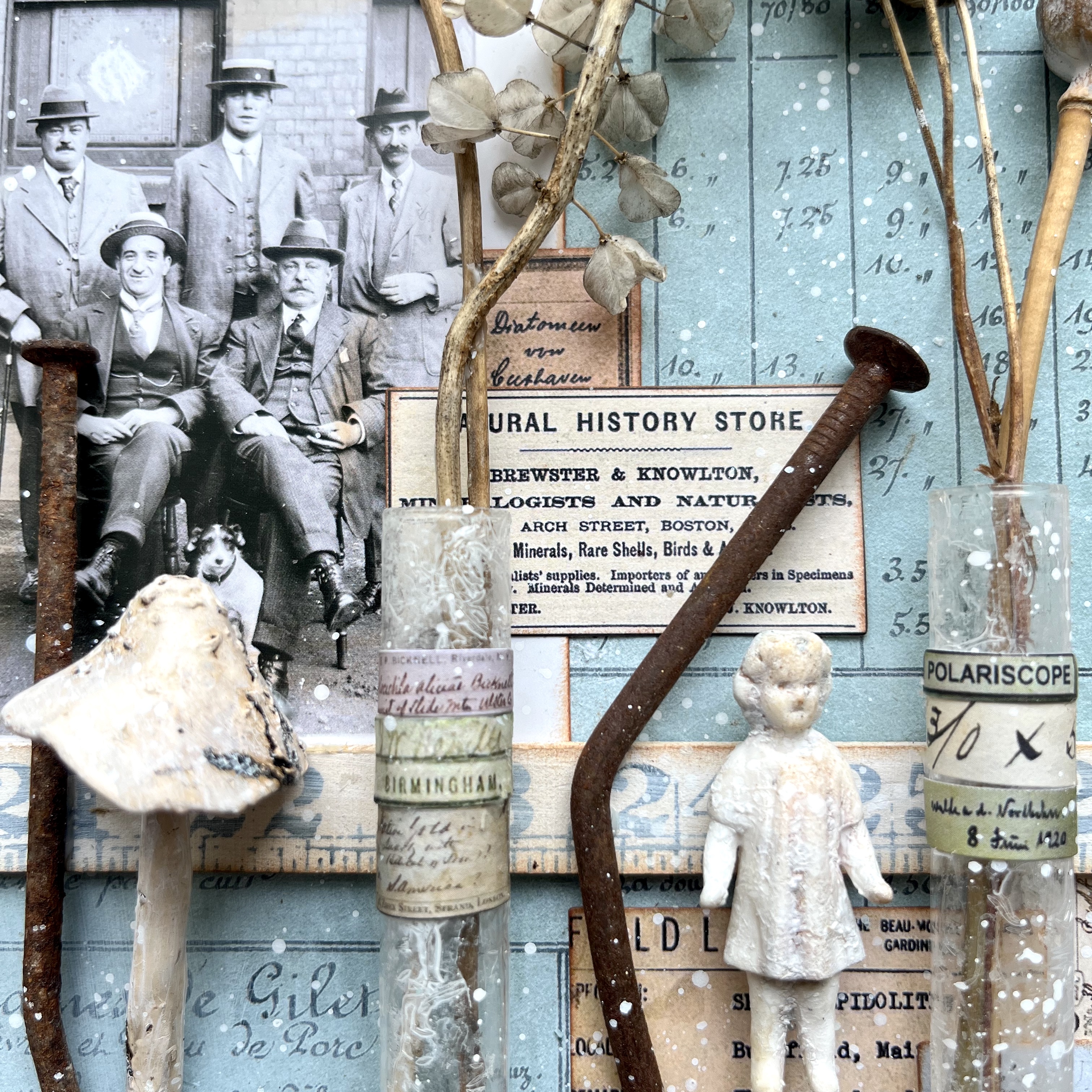
I then used Wow Bright White embossing powder to emboss a fabulous Katzelkraft collage stamp.  (It's not in stock in the Simon Says Stamp shop yet, but they have it on order - and they do have lots of other great Katzelkraft designs.)

You can't really see it from a distance at this point, but if you look a bit more closely you can see the spiralling clock face and distressed harlequins which are just a couple of elements within the stamp.

Next up are the Distress Spray Stains - Broken China and Twisted Citron.  Together, they create lots of interesting shades as they blend and flow, so I stuck to just these two (not sure what went on with the lighting here - the colours in the main photos above are much truer to life).

And now that amazing stamp comes into its own, of course...

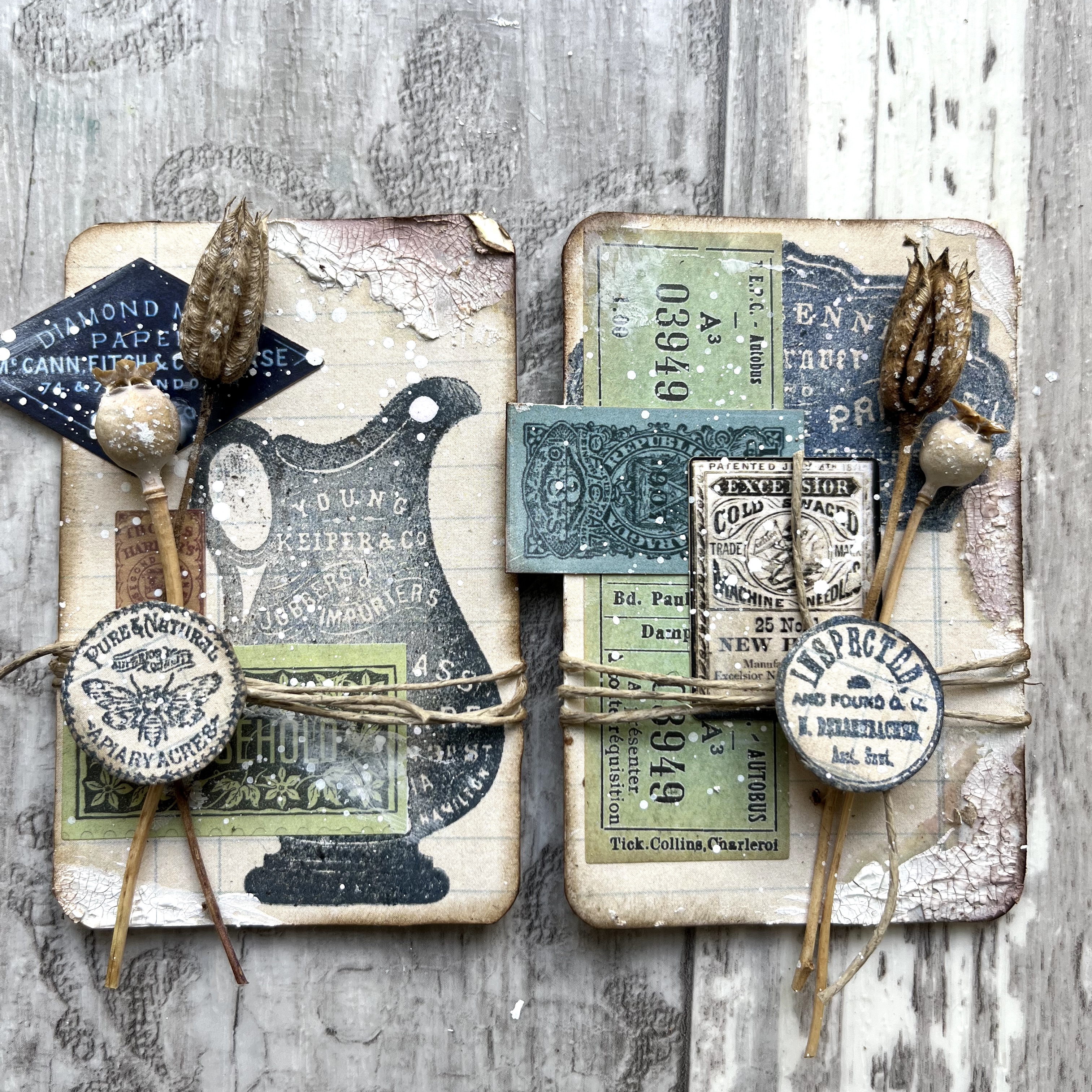
Then it's time for one of my favourite parts... working out what's going to go on top of the backgrounds.  I've now folded the flaps back into place which gives me a squarer format to work with.

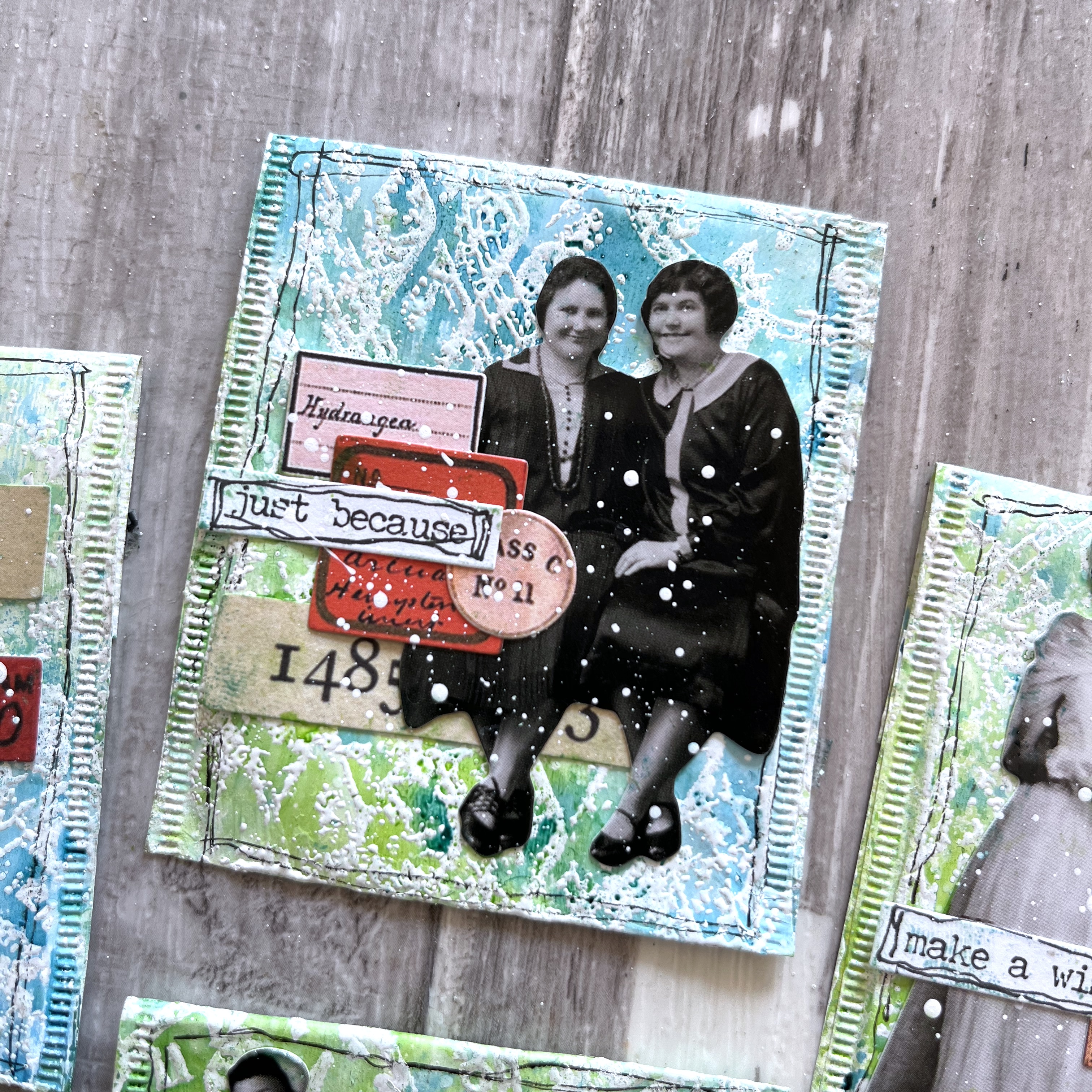
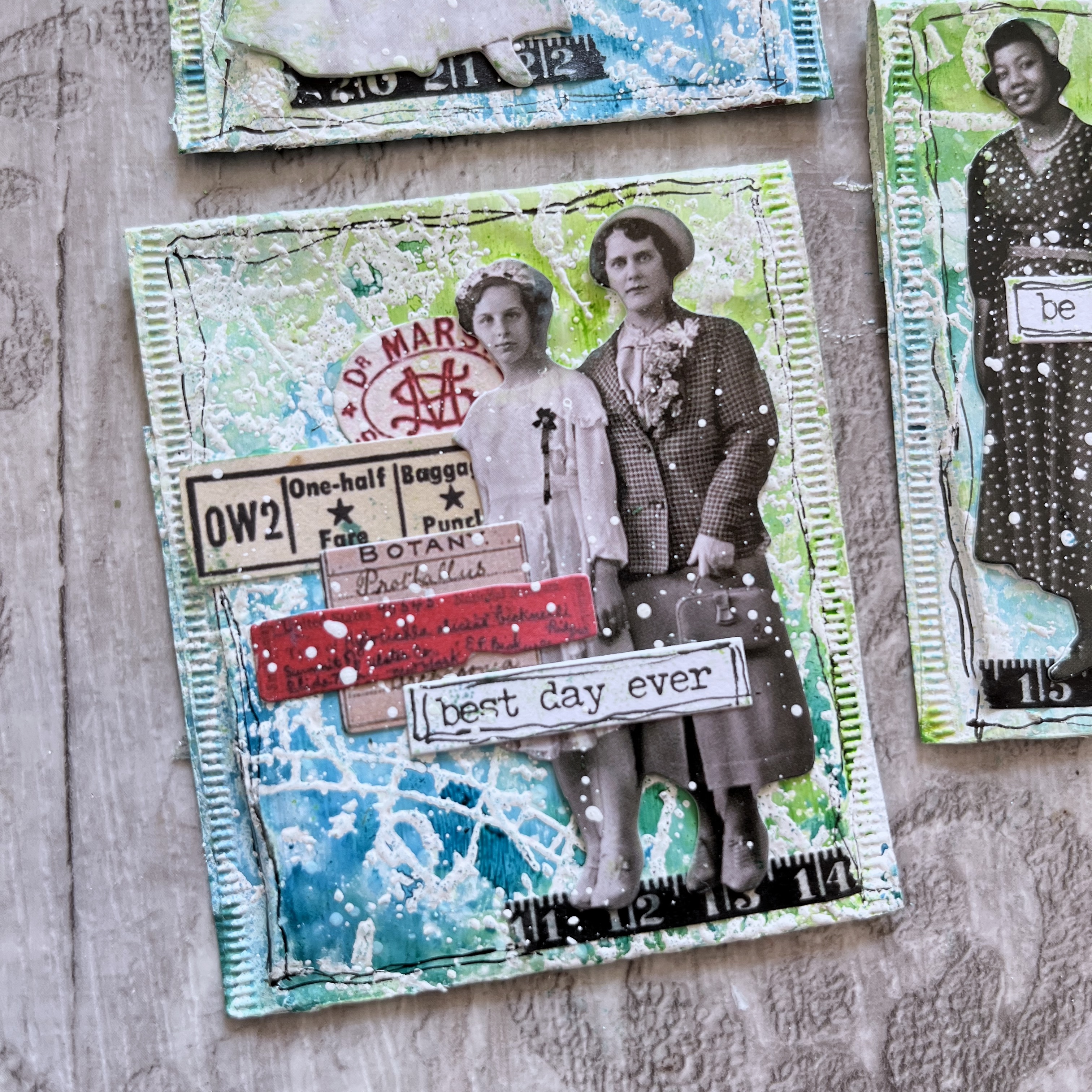
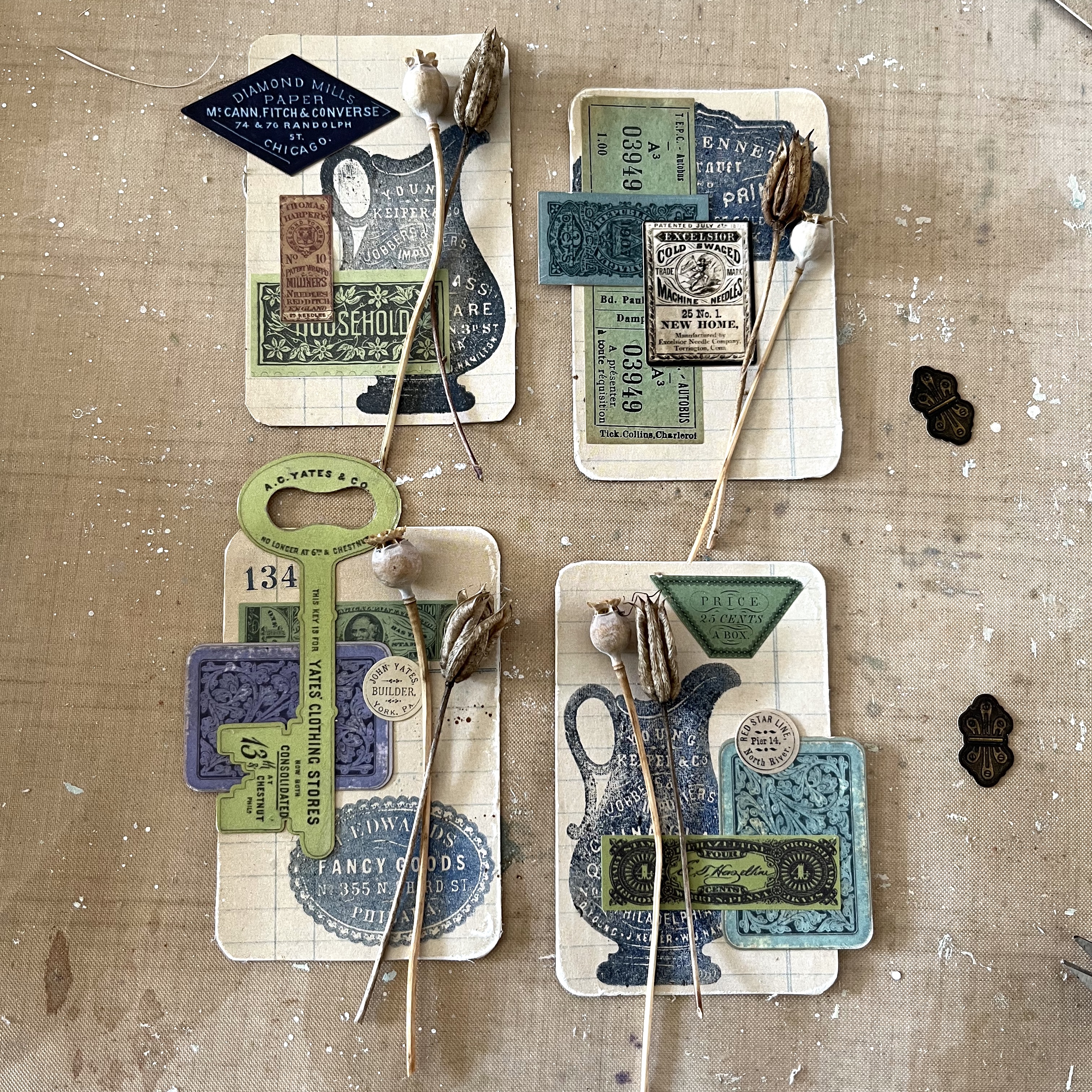
The teabag sachets are just the right size for the new Paper Dolls Minis... tiny versions of the Paper Dolls, perfect for ATCs, or other tiny crafting like teabag art.


There are old favourites here and new characters to fall in love with, and as always, I had a lovely time listening in to see who really wanted to be part of this teabag alteration.

And I'm deeply in love with the tiny Snippets Ephemera labels.  I picked out the brightest and most colourful ones I possibly could from the pack.  


For the most part, I tend to favour the neutral ones (big surprise!) so all these pink and red tones were still going begging.

I added strips of Design Tape Trim for the dolls to stand on if they needed it.  I also selected some Snippets Number Strips to add an extra element to each collage.

The final layer of the Small Chat stickers has a little bit of pen doodling around it, and I added some more to frame each sachet collage.  It draws the eye in nicely, I think.

I quite often work with bright blues and greens, but the real hop out of kin here is for me to add red/pink.  It's really not a colour you see around here very much, unless I've been painting some berries or some roses.

Over on the reverse, I kept it simple to let that white-embossed stamping and the vivid Distress Sprays continue to take centre stage.

There's just a tiny bit of Trim to add a dark contrast to those bright colours and glossy white embossing.  I think it really adds visual interest, as does the movement and dimension of the flap of the sachet envelope.  There's nothing inside these yet, but I can think of lots of ephemera, gift voucher or cash surprises which could slot right in... 

And that's it! I hope that's given you some inspiration to go and create something Bright and Cheerful for yourselves.  

If you need a bit more of a nudge, you'll find glorious inspiration aplenty from the Design Team over at the Simon Says Stamp Monday Challenge.

Do come and join in.  As always, there's a $25 gift certificate, generously sponsored by Simon Says Stamp...

... so you could get to go shopping for supplies - always a bright idea; or you might get picked by the team to go in the Spotlight which is guaranteed to make you cheerful.

Have a great week everyone, and even a bright and cheerful one!  Happy crafting, all.

Bright reds - scarlet, pillar-box red, crimson or cherry - are very cheerful and youthful. There is certainly a red for everyone.
Christian Dior

If more of us valued cheer and song above hoarded gold, it would be a merrier world.
J.R.R. Tolkien

Saturday, 4 June 2022

Flea Market Finds

Hello all!  I'm delighted to be here to share some altered playing cards, created with the help of the gorgeous new Flea Market Finds collection by Cathe Holden for Spellbinders.  They approached me to see if I would be willing to create something with the new products and, when I saw them, I very quickly said, "Yes, please!".

So here is my quartet of playing cards - showcasing some of the papers, stamps, stickers and printed die-cuts available.  You can find links to the products throughout the post if you'd like to get a closer look at them.  (And - full disclosure - if you buy anything after clicking through from those links, I will earn a small commission - it won't cost you anything extra though!)

Flea Market Finds is the perfect name for the collection.  There are vintage advertisements and posters and cigarette cards, stamps and seals, decorative packaging, shipping labels and lots more, all gathered together and full of nostalgic Americana vibes - think Little House on the Prairie or The Waltons.

(In fact, I know already that some of this ephemera will be making its way into my next project at the dollshouse museum, Small Worlds, if I ever get round to it... it's going to be a store called Brimble's Mercantile which I'm basing on Ike Godsey's General Store in The Waltons - though I'll probably set it in a slightly more prosperous era than the depressed 1930s as it was on the show!).

Anyway, back to the playing card quartet!  I started by covering them with a vintage ledger design from the Neutrals Palette Sampler paper pad.


I stamped some of the glorious Antique Adverts stamps, tapping a combination of Archival Night and Ground Espresso onto the stamps to give some colour variation as well as a vintage look. 


I'm in love with that jug (pitcher, I suppose would be the correct terminology!) - that's why it turns up twice.


And then, without too much thought, I grabbed a few stickers from the Etiquettes sticker pad to start the collaging.  I've never really been much of a one for stickers, but these could convert me.


From there, I added in some printed die-cuts, from both the Home Arts Miscellany and the Happy Thought Miscellany... and some of my much-loved poppy and aquilegia seedheads.  Aquilegia is also known both as Granny's Bonnet and as Columbine, which seemed to work well with the nostalgic vintage Americana vibe.


Then I let loose with some crackle paste roughly applied in fairly random spots...


... some white spatter...


... and some gentle inking around the edges.


And where would I be without my fine twine?!


They didn't feel quite finished, and then I had a brainwave.  I used the Circle Label Icons stamps stamped onto the offcuts of the original ledger paper to create individual buttons to top the twine-tied flower bundles.  


That seemed to do the trick - just the right touch of added dimension to give them depth and detail.


So there you have it... some vintage Americana collaging with this lovely new ephemera and paper collection by Cathe Holden.  


I enjoy haunting flea markets, but I can't get to the American ones very easily (!) - so it's wonderful to have another way to get to play with these charming vintage adverts and images.


I'm sure I'll be back with some more Flea Market Finds soon... do head over to Spellbinders to take a look at the full collection - there are so many lovely things to play with.  

For now, I'll wish you a wonderful weekend and happy crafting all!

For as long as we could remember, Ike Godsey's general merchandise store had been the social center of our community. Friendships were forged over loaves of bread, the place was a clearing-house for news, rumor and often as not, gossip. Adventure in those days was having a nickel to spend and time to gaze into the candy counter for as long as we liked before making a selection.
From The Waltons TV series 7, episode 18, written by E.F. Wallengren

With those final buttons floating Up In The Air above the rest of the collage, I'd like to enter this as an out-of-left-field response to that challenge theme at the Simon Says Stamp Monday Challenge this week.