I'm travelling into a new way of working, a new country, a new language, and a new hobby which I'm passionate about. Come with me for some of the journey...

Saturday, 6 May 2017

We're in the money!


Hello all!  Thank you so much for the lovely comments on my Eileen Hull Nature Journal.

I'm sorry I'm not managing many return visits at the moment... not only am I in the throes of packing for another stint away from home (travelling today, in fact) but my computer keyboard is having severe migraines, so I'm having to limit my time working on it.

Happily, I persuaded it to cooperate for long enough to write this post and schedule it.

You'll only understand today's title if you look very closely...

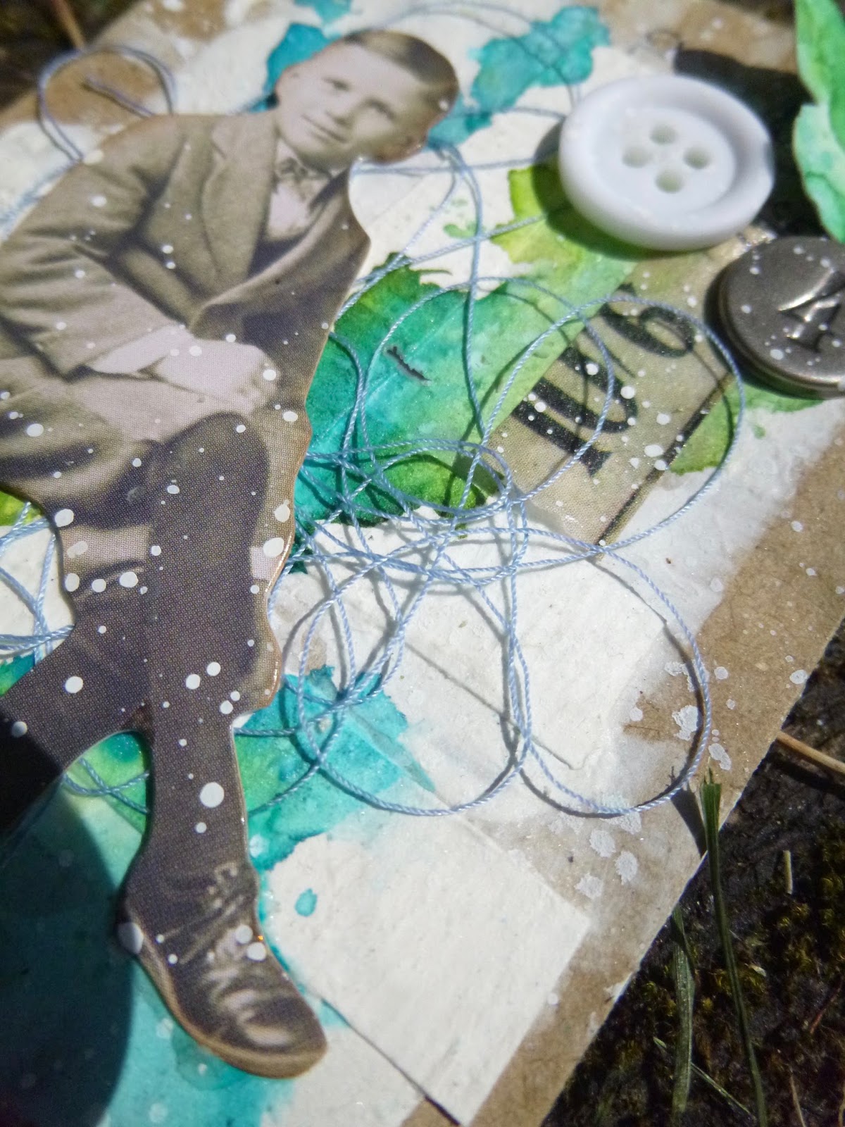
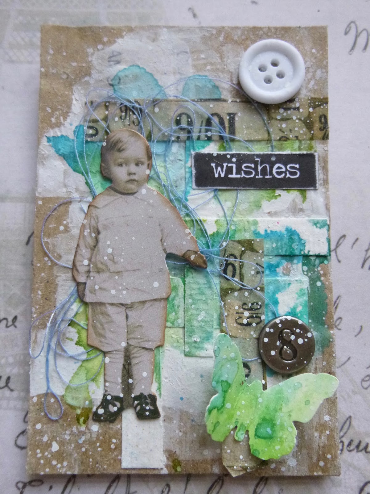
Underneath all those layers are some extremely mundane money envelopes - a pack of 250 bought for £1 in a Pound Shop at some point in the dim and distant past.  Nothing much to look at initially, but oh, how I enjoyed altering them.


I'm sharing both of these photos of the complete set as I've been flicking back and forth between them, unable to decide which I prefer, for long enough now, and there's still packing to be done, so you can decide for yourselves.

We've shifted from my actual dolls (see them at Pastime With Good Company) to Tim Holtz's new Paper Dolls... there's considerably less time and stress involved with these dolls!

I'm always inspired by the fantastic sets of ATCs created by Maj at m-1309, and these almost-ATC-sized money envelopes (they're actually 4 x 2 and 5/8) arose out of many happy visits to her blog, though they're not specifically based on any one ATC set of hers.


I've just been to take a quick photo of some of the unaltered envelopes, so that you can see the humble beginnings...


I think it's probably around a year since I created the backgrounds - paper scraps, gesso and Ecoline inks dotted on and spritzed with water.

Whatever I had in mind at the time didn't quite come together (I can't remember what or why), so they sat around near the craft table and waited patiently for me to come back and play with them.


When Tim Holtz's Paper Dolls and new Design Tapes turned up, I thought they'd be the perfect addition.


The little strips of Design Tape add lovely detail without being too in-your-face.


I had a joyous time selecting my characters and adding the simple extra layers of embellishments.

It took a while to sort through the hundreds of dolls to find the ones I wanted at matching sizes.
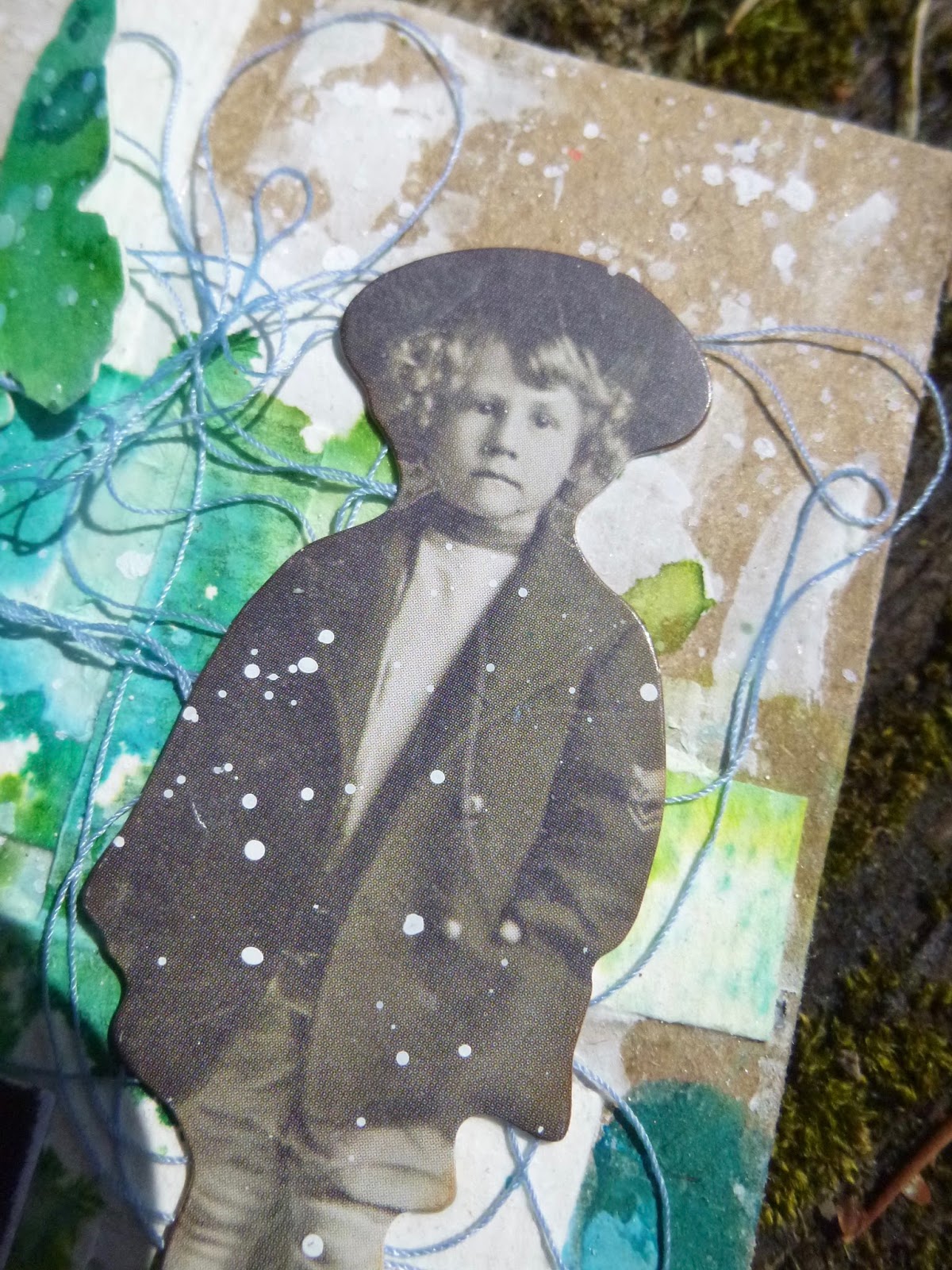


Almost all of the images in the pack of Paper Dolls are there in multiple sizes, so you can pick just the right dimensions to suit your project.

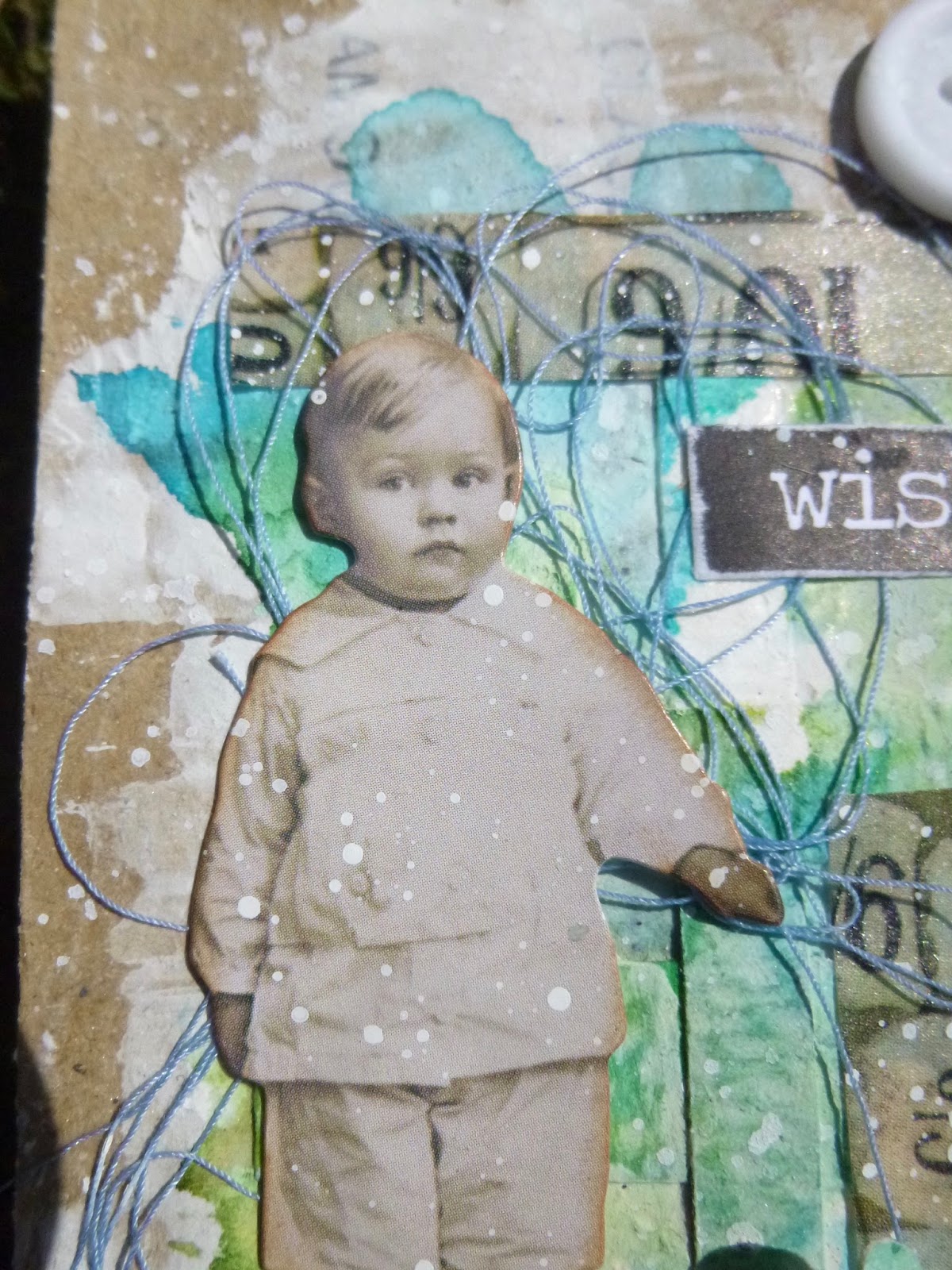
I love the selection of children I've ended up with, so full of character...


... the serious expressions of some of them, even to the point of definite anxiety in the case of the little girl on the left...


... and then this confident chap, happy to look you straight in the eye from his comfortable perch.


I find that the characters tell you stories as you work with them...


... so that choosing the individual Big Chat word stickers to accompany each of them was pretty easy.


I just listened to what they were saying to me...


... and selected the word which seemed to correspond.


I used some bundled thread on each envelope (something Maj often does).  I have quite often done it myself in the past, and always enjoy the effect, but I seem to forget about it.


I've now put a roll of thread in the little box which sits the middle of the craft table right in front of me, and I've got another in the craft supplies ready to go in the suitcase.  Hopefully I'll remember to use it more often in future!
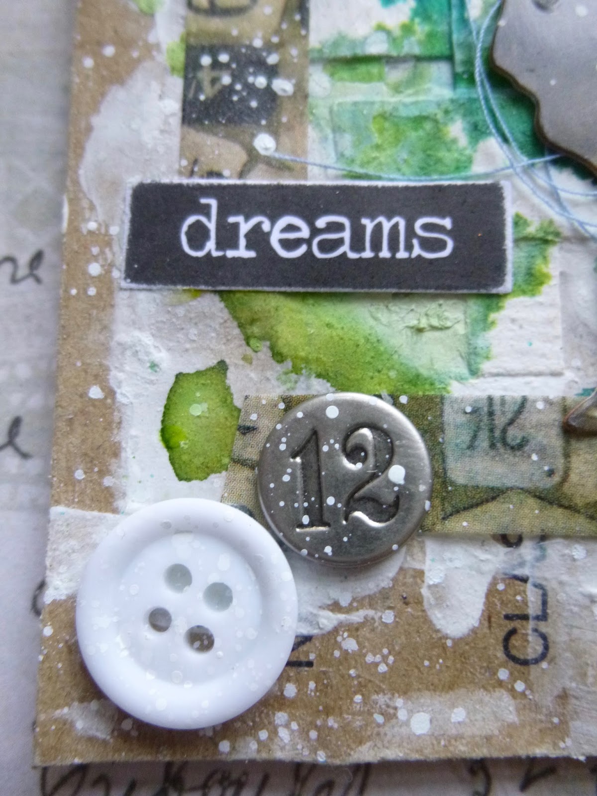


I kept the embellishments simple - a button and a number brad for each of them...


... and an inky butterfly each.


The butterflies were punched with Tim's large butterfly punch out of a wrinkle-free distress tag.


I used various Distress Inks, chosen to complement the Ecoline inks already in place from a year ago.


It's great fun varying the positioning, so that each one of the set is slightly differently arranged, but balanced in itself.


And it really doesn't take much more time to make four than it would to make one.

(It does require more photos though, in my world...)


I often work in series and sets with tags, but I can't remember doing it at this size before.

I can see this becoming addictive!


You have to look pretty closely now to see the printing from the money envelopes now, but I promise you it is still there.  (Quite why they won't sit all in a straight line is beyond me, but that's children for you.)


Thanks so much for stopping by today.  As soon as I've arrived, settled in and got stuck in to rehearsals in NYC, I hope to be round for some long-neglected visiting.

If you want to know what God thinks of money, just look at the people he gave it to.
Dorothy Parker

I'd like to play along at Frilly and Funkie where the challenge is to Put Your Inking Cap On - making anything without using designer paper.  Quite apart from anything else, that's my favourite challenge theme title ever!
This makes entry number three at Mixed Media World for their Anything Goes with an optional twist of Watercolour theme - and finally, third time lucky, there are Ecoline Watercolour Inks involved
And I hope they're bright enough for That's Crafty Challenges where the theme is Bright!

Monday, 1 May 2017

Nature Journal


Hello all!  I hope those of you in the UK are enjoying the Bank Holiday, despite the rather gloomy weather.  I'm delighted to be here today with a very exciting post.

You'll have seen projects using Eileen Hull's amazing new Journal die popping up here and there, and I'm so thrilled to have been invited by Eileen to create my own version to celebrate the release.

These journals will also be appearing soon in a special e-book, collecting together the inspirational projects from around the world.  Details for that will follow soon but, for now, here's my Nature Journal for you.


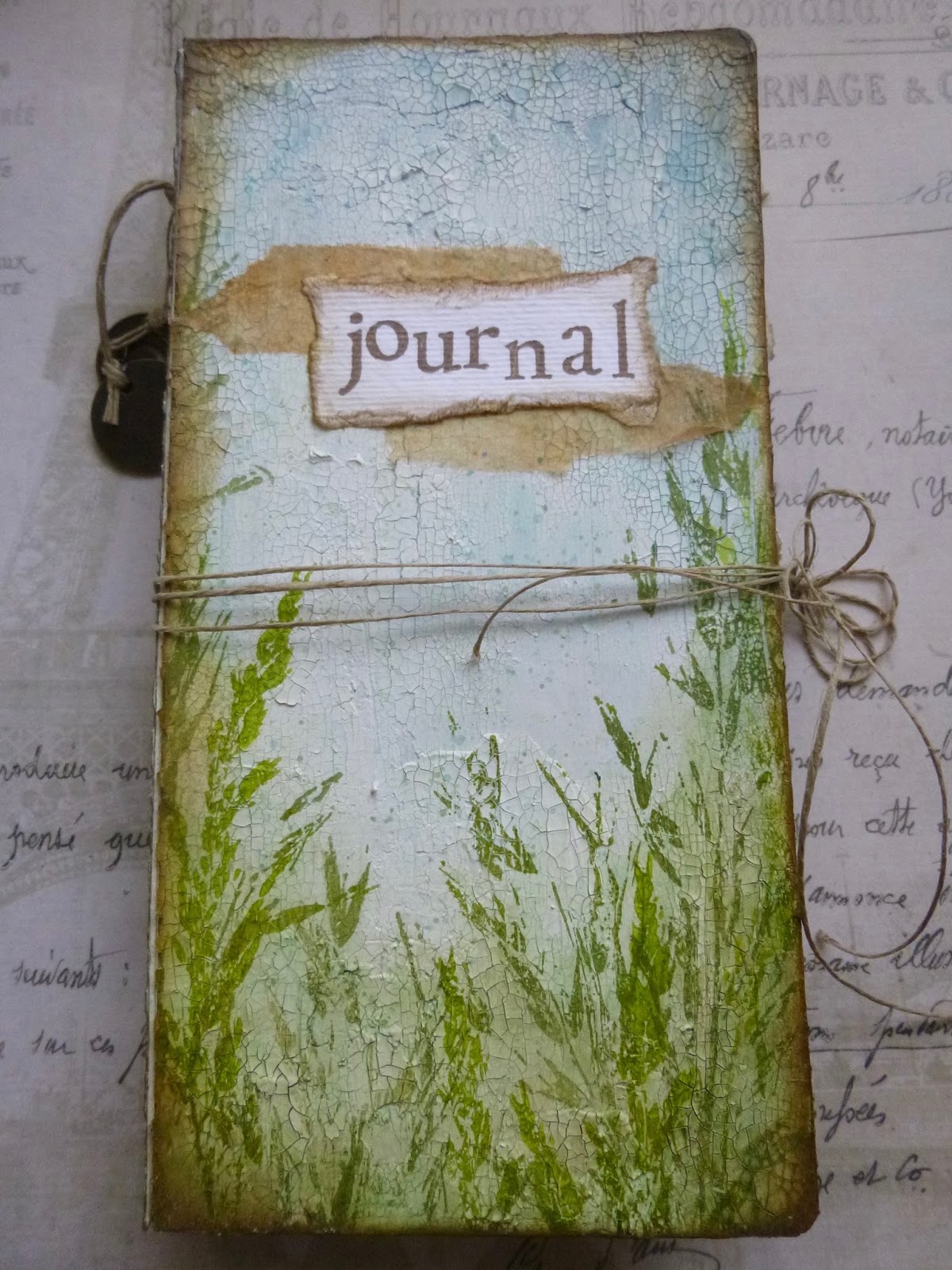
Regulars know I love my crackle and my wild meadow flowers and grasses, so that's what I went for with this journal.  It's for me, so why not have all my favourite things on it?!

The other thing which always appeals to me in a journal is gentle simplicity - to give room for the imagination to breathe.


On the inside, I've kept it simple too - a combination of watercolour paper (so that I can continue my new obsession), and some old music manuscript prepared for action with washes of gesso and white paint.


Eileen's die makes it so easy to make your journal be exactly what you want it to be, and as you will have seen around Craftyblogland, the possibilities are pretty much infinite.


I can't wait to play again and see what happens the next time around.  But for now, here are a few close-ups and some details on how I did what I did, and the products I used.


The base layer was DecoArt Chalky Finish Paint in Relic (dark grey) and Primitive (stone) - doesn't matter how it looks at this stage, it's all going to be covered!).


Over that I used the DecoArt Crackle Glaze formulated for their Chalk Paints with a coat of Everlasting (white) once it was dry.

I decided I wanted a really rustic crackle texture, so I added some of the DecoArt Media Crackle Paint with a palette knife in places as an extra layer.


To seal all that in, so that the crackle won't peel off, I gave it all a generous coat of the Ultra-Matte Varnish also by DecoArt.


From there, I added washes of Fresco Finish Chalk Paints and DecoArt Media Fluid Acrylics in lots of my favourite blues and greens.  (Blues down from the top, greens up from the bottom.)


I use them with lots of water, and also with a spritzer handy, and add layers and knock back until I'm happy with the look.

For many projects, I would do this with Distress Inks, but this journal is going to need to withstand some wear and tear, so the paint is a better alternative.


Then I let loose with the glorious meadow grasses by Lin Brown for PaperArtsy.  


I used the stems from ELB30 and 33, and layered them up in Olive and Leaf Archival inks, creating height at the edges.


You may be able to see that I've also done some light spatter with some of the leftover blue/greens from the craft mat.


I was slightly concerned about what might happen when I cracked those creases back into action, but the break was easy and clean, and I love the effect of the cracked edges.


After I'd inked around the corners and along the edges with Archival ink, I made sure they got an extra helping of Ultra-Matte Varnish to be sure they'll be nice and sturdy.

So far, it's been to the Czech Republic and back with me, and it still looks as good as new.  Next stop, New York.


For the inside covers, I used some design papers by 7 Dots Studio.  The line is called Nature Walk (which seemed appropriate for my Nature Journal).


And the signatures are formed of papers which I hope will inspire me to play...

Plenty of watercolour paper, torn along the edges for a nice distressed look...


... alternating with the white-washed music manuscript pages torn from an old, unwanted music book.


I love how the page edges look all together.  Simple things please me!


The signatures are held in place with fine twine, threaded through Eileen's cleverly constructed spine.


I made a feature of the binding on the spine, adding a couple of Idea-ology pieces to an extra piece of the twine and tying it around the strings at the back.


And the same fine twine acts as a fastening - tied in a simple bow.  It looks complicated to untie and retie, but really isn't!


I used my Hero Arts alphabet to stamp the word Journal onto one of the leftover watercolour strips torn from the sheets used to make the pages inside.


It's layered up over some tea-bag fragments.  I love how these fragile bits of paper add some definition, while still allowing you to see the crackle and the stamping underneath.


And the back, of course, continues the gentle walk through the meadow...


So that's my Nature Journal - just the first of many journals which will appear, I'm thinking.

It's been amazing to get a chance to experiment with Eileen's design - it's going to be in such regular use when I get my own die back home to play with (it's waiting for me in the States at the moment).  


I'll be back with details of the e-book release as soon as we have them, and at that point I may even give you a sneak peek of some of the experimental works in progress which are now in the pages inside!  For now, you can catch up with some of the extraordinarily inspiring creations from around Craftyblogland over at Eileen's blog.  


Thanks so much for stopping by today, and if I can get my computer keyboard to behave, I hope to spend some time in Craftyblogland soon.

Nature's peace will flow into you as sunshine flows into trees. The winds will blow their own freshness into you, and the storms their energy, while cares will drop off like autumn leaves.
John Muir


I'd like to share this at the Simon Says Stamp Monday Challenge where the theme is The Great Outdoors
At Mixed Media World they are playing Anything Mixed Media Goes with a twist of watercolour
As always at Love To Create it's an Anything Creative/Mixed Media Goes
And at Mixed Media Monthly, as you can see, they would like us to Put A Stamp On It