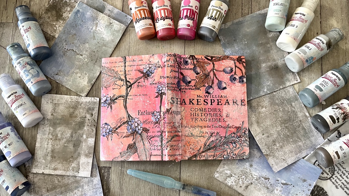
I'm travelling into a new way of working, a new country, a new language, and a new hobby which I'm passionate about. Come with me for some of the journey...

Wednesday, 22 May 2013

Under the boardwalk...


Hello all, and welcome to Words and Pictures on a busy and exciting day - there's so much going on over at Artistic Outpost!  Today sees the release of a brand new stamp set - and it's fabulous... like summer on a stamp plate!  

Here's a little taster of just some of what I've been up to with it... I've got several pieces to share with you and I'll spread them out over the next few days and weeks, but I thought I'd give you a quick glimpse of them all to whet your appetites.

So, without more ado, I give you: Boardwalk...


And if you hop round the rest of the team, you'll find so many amazingly inspirational makes.  Here's the list:


Here's what designer Robyn Phelan Sharp has to say about the new stamps:
For the love of the Jersey Shore and Atlantic City's historic boardwalk, this stamp collection features a lovely ATC sized collage featuring Steel Pier, bathing beauties, a handsome gentleman, and other summertime elements. 

Collection available in both unmounted sheets of red rubber or precut and mounted on EZMount clingfoam.


And to celebrate the (hoped-for) approach of summer, there's an amazing special offer on AO stamps at the moment: a Memorial Day sale with 15% off all Artistic Outpost stamp sets until June 8th - temptation, or what?!


So, I had to decide which project to share with you to start with, and I decided to go with one of my recent obsessions...


With the number of tiny floors I've been making recently, it was obvious to me from the get-go that I would have to make a "boardwalk"!


So I grabbed a fistful of coffee stirrers from the Costa Coffee on the boat on the way home, and here they are transformed into a weatherbeaten boardwalk in Atlantic City!


The Alterations cabinet card dies sliced through my cream mountboard with no problem at all, and I dabbed the resulting frame and background into some Salty Ocean, Tumbled Glass and Broken China inks daubed onto my craft mat.

There's Frayed Burlap around the edges to add a touch of vintage ageing to the overall look.


The gorgeous background image of the Steel Pier building has also had a little shading with Frayed Burlap Distress Stain, just to deepen the brickwork.  

And I surrounded it with random stampings of some of the seashells.


The coffee stirrers were painted with Broken China and Picket Fence Distress Paints mixed in varying proportions to get variegated "wear and tear" across my boards.


I didn't want too neat a finish along the edge, so I cut them to varying lengths, but always with the same angle to the cut, so that they would line up nicely against the back board.


I stamped the word Boardwalk beneath my boardwalk - just in case it wasn't obvious! 


And the line from the song got pride of place at the top of the frame.  

By the way, it's pretty inevitable that you will be singing the song the entire time you're working with these stamps... just as well it's brilliant!


I coloured the two New Jersey badges with Distress Markers before UTEEing them.  

While the UTEE was still slightly warm I brushed some Pewter Distress Stain over them to try to get a bit of a look of a vintage tintype button.


I stamped a couple of Pier tickets and attached them with one of the adorable Idea-ology paper clips.


The 3D seashell embellishments were a fantastically lucky addition to my stash recently... 


I won a giveaway of "doodads" from the amazing mixed-media artist Cat Kerr (she has another Giveaway right now, but only until 24th May, so hurry!), and these seashells were amongst the doodads that arrived - how fortuitous is that?!  

They couldn't have been more perfect for this new release - and they match the seashell stamps brilliantly!


I pressed the seashell stamps into service again to decorate my padded supports between the frames.  

As I've done before, I used the sponges which come in the packet when you buy Texture Fade embossing folders.


I sliced them to size and then stamped the shells in Cobalt Archival, so that even if you do catch sight of them within the three-dimensional frame, you've still got something nice to look at!


So that's my first encounter with the Boardwalk stamps.  You'll find lots of amazing work from my amazing team-mates on your way round.  

If you get lost, you can find all the details here at Artistic Outpost.  And don't forget that fantastic 15% off offer... until June 8th!  

For now, thank you so much for stopping by today... I hope the summer is finally starting for you (if you're in the correct hemisphere for that of course!), and happy crafting whether it has or hasn't turned up!


Oh, when the sun beats down and burns the tar up on the roof
And your shoes get so hot, you wish your tired feet were fireproof
Under the boardwalk, down by the sea
On a blanket with my baby is where I'll be
Under the Boardwalk by Kenny Young and Arthur Resnick


Tuesday, 21 May 2013

Just a little recycling...

Hello all, and a warm welcome to Words and Pictures.  It's the start of a new challenge over at Fun With ATCs, and we'd like to see some Recycling on your tiny creations - ATCs of 2.5 x 3.5 inches, please, and no more!

There's lots of inspiration from my brilliant team-mates, so I hope you'll have time to hop over and check it all out... but here's my starter for ten.


BIG surprise, I chose to use some corrugated cardboard for my make!  

But not only is the background made of it, but the butterfly is made out of the paper that I peeled off it, and the flowers are stencilled onto the same stuff, so it's a double use of the materials!

The beautiful flower stencil is one of Ellie Knol's wonderful new designs for Magenta - there's a matching stamp too... well worth a look.  

The cardboard was salvaged from a crafty package (yes, one of many!).


Having ripped the paper layer off and set it to one side, I gave the card a rough and random coat of gesso, and then did a bit of stamping right on the ridges using the gorgeous script from the Tim Holtz Apothecary set.  I also added Walnut Stain and Vintage Photo distress inks for definition.


The butterfly is cut using the Movers and Shapers die, and also given the gesso and stamping treatment, before being stapled with one of the tiny attachers.


I used gesso with Ellie's template too, stencilling it on to the ripped-off paper.  The gesso gives a lovely texture to the image.  Then I sprinkled a very light dusting of Vintage Photo distress embossing powder across it, for a rusty look.  

The edges of the cardboard paper have been inked to show off the torn texture, and I stamped and then doodled over the words "new life" - a butterfly out of a caterpillar, an ATC out of an old cardboard box.

We'd love to see what old things you'll give fresh life to, so do come and play at Recycling with us... see you there!


(How short was that post?!  For me, I mean, at least...  I hope maybe that means you might have time to pop over and visit my Artistic Outpost offering today - sneak peek to the right, here - it would be lovely to "see you there" too!)

For now, happy crafting, and I hope to catch up with some of my visiting over the next couple of days... 

We are not to throw away those things which can benefit our neighbor. Goods are called good because they can be used for good: they are instruments for good, in the hands of those who use them properly.
Clement of Alexandria

Use it up, wear it out, make it do, or do without. 
New England proverb


Sunday, 19 May 2013

Float like a butterfly


Hello all!  

This post is for me rather than all of you, I'm afraid!!  Many of you have already seen this project, which was my first piece as Guest Designer for The Artistic Stamper in February of this year, and I was so thrilled with all your amazing comments and feedback.

However, when you post your pieces you can only put a sneak peek on your own blog and since I use this place as a sort of virtual scrapbook of what I've made and how I did it (hence the massively long posts the whole time!), I asked if it would be okay to post the full thing on Words and Pictures at some point in the future.

And this is that day... so please don't feel you have to comment all over again!!  This is just so that I can get all my work "under one roof"...


Now my "crafty" name of Butterfly was pretty much an accident as anything else - I've never really been much of a lepidopterist, but having adopted the name, I do seem to be drawn to them, craftily at least, quite often.


I'd seen quite a few "specimen cabinet" projects on my travels, and when I decided to work with the amazing Insects and Butterflies plate that was sort of what I was thinking of trying.


But in the end, I couldn't bear to pin them down, and so I decided to try to find a way to let them fly free - why do we create these difficulties for ourselves?!?


It all started with a little floristry frame I bought in the Czech Republic.  I got three of them at the time, and last time I used one - for the Semi-Controlled Mayhem of my Big Top Circus - it gave me headaches, so I knew the chances were it would go that way again!


I experimented with stamping the butterflies and dragonflies and colouring them in various ways, but it wasn't really taking off for me, so I decided to try it the other way up and create my colours first.

I did lots of wrinkle free distress technique with a mixture of Distress Stains in blues, greens and turquoises.


I also added Cosmic Shimmer sprays and Glimmer Mists both to the craft mat and onto the paper as I was drying it so that I could create lots of iridescence within the colours.


Then I got busy stamping...  I used Archival inks, mainly in Cobalt, Olive and Library Green - either individually or blending them on the stamp...


...and occasionally I even zhuzhed it up a bit with some Aquamarine!


Then there was lots of fussy-cutting - absolutely NOT my favourite thing to do!  

Some of the images are virtually symmetrical, so those I was planning to glue back to back and colour any edges that were still showing.


But others were too asymmetrical for that.  I toyed with stamping on tissue and using the reverse, but in the end I decided to go for something more abstract.

I used my Viva metallic paints - one in Turquoise and one in Golden Green - to paint the backs of the asymmetrical insects.  These are some of the most beautiful iridescent paints I've ever seen!


I used the lovely Calligraphic Mat stamped in either Library Green or Cobalt Archival to provide some decoration across the gleaming paint.


Then it was UTEE time!  And this was where I had one of my accidental brainwaves.

As I was adding the UTEE - great for protecting vulnerable antennae, and adding beautiful glossiness, as well as having the effect of intensifying the colours - I realised that it made the wings mouldable.

So once everything was safely coated on both sides, I went through again, heating lightly and shaping the wings for flight.


Let's skip over the part where I tried all sorts of ways to string'em up - raffia, twine, gold wire - and go straight to the elegantly simple solution: ribbon.

Not only easier to thread onto than most of those others, but also they were all far more prepared to sit nice and perkily with just the folded ribbon holding them in flight... no need for knots beneath each insect, or glue.


Still fiddly - don't get me wrong! - to get them all threaded in the right order, the right way up, balancing the different insects and heights.  But eventually I was pretty happy...


Once the "flying" insects were sorted, I needed to have some perching ones, some who'd just alighted for a moment on top of the mobile.  


Cue lots of fun and swearing as I attempted to glue minute portions of glossy butterfly to a single twig within the frame at exactly the angle required.


And then a couple just balancing on the upright tower part at the centre... more angling, more bad words, and a bit of cheating by tucking bits of dragonfly into the weave of the twigs!


Thank you for sticking with me through one of my trademark lengthy posts.  I've tried to give you some idea of the journey and some idea of the finished piece... 

Of course the real joy lies in the movement as the butterflies and dragonflies flutter in the breeze.  (Not when you're trying to take photographs of it in a biting wind, though - it was February at the time!)  

Thank you for dropping in today... and indulging me in this little revisitation.  

I hope whatever you're up to today brings you joy, and I hope to do some catching up in Craftyblogland over the next few days.


Happiness is a butterfly, which when pursued, is always just beyond your grasp, but which, if you will sit down quietly, may alight upon you.
Nathaniel Hawthorne

Saturday, 18 May 2013

Wonder no more...


Hello all... I won't keep you long here at Words and Pictures today, but I am sending you on your way elsewhere!

Lots of you were curious about how the background for my Think and Wonder tag was created... well, wonder no more.

All is revealed over at eclectic Paperie today, so if you hop on over you'll find out how it was done.

Thanks so much for your continued company on this crafty journey.  Your amazing support is a constant source of strength, and hopping around Craftyblogland provides endless inspiration - what a wonderful place it is!


Wonder is the beginning of wisdom.
Socrates

He who can no longer pause to wonder and stand rapt in awe, is as good as dead; his eyes are closed.
Albert Einstein

Thursday, 16 May 2013

Simply Irresistible


Hello all, and a very warm welcome (though it's pretty chilly here, yet again)!


A new challenge starts today over at eclectic Paperie, and it's a really cool one!  Our host is Julie, who would like to see what we all get up to with Gel Medium.


It's such versatile stuff, and there's lots of different ways to get crafty with it - check out Julie's amazing technique here, along with all the challenge details and rules.


I decided to play one of my favourite games and create a resist for some inky loveliness.  Yes, I'm back with another tag!!


First of all, I gave the tag a coat of Picket Fence Distress Paint, so that the colour coming through the transparent resist would be paler than the straight manila of the tag.


Then I splodged some Golden Gel Medium (Soft Gloss) onto the craft mat, and used a sponge to apply it to my stamp... yup, you spotted it: the wonderful Unity hedgerow flowers, Delicate Flowers by Donna Downey.

After stamping, it was straight to the sink and plenty of nailbrush action to make sure I'd got all the medium off my precious stamp!


One of the lovely things about using the medium like this is that you get not only a glossy finish, but also a bit of dimension to your image.


I used Distress Stains and Inks to build up layers of colour onto the background.

The opaque Distress Paint underneath slightly alters how the colours "take", which I quite enjoy.


I used another Unity stamp, Christy Tomlinson's yummy SheArt Print Texture to add some, yes, texture to my inks.  Some stampings are done in Faded Jeans Distress Ink, some in Memento Teal Zeal, and some in Olive Archival.

I rolled it on and off pretty randomly...


The three sentiments are also Unity - Donna Downey again - and I stamped them in Olive Archival onto a sticky-back canvas ATC.


I cut round them and then used Faded Jeans to give the edges some definition


I love the texture of the canvas, and I also love that you can just peel off the back and stick it down - dead simple!


Well, it wouldn't be right not to top the thing off, and I went with one of my current favourite combinations: some dyed crinkle ribbon tied together with paper string.

I dyed the ribbons initially with Distress Stains, and then decided that they'd look better with a touch of the opaque shabby look that using Distress Paint gives them, so I added some Picket Fence DP to the mix.


So that's one pretty simple game to play with Gel Medium... I can't wait to see what creative games you all get up to with it!

There's a prize voucher for the eclectic Paperie store on offer, generously sponsored by the lovely Kim of eP - so get out your sticky thinking caps and show us what you've got!

For now, thank you so much for stopping by, and I'll see you soon - either here, or elsewhere in Craftyblogland!

Stand before the people you fear and speak your mind - even if your voice shakes.
Maggie Kuhn

Courage doesn't always roar. Sometimes courage is the quiet voice at the end of the day saying, "I will try again tomorrow".
Mary Anne Radmacher

It took me quite a long time to develop a voice, and now that I have it, I am not going to be silent.
Madeleine Albright


Click on the link to go straight to the product (I used Golden Gel Medium, which I think might be in stock quite soon - but either of the options here would also work):