I'm travelling into a new way of working, a new country, a new language, and a new hobby which I'm passionate about. Come with me for some of the journey...

Showing posts with label paper rolling. Show all posts

Friday, 30 November 2012

A Christmas Postcard

Hello all, and welcome to Words and Pictures.  It's Friday, and it's time for a new challenge over at Fussy and Fancy... and this fortnight it's I Love Christmas.  So, to fulfil my DT duties, I've finally had to abandon my "No Christmas Crafting Before December" policy... but only by a day (though obviously I had to make this a few days ago, in all honesty).

Here's the card I'd like to share with you, made with a Jumbo Size 10 tag as the base.


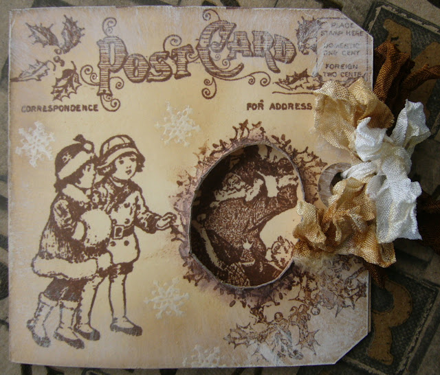
The stamps are nearly all by Graphic 45, except for the white embossed snowflakes which are from an Artistic Outpost set (which you'll be seeing a lot more of as December progresses...).

I love the vintage feel of the images, and they're lovely to stamp with.


I know Graphic 45 are best known for their papers, but the stamps (made by Hampton Art) are a real delight too.

I folded the tag in half, and used the postcard stamp both on the front and the back.  I did some distressing with Frayed Burlap DI, and also some brushes of gesso.


I stamped the two little girls (and the inside image, actually) and then had to leave the thing sitting there for a couple of days while I tried to work out what to do with the space in front of them!


Finally, light dawned - by a happy coincidence, Father Christmas was just behind that empty space so, by creating an aperture, I could have him as they thing they are looking at so eagerly!

I cut the hole and rolled the the edges, and used the holly stamp to create a border around it.


Inside you have the family dancing - or are they putting up decorations? - hard to tell!  In any case, they certainly look as though they love Christmas!

There are some more embossed snowflakes, the holly stamp again, and the distressing as on the outside of the card, but a little more gently applied.


I think the little girl is adorable!


I love the Glad Tidings greeting... and there's room, I hope, for some fairly neat signatures underneath.


The ribbons are dyed using Distress Inks, and tied so that you only have to undo the little white bow.  Once open, you then have one ribbon still on each side as you are looking at the card, and if you want, you could leave it open and add the white ribbon back on to one side or the other.

So that's my little vintage offering... Do visit Fussy and Fancy and have a look at the amazing work done by my Design Team colleagues - I'm sure you'll find lots of inspiration, and we really hope you'll be able to play along with us this fortnight.  Thanks so much for your visit, and see you again soon!

The best of all gifts around any Christmas tree:  the presence of a happy family all wrapped up in each other.
Burton Hillis

One of the most glorious messes in the world is the mess created in the living room on Christmas day.  Don't clean it up too quickly.
Andy Rooney

I'm entering this in the following:
At Sugar Creek Hollow they are playing a Vintage Christmas challenge
The Shabby Tea Room are looking for Just Neutrals - and my sentiment is on the inside
Hels Sheridan's Sunday Stampers are playing with Vintage this week
Simon Says Stamp are on an Anything Goes week
They would like to see Christmas cards in non-traditional colours over at Elke Kaart Een Feestje! (Every card a party!)

Friday, 31 August 2012

Back to school...

Hello everyone, I'm delighted to have your company here at Words and Pictures today.

I'm sharing a Guest Design project with you today for Fussy and Fancy and their Back to School challenge.  I'm afraid I'm one of those odd types who actually didn't mind going back to school (yes, I know - boo, hiss!)... I've always enjoyed learning new things, and being set new challenges.  And I know for sure many of you share that - look at us all here in Craftyblogland trying out new techniques and styles and equipment all the time.

So, perhaps my take on this challenge comes from a slightly offbeat position - made as a wall hanging to go by the front door, so that each day as you set off for school you're reminded that it really is completely worth your while.  And, being me, it's vintage and distressing all the way (and lots of photos, as there's lots going on!)...


The minute Fussy & Fancy let me know that the challenge was Back to School, my head went to these glorious images from Nicecrane Designs.  

This set is called A Child's Garden of Verses (taken from a version of Robert Louis Stevenson's collection of poetry for children illustrated by Jessie Willcox Smith).  Usually, I would take an actual stamp over a digi any day of the week, but for these I was prepared to make an exception!

I think they're completely adorable.  It's really worth a visit to the Nicecrane store and blog if you've never been, because there are so many amazing images to play with, and lots of inspiration.


I experimented with colouring them with Distress Markers, and I'll certainly hang on to the results for future projects, but it wasn't quite what I was after this time.  Then I thought I'd try printing them onto Kraft paper, and suddenly things started to fall into place.

I adore this one with the boy so completely absorbed in his reading - just as captivated and engrossed by that as an activity as he is by the adventure games, or the idling in conversation over the five-bar gate...


I used the Picket Fence Distress Marker to highlight certain parts of each image - trying to give the impression of the same boy moving from picture to picture, and then gave each of them a buffing with a blending tool full of Vintage Photo Distress Ink.  I'm really happy with the results.  I really like the golden brown of long lost summers...

As my first background layer, I used a sheet from the Graphic 45 ABC Primer collection in the 8x8 size.  I gave it a whitewash layer with Picket Fence Distress Stain to get that slightly shabby look, but I'm quite pleased that it also looks like a partially wiped blackboard behind the pictures, with plenty of chalkdust left on it.  It's got a bluish tinge in the photos, but I promise you it's not!


The quote is by George Washington Carver - not someone I really knew anything about (seems he's an American scientist 1864-1943), but I love the sentiment - and wholeheartedly agree with it.


The two really significant words get extra attention drawn to them by being backed onto some cream mesh ribbon.


The key seemed a perfect addition, not only in support of the words, but also with the whole golden vintage glow I was - by now - trying to create.  


The compass is there to help you decide your direction in life.  It's the Tim Holtz stamp on Kraft card, given a good coating of UTEE for the super glossy finish, and with a dull gold game spinner through the centre.


I then started building extra framing layers.  There's one on white paper, stamped with the Prima Almanac Script stamp, and inked with Vintage Photo.  

And over two corners of that, in the opposite corners from where the words are, I've added the lovely Memory Box corner die cut out of Paperartsy's wax paper (same thing as Kraft Glassine, as far as I can make out).

And then, for the base frame, I started ripping up one of my ex-stash-delivery-boxes (nothing useful ever thrown away round here) to try to get at the corrugated card inside.  

You have to peel away the top layer of paper/card over it - easier said than done! But in the end I quite liked the textured effect where some of the paper wouldn't quite come off.

I played around with gesso, white acrylic, Vintage Photo and Walnut Stain DIs, some Mushroom Color Wash spray and Perfect Pearls Mist in Heirloom Gold, ripping, distressing and rolling the edges as I went, until I had a weatherbeaten look which pleased me.


The banners are hand-cut from one of the other ABC Primer papers and inked... learn your letters as well as your numbers for an all-round education!


Thank you so much for stopping by today here at Words and Pictures - your support and comments mean so much to me.  Do pop over to Fussy and Fancy and see all the amazing projects from the Design Team there - there's lots of inspiration, and still plenty of time to join in with the challenge.

What we want is to see the child in pursuit of knowledge, and not knowledge in pursuit of the child.
George Bernard Shaw

The larger the island of knowledge, the longer the shoreline of wonder. 
Ralph W. Sockman

I'm entering this in the following:
Kraft Outlet's Make it Monday who are also playing Back to School this week
It's All About the Vintage have a lovely challenge called Summer Memories, for which this seems perfect
Simon Says Stamp are having an Anything Goes week
The Addicted to Stamps Challenge would like us to Recycle Something - I've used my packing boxes
Papertake Weekly who are having a Sketchie Free For All... I'm using Sketch #35


Tuesday, 21 August 2012

La Sylphide

Hi all, thank you so much for stopping by... and a big welcome to the new followers - thank you for joining the gang!

I'm sharing a new stamp today - very in love with it - it's from The Stampsmith.  Their main focus  is on photo-real images, so it's pretty new for me, and I'm still experimenting with the best surfaces and inks to get the best possible stamped image.  But my experiments have been hanging around on my desk, so inevitably I started to slide papers and ink colours towards them, gathering ideas around them ready for the first card/project... and here it is:


Isn't she gorgeous?!  Ballet was my first love, so I'll understand if not everyone goes head over heels in the same way I do whenever I look at her!  I originally stamped her in Coffee Archival, but she's had some Victorian Velvet blended over too, to get that wine coloured depth.  The Paper Distresser came into its own giving some dimensionality to the edges of the thickish cardstock.

I wanted a really romantic background for her, but also one drawing on nature, given I feel she's a wood or water nymph of some kind.  From very early on, the ink pads which came out to sit round her were Vintage Photo, Weathered Wood, Stormy Sky and Victorian Velvet, and eventually I decided to just sling'em all in there!

I created the first layer of background using Tim Holtz's wrinkle-free distress technique: swiping the inks in patchwork direct onto my craft sheet, spritzing with water, and then laying and tapping the paper into the pools of colour until I had an effect I liked.  I cut it to frame my Sylphide, and then used the TH Paper Distresser to give some life to the edges.


I did mean to take a picture before I stuck the whole thing together, but I forgot - sorry! - so you'll have to make do with peering around the sides of the dancer.  


Next, I added possibly my most used stamp of all - one of the branches from the Autumn Leaves set, Silhouette Blossoms.  It's just the right amount of thorny, so not too florally sweet.  I put both some Coffee Archival and some Victorian Velvet onto the stamp, and used it to add a framing element in all four corners of the background.

The second background layer is the Tattered Angels texture stamp from the Architectural set applied in Coffee Archival to some Kraft paper, inked with Vintage Photo and Victorian Velvet, and subjected to the Paper Distresser too!


The leftover background trimmings got pressed into service too, as I so liked it.  First I stamped the tiny manuscript music from the Pink Paislee London Market set on the back of what was left.  Then one strip was left quite broad to create a 'ribbon' of music under her feet.

The rest I cut into very thin strips to create some fine paper ribbons for the embellishment in the top left of the card.


I do like doing this, as it means you can really co-ordinate your ribbon to the project.  You may remember other examples from previous projects.  


I curled some inwards and some outwards, so you get some with music showing and some with the ink colours.


I used two long attachers to loop some natural twine around and tied it in a simple bow, running along the line of the music.

The whole thing is mounted on white card, with a very fine, delicate edging of Stormy Sky.


I'm very happy with this card - I think there's quite a lot of me in it.  The colours really please me; I adore the random element in creating one of these inky backgrounds; and, as I said, I think this stamp is really beautiful - down to the sheen on her satin pointe shoes!  

I hope you've enjoyed sharing it even half as much as I enjoyed making it!!  Thank you so much for dropping in - I so appreciate your company and hearing your feedback.

I'm entering this for the following:
The Stampsmith Challenge - it's an Anything Goes, as long as you use at least one Stampsmith stamp
Make Your Own Background over at the Anything Goes Challenge Blog
And since we're on an Anything Goes hatrick... this goes in as another No Rules entry at Simon Says Stamp and Show
That Craft Place are having a Vintage fortnight

Dance is the hidden language of the soul, of the body.
Martha Graham

We should consider every day lost on which we have not danced at least once.  And we should call every truth false which was not accompanied by at least one laugh.
Friedrich Nietzsche

Saturday, 18 August 2012

Parting is such sweet sorrow...

Hello again!  Hope you're all having a lovely August weekend - weather permitting!  Thank you so much for choosing to spend some of it here at Words and Pictures... it's great to have you stop by.

I've been having a glorious time distressing and ageing to create some leaving cards I'd been commissioned to make.  It was a slightly strange experience...  a colleague from the Royal Shakespeare Company (where I worked for nearly eight years until going freelance earlier this year) is now also leaving, and asked if I could make some farewell cards for her to distribute.  So I found myself making Farewell cards on someone else's behalf, for people I know very well, and with whom I'm just about to start working again, as I'm going back in as a freelancer at the beginning of September!!

In any case, you'll now understand the Shakespeare theme when you see the cards.  And my colleague had selected specific 'thank you' quotes for each person, so the cards vary slightly according to the play from which the quote is taken.  Take a look...


When I knew I'd be making several cards, I wanted to work with a technique I really enjoy!  I did enjoy getting a vintage patina and lustre onto the embossed background, but my absolute favourite thing to do at the moment is the ageing and distressing... I love using inks, the Tim Holtz Paper Distresser, rubbing, rolling, ripping, tearing and curling to give the papers an antique feel, and some dimensionality on the page...


Each card has the first page of the First Folio (my absolute desert island book) text for the relevant play for its quote, inked, ripped, rolled and so on to get some sense of the nearly 400 years which have passed since its publication (1623 for the curious amongst you...).


Then the quote itself is printed, grunged with a Tim Holtz texture stamp, inked, Paper Distressed on the edges, and finally rolled around my useful bit of wooden dowelling to get the wave effect, and the curly edges.

(I'm sharing mainly the Twelfth Night one here, but you'll get glimpses of some of the others.)


The background is medium weight Kraft cardstock, embossed with the Tim Holtz Patchwork embossing folder.  I then blended Vintage Photo, Walnut Stain and a bit of Black Soot onto it, and finally gave it a good spritz with the Heirloom Gold Perfect Pearls Mist, for a lovely lustrous finish.

The nib, of course, is there for the writer, and you'll see that I've used the Prima French Script stamp to provide a background on the cream card base.


I printed some tiny Williams to put in the little jewellery findings frames I got from the Bead Shop online, and filled them in with Glossy Accents... then attached them with a TH Idea-ology long attacher.

You can see in this photo that I've also taken the Paper Distresser to the edges of the embossed background layer to get that extra texture.


Just another little shot trying to really capture the movement in the quotes (this one the Henry VIII card).

You can also see below the inked mesh and ribbon added for texture and for some strong horizontal detailing, which I felt it needed to anchor all the higgledy-piggledy layout and distressing.


And finally a shot of the whole lot, awaiting delivery to their commissioner - who was, thankfully, very very happy with them.  I look forward to finding out how they went down with the recipients soon!

Thanks so much for spending some time here at Words and Pictures... it's great to have your company along the way in this crafty journey... and I look forward to meeting again here or elsewhere in Craftyblogland very soon!

I'm entering these in the following:
Favourite Technique (ageing/distressing) at Simon Says Stamp and Show
The Allsorts challenge to add something metal (nib and picture frame) with their Heavy Metal challenge

The remarkable thing about Shakespeare is that he is really very good - in spite of all the people who say he is very good.
Robert Graves

Wonderful women!  Have you ever thought how much we all, and women especially, owe to Shakespeare for his vindication of women in these fearless, high-spirited, resolute and intelligent heroines?
Dame Ellen Terry