I'm travelling into a new way of working, a new country, a new language, and a new hobby which I'm passionate about. Come with me for some of the journey...

Friday 29 November 2019

A journey of your own


Hello all and welcome to another round of Tag Friday over at A Vintage Journey.

It's that extra Friday in a challenge month when the Creative Guides get to play with tags, and you can share any tags you've been making this month with us in our Linky Party.

There's no other theme or requirement... just a tag.  And it doesn't matter when you made it, just any time in the last month.

Here's mine.  As you probably know, I've not been making much lately, so this was a good push to get me going again (hopefully!).


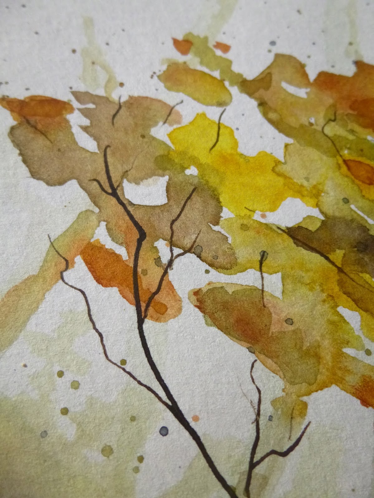
It's a mop-up tag I used to smoosh up the leftover inks when I was making the flowers and twilit sky for Sunrise, Sunset.

There's Wilted Violet, Seedless Preserves, Rusty Hinge, Vintage Photo and Gathered Twigs in the mix as well as tiny touches of Faded Jeans and Stormy Sky.


As I did with the wallflowers in my cottage book cover, I added some extra Stormy Sky for a touch of contrast, and stamped one of my favourite "weeds" from Rubber Dance's Weed Love set.

Then it was mostly a question of gathering up other leftovers - scraps and bits and bobs which have been lying around the craft table for far too long.


I put down several strips of design tape and tissue tape and scraped some DecoArt Crackle Paint across it.


Then over that I layered some scraps of lace which have been hovering around for a while, as well as some leftover handmade paper scraps which were also cluttering up the workspace.

The long strip is actually lace on its own sticky tape so you don't even need any glue.


I mounted the Photobooth photo on some scraps of card so that there would be room to wrap the rusty wire around behind her.  This girl has been hanging around on the desk for at least a few months.


She's left behind her "partner" - the two of them were originally going to feature together on a pair of tags a while ago before I changed direction with those tags.

(It was my Birthday Bubbles for Simon Says Stamp - there's even a picture in the post of the pair of them trying to claim their place before being discarded - so they've been waiting to be used since July, and now one of them will have to wait on alone!)


I find that I can make my peace with shades of pink as long as I've got some nice rust to go along with it (it's happened before!) so, as well as the Rusty Hinge and Vintage Photo inks, the rusty wire was definitely an important ingredient here.


The tiny autumn leaves also bring a welcome touch of earthy brown to the mix.


They're punched with a Tim Holtz punch, and have been putting in regular appearances this year on my autumn creations.


I think we may finally have come to the end of the punched leaves I can manage to squeeze out of the card I inked up at the beginning of October!


I picked up these lovely dewdrop embellishments as part of my lucky SSS prize win recently, and I'm so happy I chose them.


Regulars here know that I love to catch light in my creations whenever possible, and these do that in a wonderful way.


The brilliant Idea-ology Clippings stickers provide the words.


I've slightly snipped and amended them to suit my purposes... or rather the purposes of the girl in the photo.


I love the confident glow of expectation in her eyes, and I definitely wish her well on the journey ahead.


A little rustic twine finishes things off at the top of the tag - again a snippet which has been hanging around (but then there's always plenty of twine around!).


There's just a touch of the crackle still visible, but it does add a nice extra textural detail I think.


Quite a few of the vine tendrils have disappeared under the layers but what you can see makes me happy.


And the same applies to the smooshed ink around the collaging.  I never tire of ink splotches!


I hope you've enjoyed collecting leftovers with me.  I'm glad I managed to sit down and make something for the first time in two weeks... even if it is just a gathering up of what was already on the craft table!  (I don't count sticking down the pages of my Orchard Fruit art journalling, given it was all basically done before I got ill.)


Over at A Vintage Journey you can see what fun my fellow Creative Guides have been having with their tags, and there's a Linky for you to share any and all tags you've been making this month.  Come and join in the Tag Friday fun with us!

Thanks so much for stopping by and I'll see you again soon.

It's not leftovers that are wasteful, but those who either don't know what to do with them or can't be bothered.
Julian Baggini

I'd like to play along at the Funkie Junkie Boutique Blog where they are looking for Lovely Leaves
The challenge theme at the Simon Says Stamp Monday Challenge this week is Tape It Up - I promise there's tissue tape, design tape and lace tape buried under there somewhere!
In a happy piece of timing the challenge at Moo Mania & More this week is to Use Your Scraps
At the Bleeding Art Challenge as always Anything Mixed Media Goes

Saturday 23 November 2019

Orchard Fruit

Hello all!  I'm still a bit groggy from my cold, but getting there.  Sorry I've not been visiting much - I'm conserving my energy for recovery!  I'm here with some watercolour orchard trees today for the Fruits & Vegetables theme at Art Journal Journey.


Most of this page spread was done before I got ill, and it's been sitting on the craft table for two weeks waiting for me to have the energy to stick it all down.


The trees themselves were actually painted months ago - done with some of my Daniel Smith watercolours in an A4 watercolour sketch pad.


For these pages, I tore around them and inked the torn edges with Vintage Photo and Gathered Twigs to give a nice framing effect.


I think they look pretty good against the simple kraft pages of this 8x6 inch Paperchase journal.  (As a double spread it measures 12x8 inches.)


I love the soft patches of colour creating the foliage...


... layered and overlapping...


... and the intricate twining of the trunk, branches and twigs...


... done with dip pen and ink.

I'm also pretty pleased with the soft shadowy trees in the background, giving the scene a touch of depth.


The Art Journal Journey theme meant I needed some fruit to be hanging from the branches of my trees, so I used Fresco acrylic paints to add some green apples.


I applied the paint quite thickly to give them a bit of dimension.  But then I decided the green wasn't really doing it for me...


... so I gave all the apples a touch of Cherry Red/London Bus over the top.


And then on top of that each one got a blob of Glossy Accents to give them even more dimension and that glossy look of delicious ready-to-eat apples.


It also helps them stand out from the watercolour effects in the background...


... as well as fulfilling my favourite light-catching function.


The words are from my PaperArtsy EAB04 Autumn Edition.

They're stamped in Sepia Archival on one of the leftover scraps from the torn up watercolour page.


You'll have noticed in the green-apples-photo that I'd done some colourful splattering on the kraft background.  When I changed apple-colour I also decided I wasn't enjoying that, so I turned over a new leaf and tried again.


Now there's some watery brayering of Cloud 9 (a lovely soft white by PaperArtsy) as well as splatters and credit-card streaks of the same paint.


There are twisted tangles of thread and some of my much-loved ivory sequins.  Again, it's about catching the light I think - but in a nice subtle way.

And a trio of punched leaves cut with a Tim Holtz punch from some Distress Ink spattered cardstock add the final touch of autumnal colour.


I hope you like my watercolour trees and their glossy fruit, hanging low and ready to be picked.


I was a bit nervous about adding the apples, worried that I might just spoil my autumnal trees on the turn.


But I've ended up rather liking the effect.  And I do think it's quite a good way to give these trees something more to do, rather than having them tucked away in a sketch pad somewhere, never to see the light of day again!


Thanks so much for stopping by today.  I'm glad to have a bit more colour to share with you than for my previous watercolours Got the Grey-Blues!  I hope you're all having a lovely weekend, and I also hope to catch up with what you've been up to very soon.  Happy crafting, all!

...and so many orchards circled the village that on some crisp October afternoons the whole world smelled like pie.
Alice Hoffman

I'd like to share this at Art Journal Journey where Rike is looking for Fruits & Vegetables
At the Funkie Junkie Boutique Blog they are gathering up Lovely Leaves - since these trees are really all about the colours of the autumn foliage, I hope they will fit right in
I'd also like to join in with Week 38, Year 9 of the marvellous Paint Party Friday

Sunday 17 November 2019

Got the Grey-Blues

Hello all and sorry for the silence here at Words and Pictures.  I've been in the throes of a foul cold/cough/pharyngitis and generally feeling pretty sorry for myself.  I've not been anywhere near the craft table, but having found a little extra energy today I wanted to post something at least!  So here's a watercolour triptych I painted earlier this year.  They've definitely got something of the grey blue melancholy I've been experiencing this week. 


The paintings are done in a 12 x 16 inch watercolour sketch pad, taped with masking tape to create the three panels.  Each panel is 8 x 4 inches, so you get a nice white framing border. 


No surprise that we're in a meadow again.  I'm still experimenting and playing with capturing these grasses and wildflowers that I love.


With these three, I tried out the effect of adding some pen and ink work for extra fine detailing.


I like it in contrast to the softer watercolour effects, and how it helps create depth and focus, but I'll continue to work on the balance.


I'm not going to keep you long today.  To be honest, I'm still feeling pretty groggy but, as I say, I felt horrible about having neglected the blog for so long again.

In any case, I feel these need to be able to speak for themselves.  


At some point, hopefully quite soon, I'm aiming to make prints of these and some other paintings available for sale, either through Etsy or other means, and one day I might even come to terms with the idea of selling the originals!


I'm still exploring the best means and method of doing it, but if it's something you think you might be interested in, or if you've any experience with such things and advice, do let me know in the comments.  I'd be happy to hear your thoughts.


Looking at them now, I think probably you'd want the bluest one in the middle for display purposes.  The other two could go either way round...


I hope everyone is in better health than me, and enjoying a peaceful Sunday.  I hope I'll be up and around and ready for some proper crafting, blogging and visiting soon.  Happy crafting all!

A grey day provides the best light.
Leonardo da Vinci

The colour of truth is grey.
André Gide

I'd like to share this triptych at Paint Party Friday where they are on Week 37 of Year 9
At MOO Mania & More the theme is Peace and Tranquility so I think these will fit right in