I'm travelling into a new way of working, a new country, a new language, and a new hobby which I'm passionate about. Come with me for some of the journey...

Thursday 31 January 2019

Taking Flight

Hello all!  I'm here with a pair of tags today, just for fun - and with a jolt of colour to brighten up these chilly days.  It's still a combination of my favourite blues and browns, but really pushing into the rusty-orange end of the spectrum.  I think I got infected by the Rusty Alcohol tag!


I'll make no apology for reverting to my favourite imagery either - the meadow flowers, the birds taking flight - it's what I need at the moment.  And I'm taking permission from my recent art journalling spread to create what I need.


The background is a combination of Distress Inks and Oxides.  When you're smooshing inks on the craft mat, you might as well make two tags while you're at it.


There's some Faded Jeans involved up in the sky area...


... and some Rusty Hinge, Antique Linen and maybe Walnut Stain involved lower down.


I also used the Rusty Hinge DI to add some really intense spots of colour in places.  (Click on the photos to see them full size.)


I love how it really pops against the chalkier Oxide effects, and provides such contrast with the blue tones.


I stamped with a combination of inks mixed directly on the stamp - some Oxide, some Archival, some DI.  Darker toned Walnut Stain and Coffee take their place towards the foot of the stems, and brighter Rusty Hinge and Sepia at the tips.


I used clear embossing powder to give the delicate stems a little more presence against the busy background.


The birds are stamped in Jet Black Archival, and then there's some Wow Bark embossing powder over the top of that.


It gives them more substance, and also that fabulous gleam when the light catches them, so that there's almost a sense of movement in the wings as you move the tag in the light.


The words are from the Idea-ology Small Talk stickers, with just a sweep of Antique Linen DI over them to soften the whiteness of the lettering.


The original white font was sticking out too much and drawing the eye away from the mellow glow of the sunlit meadow, but the Antique Linen drops it back just the right amount.


Some fine twine tops off the tags, and I used my dip pen to add some walnut ink borders around the edges of the tags.

Rustic simplicity right to the end.


Thanks so much for dropping in today.  I hope you've enjoyed walking in this wintry meadow at dawn with me.  See you soon, and happy crafting in the meantime.

Once you have tasted flight, you will forever walk the earth with your eyes turned skyward, for there you have been, and there you will always long to return.
Leonarda da Vinci


At Country View Challenges there's a theme of Landscapes/Cityscapes

I'd like to play along at the Fashionable Stamping Challenges where Anything Goes

Anything Goes  at the Bleeding Art Challenge Blog too -  with four kinds of ink, paint spatter and lots of embossing powder, these should be mixed media enough

I'm also joining in at the Three Muses Challenge where the theme is Birds (thanks to Anne for the heads-up!)

Tuesday 29 January 2019

Encore Post - Merry Berries

Encore Posts
Projects which made their first appearances elsewhere for Design Team duties or Guest Designer opportunities, but which only had a sneak peek here, are being gathered together in the pages of my virtual scrapbook while I'm busy.
As always, the Encore Posts are formatted differently from the regular ones, so that you can easily spot them.  Please don't feel that you have to comment all over again!

I'm so happy you enjoyed the Rusty Alcohol tag as much as I did! I'm on another working jaunt at present so it's an Encore ATC today.  I thought, given the recent snowy weather (and maybe more today, I hear), it would be good to share it now, and also it's linked to the Snowflake ATC from last week.  Remember those two little birds?  Well, this is where they born.  This ATC was made for Destination Inspiration at A Vintage Journey back in December 2015, and here's what I wrote back then...
______________________________

Hello all, Alison here from Words and Pictures.  I hope you've all been enjoying a peaceful and prosperous festive season.  This is my favourite time, I think - the quiet period once the major work is done, and you have the 12 Days until 6th January to rest, read, recuperate and enjoy peace and candlelight.  Not too much rest though... there's always inspiration to play, and I've arrived at Terminal 4 of Destination Inspiration this week.

I've unpacked my travel bag to see what I could make with what's inside.  Here's a reminder of just what was in there:
Substrate - ATC
Colour - Festive Berries
Technique - Extreme Masking (Compendium of Curiosities I, p.61)
Product - Remnant Rubs

I have to confess I was panicking slightly at the notion of Festive Berries - those who know me will know that red is not a shade which appears very often round my way.  But once I'd come up with the notion that I could use the Festive Berries for actual festive berries, I felt a bit better!
So here's what arrived on the craft table.


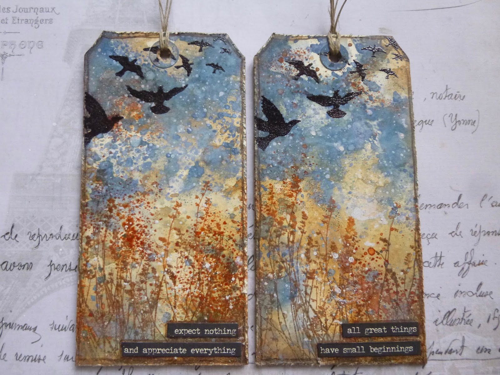
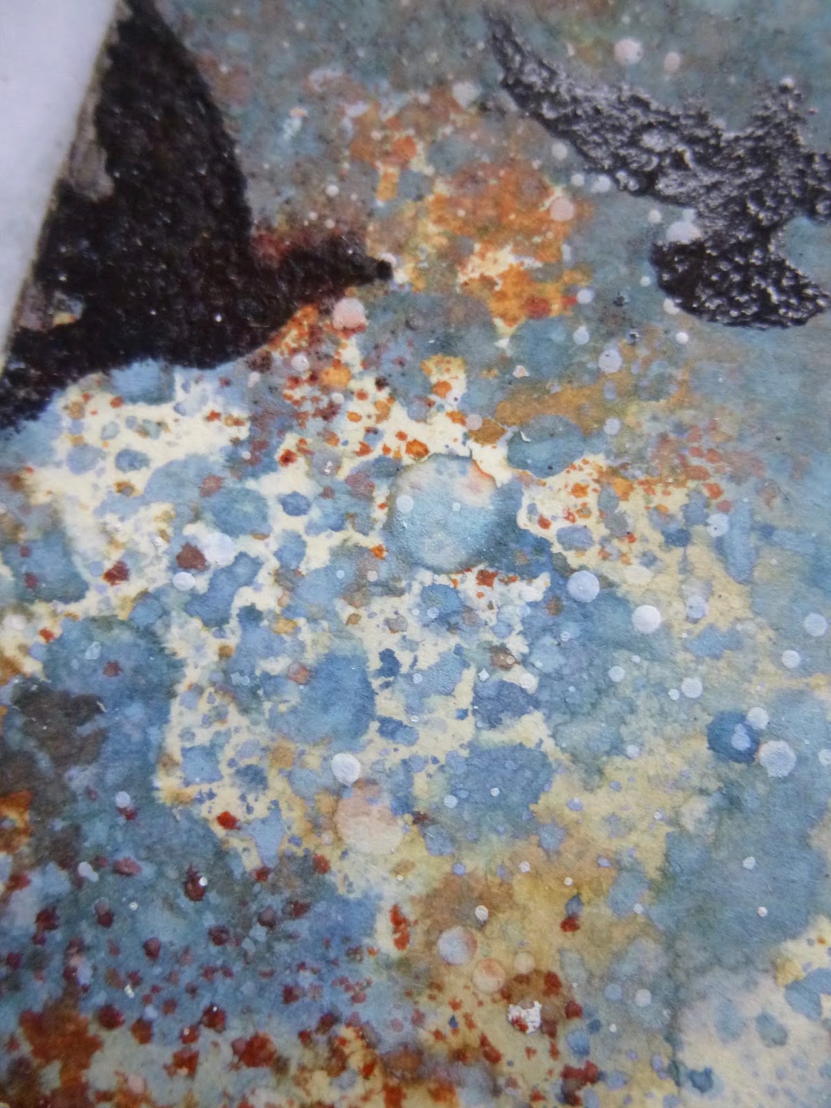
I love working with ATCs, and I suddenly had the brainwave of trying to work with one of Tim's punches as my mask.  I figured the little bird would be the right sort of size to work with for an ATC.


I punched a couple of them, so that they could have a little conversation.  It wasn't the easiest thing in the world holding them down to ink around them, but it was do-able.  It's Ground Espresso at the bottom, and the sky shades from Stormy Sky up to Chipped Sapphire at the top.  (I was working on a plain manila tag at this point, but always thinking of the size the ATC would end up.)


Same tricky process for the stamping - those birds are small and, because I'd punched them out of book pages (first thing to hand, not really thinking ahead), a little fragile too.  But not so fragile that I wasn't able to save the masks to use on another project (as those of you who've seen my Snowflake ATC will know!).


I stamped the starry snowflakes from Tim's Christmas Magic set in Picket Fence Distress Stain, and I love that one of the birds has ended up accidentally wearing a little starry crown!


I then used the gorgeous pine needles from his Winter Sketchbook to create some plant texture below and around the birds.  The pine needles are stamped in Ground Espresso, and you can see where the Distress Paint snowflakes have resisted the Distress Ink needles.


For the reverse masking, I thought the birds really ought to be musical, so I stamped some tiny music notation in Pumice Stone, before deciding that as well as berries, I could probably deal with using Festive Berries to create a couple of Robin Redbreasts too.  I applied the Festive Berries with a water brush, trying to get quite a loose, painterly look.  (In the long run, I decided the ink wasn't quite holding its own against the bold colour of the berries, so I added some paint over the top too.)


Ah yes, the berries... they're on one of the fabulous Calico Craft Parts - a spray of holly which I've painted with Ground Espresso Distress Paint so that it would tie in tonally.  Then it was time for the vivid berries.  Although I have the ink, I don't have Festive Berries Distress Paint, but I found that the PaperArtsy Fresco paint in Cherry is an almost dead ringer in terms of colour, so I used that, applied quite thickly to get nice rounded berries.  And that's the paint I used to brighten the robins too.


I almost forgot the final requirement - my Remnant Rubs were hidden at the bottom of the bag! - but just in time I realised I needed to add a little transfer somewhere.  The gorgeous white December text seemed perfect for my wintry little ATC.


As you can see, I mounted it on one of the nice thick Calico Craft Parts ATC blanks - love how this gives it substance.


_____________________________________

I've got another journal page ready to share, but I've not had time to write the post yet, so I'll be back as soon as that's done.  And pretty soon I'm going to have to think about packing my bags again for another working trip to New York.  It's always fun trying to decide which crafting materials make it into the travelling stash (usually augmented by some purchases while I'm over there!).  I hope you're having a good week... happy crafting all!

Nothing in the world is quite as adorably lovely as a robin when he shows off - and they are nearly always doing it.
From The Secret Garden by Frances Hodgson Burnett

Friday 25 January 2019

Rusty Alcohol


Hello all, and welcome.  I've got a little MDF tag for you today before heading back into the journal.

I've had a small tag (12 x 6cm, which is not quite 2.5 x not quite 4.5 inches) sitting around on the craft table for a while with a paint-crackled surface already on it.

Today I was inspired by the current Simon Says Stamp Monday Challenge to try some alcohol inks over that crackle, and I love where I ended up.

I'm not sure I know any longer what crackle paint that is... maybe DecoArt Chalky Finish over something very dark underneath?

But what I do know is that I love how the alcohol inks flowed over the surface with the help of a little Blending Solution.


I started with some Mushroom ink, and then added Stonewashed and, after that, some Eggplant.


I gave each of them a chance to move alone first and then started encouraging them to join forces using the Blending Solution.


One of the really great things about using the alcohol inks is it means I can mess around with some watery washes of paint over the top without losing any of my inky effects.

The alcohol ink is not affected by the water or the paint, so it stayed happily in place while I added some rusty touches of Quinacridone Gold and Paynes Grey DecoArt Fluid Acrylic paints.


I was even able to spritz the paint with water and dab away to get exactly the rusty cracks I wanted, and all my lovely bluesy alcohol inks were completely untouched.


You'll recognise the thistles if you saw my post Hoping for some light.  In fact, that pair of tags were also done on this same size MDF tag.


For these thistles I applied Sepia and Jet Black Archival inks to the stamp, using the black to create shadowed areas.

I had to quickly add some clear embossing powder after stamping, as they weren't showing up enough, but the e.p. gives them a bit more presence.


Some rusty wire had to be next, wound around the tag.


There are some words, of course - simple Small Talk stickers, given a touch of their own rustiness with some Sepia, before being edged with Jet Black and a touch of pen work to shade them into the background.


Oh, and in a slight afterthought I added a number brad, altered with some Ginger and Rust alcohol inks so that it would look as if it's been there as long as the wire (which it has, though neither of them has been there very long!).


Some more rusty wire tops us off, and we're done.


I do like working on the MDF tags, especially when using fairly heavy crackle and the rusted effects.


You get a far more substantial artefact at the end of it.  I feel this could be an old panel which has maybe been around for a few decades, and that makes me happy.

In a decaying society, art, if it is truthful, must also reflect decay. And unless it wants to break faith with its social function, art must show the world as changeable. And help to change it.
Ernst Fischer


I'd like to share this at the Simon Says Stamp Monday Challenge where this week's theme is Alcohol, Drinks or Inks

Anything Goes (as long as they can see the stamping) at the Fashionable Stamping Challenges, so I'd like to join in there too, after far too long an absence

I'd also like to play along at the Mixed Media Place where this beautiful January Moodboard with its dusky purples, hits of rusty brown and orange, and natural elements have all inspired me

Anything Goes for January at the Bleeding Art Challenge Blog too, as long as you've got at least two mediums involved - crackle paste, alcohol ink, fluid acrylics, and Archival inks should squeeze in okay!

Tuesday 22 January 2019

Create what you need

Hello all!  I've been busy in the art journal, and surprised myself with a little touch of spring appearing.  It all started out in the neutral zone, and then the page itself demanded some fresh leafy green colour - minimal colour, but still definitely colour!  This page spread was done in the altered book created as part of a workshop with France Papillon, back in November 2014. 


That greenish-blue mesh at the foot of the right-hand page was already there as part of the alteration, as was the lacy fringe down the right hand side, so maybe that influenced what appeared on the page spread.  You can see details of the full book alteration in this Ancient History post.


I was influenced by the Geometric Shapes theme being hosted by Alison (a.k.a. Craftytrog) over at Art Journal Journey this month.  Having played along so often in December with my Winter Journal, I want to try to join in at least once a month from now on.


Geometric shapes didn't seem, at first sight, to be a theme I would find very easy, but then it occurred to me that I often use geometric shapes... they're just not usually the "point" of a project, but rather built into the background, creating architecture and structure.


So my collaging is built here of rectangular pieces of T.H. design paper, snipped to suit.


The two pieces of rusty mesh, though frayed and roughened along the edges, are also essentially rectangular.


As, of course, is the photobooth photo, taken from Finnabair's new Art Daily collection.


And there are plenty of circles around too - from the Muse Token celebrating the young woman's courage...


... to the inky lid-stamping here and there (some done with Distress Paint lids, and the tiny ones with the lid of one of my water-brushes)...


... to the tiny mica-esque sequins catching the light across the spread.


I notice from the close up that those sequins have actually got a hexagon at their centre - another geometric shape for you there.


I was pretty happy with all that in place - a slightly spare composition, with wintry bleak neutrals, suitable to my mood (as we learned in Hoping for some light), and I could have left it there.


But somehow the page didn't want to stop yet, so I kept fiddling with extra possibilities - metal gears, or clocks, but they were all just a bit heavy and full-on.  I'm not often one for the paper flowers, so you won't be surprised to learn that it took a while before I came up with that as an alternative.


But once I did try a couple of (still pretty neutral-toned) flowers by the photo, I knew there was no going back.

I'm much more at home with greenery, of course, so along with the flowers I added some tiny leafy branches.


They're punched with a Tim Holtz punch from some more of the inky card I made for the greenery on some of the Winter Journal pages.  It's finally almost all used up now.


And once those stems were in place, I found myself adding some watery washes of Peeled Paint Distress Stain to the brown inky spatter already in place.


The fresh green surrounds the words (some of the new Art Daily stickers), highlighting their positivity.


The brighter colour echoes the energy of the ideas in the words.  And clearly this was exactly what I needed right now.


I'm very pleased to have succeeded in keeping some more white space than I usually manage.   Whenever I do leave breathing space around the composition it makes me happy, so it's something I'm going to aim for more often.


And given my "white space" has plenty of book text showing through, that's a double bonus as far as I'm concerned!


So there are geometrical shapes galore within this page spread, but my organic, asymmetric, wilder heart breaks through in the end - with the misshapen cheesecloth (it was originally cut in rectangles, believe it or not) tangled amongst the rusty wire...


... and of course with the natural elements of flowers and leaves, not to mention lots of spontaneous, organic, random spatter in various colours.  I'm simply not a regular kind of woman!


I enjoyed this a lot, and I think there are probably some more variations on this theme to come.  Who knows?  We may be in for another journalling series...

Thanks so much for stopping by today.  As always, it's a joy and an honour to have your company on this crafty journey... especially as we make our way through the January doldrums.  I hope you're wrapped up warm (in one hemisphere) or surviving the heat (in the other).

If we had no winter, the spring would not be so pleasant.
Anne Bradstreet

With the rectangular collage pieces, and the circular ink-prints, Muse Token and sequins, I'd like to share this spread over at Art Journal Journey, where the lovely Alison (a.k.a. Craftytrog) is hosting a theme of Geometric Shapes