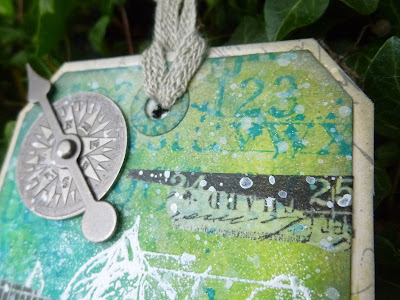
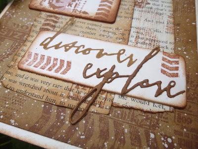
I'm travelling into a new way of working, a new country, a new language, and a new hobby which I'm passionate about. Come with me for some of the journey...
Friday, 31 July 2015
Lost Lives
Hello all, and a very warm welcome to Words and Pictures!
It's Tag Friday at A Vintage Journey today... When there's an extra Friday in the month (which happens more often than I'd've guessed) you get a whole extra array of inspiration from the Creative Guides - all tags and all inspired in one way or another by our guiding light, Tim Holtz.
So do hop over there and check out the goodies on offer, but before you go, here's my offering.
I usually take Tag Friday as an excuse to go back to basics and stick essentially to inks and stamps, but it got just a little bit busier this time because of the story which took over the process.
It has an unexpectedly dark underbelly, so be warned.
I started with a wrinkle-free distress background which was hanging around on the craft table.
I'd been experimenting with some of the new Distress colour releases, and this was a combination of Mermaid Lagoon, Twisted Citron and Hickory Smoke.
As usual, I put so much ink on the mat that I ended up with three tags.
This one was the second one - so had a medium amount of inky distress, which then gained depth with added stamping and ink-blending. Since those new colours were already in action, that's also what I pretty much stuck to as the tag progressed.
You can see the two I still have waiting to play with... that's for another day.
So what's behind this tag? Well, it's a combination of things...
(And from here, feel free to stick to just the pictures if you want, as the words are heading to some dark places.)
I watched the Dispatches documentary Escape from Isis which, while it dealt mainly with the lucky few who are managing to escape across the border from the Daesh territory, couldn't help but leave one sickened and despairing for the thousands upon thousands trapped inside, particularly the women and girls.
They will never get to experience a life which we would call in any way normal - compulsorily veiled so that even their eyes are invisible, and told that their voices must not be heard in public; girls as young as nine sold into marriage at slave markets. Even should they escape, they will bear the scars - physical and emotional - forever.
I wept and I raged. I sat wondering what I could possibly do.
And I was blown away by the quiet heroism of the men putting their own lives at risk to give at least some of them a chance of escape.
That all then sort of melded with the conversations I have almost daily with our wonderful 97-year-old neighbour. Until very recently, she was whizzing along, but now her short-term memory is unreliable, and you tend to go around the same conversational circles.
One of the main loops is around her having no family - largely because of the losses caused by war. There's the story of her father who died in the Great War, aged 26, never having seen the daughter he'd only read about in a letter.
And then her step-brother (her mother remarried eighteen years later) died in World War II, aged just 18.
Neither of them ever got to discover life.
I suppose they are hovering here in the photo of the young man, as are the men from the documentary who are risking everything to give others a chance to discover life. But so are all those others - male and female - who will never have the possibility or the freedom to explore life's journey.
The rest of us owe it to them to be fully present and to explore, discover, travel and, I think, also to speak out against injustice and wrongdoing.
If I can do nothing else, I can use my voice to speak, to bear witness, to cry for help for those lost women and girls who cannot be heard themselves. And I can be mindful that the reason I am free to do that is at least partly thanks to all those lost young men.
If you haven't already run a mile, I do urge you to take a trip over to A Vintage Journey where you'll find lots of Tag Friday joy and inspiration from my fantastic team-mates.
I'll leave you in peace for now, and I'll see you out there soon in Craftyblogland.
First they came for the communists, and I did not speak out - because I was not a communist;
Then they came for the socialists, and I did not speak out - because I was not a socialist;
Then they came for the trade unionists, and I did not speak out - because I was not a trade unionist;
Then they came for the Jews, and I did not speak out - because I was not a Jew;
Then they came for me - and there was nobody left to speak out for me.
Pastor Martin Niemöller
Monday, 27 July 2015
Some light relief...
Hello! The last post found me in a grey mode and mood, and although I really love the Gently Grey cards which resulted, I thought we could do with a touch of light relief so I'm just here to share, very quickly, another little play I was having with the crazy birds.
In fact, this one started before my Bird Crazy version of Tim's July tag, and I'd already stamped, coloured and used the Micro Glaze on these two before Tim's tag even appeared - so my choice of stamps for that was pretty obvious after all!
Like the ones on my July tag, these are also watercoloured with Distress Stains - splodged onto the craft mat and then applied with a water brush.
And I took a leaf out of Alie Hoogenboezem-de Vries's book (she's been doing wonders with the birds - and here and here - for some time now, and is probably one of the main tempters behind my caving in to them)...
... by adding Glossy Accents to the eyes for an extra goggling look.
I love that the Micro Glaze means you can then blend inks around your main image without affecting it.
As well as straight inking, I added some splotches and blotches with one of the layering stencils...
... and over the top of that I used Tim's great crackle background.
I remember I had some thought about eggs cracking, or some such, but when it came to looking for some words to go on the tag it became evident that my subconscious was way ahead of me!
A little bit of Vintage Photo around the edges, some JOFY grasses for the birds to stand on (as well as some shadows to give them a bit more substance), some twine through the hole, and we're done.
I hope that's put a smile on your face after the grey gloom (though I notice the actual words are probably not that reassuring... see, the truth will out, even in the light relief).
I'm interested in people's darker side, the ones that aren't easy and well balanced. The cracks.
Noomi Rapace
A true friend is someone who thinks that you are a good egg even though he knows that you are slightly cracked.
Bernard Meltzer
In fact, this one started before my Bird Crazy version of Tim's July tag, and I'd already stamped, coloured and used the Micro Glaze on these two before Tim's tag even appeared - so my choice of stamps for that was pretty obvious after all!
Like the ones on my July tag, these are also watercoloured with Distress Stains - splodged onto the craft mat and then applied with a water brush.
And I took a leaf out of Alie Hoogenboezem-de Vries's book (she's been doing wonders with the birds - and here and here - for some time now, and is probably one of the main tempters behind my caving in to them)...
... by adding Glossy Accents to the eyes for an extra goggling look.
I love that the Micro Glaze means you can then blend inks around your main image without affecting it.
As well as straight inking, I added some splotches and blotches with one of the layering stencils...
... and over the top of that I used Tim's great crackle background.
I remember I had some thought about eggs cracking, or some such, but when it came to looking for some words to go on the tag it became evident that my subconscious was way ahead of me!
A little bit of Vintage Photo around the edges, some JOFY grasses for the birds to stand on (as well as some shadows to give them a bit more substance), some twine through the hole, and we're done.
I hope that's put a smile on your face after the grey gloom (though I notice the actual words are probably not that reassuring... see, the truth will out, even in the light relief).
Starting to think I may need a holiday...
I'm interested in people's darker side, the ones that aren't easy and well balanced. The cracks.
Noomi Rapace
A true friend is someone who thinks that you are a good egg even though he knows that you are slightly cracked.
Bernard Meltzer
Friday, 24 July 2015
Gently Grey
Hello all! I'm glad you enjoyed peeking through my Brocanterie Window. Today I've got something to share that I made completely and utterly for no other reason than that I wanted to. That's become a real rarity here at Words and Pictures lately.
And I may finally have worked out a way for me to make cards... start them as tags!
I was tempted into buying the Tim Holtz flower stamps largely by the beautiful work Jennie at Live the Dream has been doing with them (including one of my favourite tags of all time).
And so I suppose it's no accident that my first play with them echoes her delicate style and colour palette.
It was also my first chance to try out the new Hickory Smoke colour, and I paired it with Pumice Stone and Frayed Burlap. (I would love to call them shades of grey, but I don't dare to any more.)
What can I say? I've been feeling a little grey recently (which is at least partly to do with not being able to get to the craft table as often as I'd like), and also the weather keeps returning to a grey drizzle which really doesn't feel very summery... so I think the greys were inside and outside of me, and so they turned up on the craft mat.
I started by gluing some leftover book page pieces to manila tags and painting the whole lot with a wash of white paint.
Then I did some wrinkle-free distressing with the three grey tones. The result is certainly downbeat, but it gives me great delight.
I stamped the flower stems and heads in Watering Can Archival with a hint of Olive tapped onto the stamps too, and then clear embossed them.
I used Hickory Smoke and Frayed Burlap to watercolour them - plenty of imperfections in terms of extra embossed bits creating a resist as well as extra bubbles of light, but I'm definitely embracing the effect.
In a brief moment of sunlight I was able to capture the magical effect of the light on the embossing - like faerie dust!
I used the end of the stem to add some extra grass stamping around the base of the flower, as well as stroking some blades of grass into existence using a water brush and some Frayed Burlap Distress Stain from the craft mat.
Taking a deep breath, I snipped off the top edges of the tags, and set about mounting the resulting panels onto cards. With one of them, I kept it very simple - just distressing the edges and gluing it to a tall, slim piece of folded card.
For the other, I added a couple of extra distressed layers - one of the same card as the base, and one made from one of the Tim Holtz papers that toned in with the flower panel.
And it's a happy accident that such a lovely word turned up right in one corner.
Small Talk stickers next... and once I'd chosen my wordings and stuck them in place, I added shading around them with pastel pencils and with some more Distress Stain.
I created puddled shadows above and below the words by applying soft layers of the Hickory Smoke with a water brush. It has an almost pinkish tone at times - or at least my bottle does!
And that's really that. I know that's quite a lot of photos for some simple cards, but the chances are - since they are cards - that they'll disappear in an envelope some time, so this will be my only record of them.
True strength is delicate.
Louise Nevelson (Russian-born American assemblage artist and sculptor)
In case you haven't heard, the wonderful Sue Carrington had her blog hacked, and it's all gone... I can't even imagine how awful that must be (am now backing up maniacally in the hopes of avoiding complete disaster). She's started over, so do hop over to the all new Stamping Sue Style and follow or re-follow her brilliant work.
And I may finally have worked out a way for me to make cards... start them as tags!
I was tempted into buying the Tim Holtz flower stamps largely by the beautiful work Jennie at Live the Dream has been doing with them (including one of my favourite tags of all time).
And so I suppose it's no accident that my first play with them echoes her delicate style and colour palette.
It was also my first chance to try out the new Hickory Smoke colour, and I paired it with Pumice Stone and Frayed Burlap. (I would love to call them shades of grey, but I don't dare to any more.)
What can I say? I've been feeling a little grey recently (which is at least partly to do with not being able to get to the craft table as often as I'd like), and also the weather keeps returning to a grey drizzle which really doesn't feel very summery... so I think the greys were inside and outside of me, and so they turned up on the craft mat.
I started by gluing some leftover book page pieces to manila tags and painting the whole lot with a wash of white paint.
Then I did some wrinkle-free distressing with the three grey tones. The result is certainly downbeat, but it gives me great delight.
I stamped the flower stems and heads in Watering Can Archival with a hint of Olive tapped onto the stamps too, and then clear embossed them.
I used Hickory Smoke and Frayed Burlap to watercolour them - plenty of imperfections in terms of extra embossed bits creating a resist as well as extra bubbles of light, but I'm definitely embracing the effect.
In a brief moment of sunlight I was able to capture the magical effect of the light on the embossing - like faerie dust!
I used the end of the stem to add some extra grass stamping around the base of the flower, as well as stroking some blades of grass into existence using a water brush and some Frayed Burlap Distress Stain from the craft mat.
Taking a deep breath, I snipped off the top edges of the tags, and set about mounting the resulting panels onto cards. With one of them, I kept it very simple - just distressing the edges and gluing it to a tall, slim piece of folded card.
For the other, I added a couple of extra distressed layers - one of the same card as the base, and one made from one of the Tim Holtz papers that toned in with the flower panel.
And it's a happy accident that such a lovely word turned up right in one corner.
Small Talk stickers next... and once I'd chosen my wordings and stuck them in place, I added shading around them with pastel pencils and with some more Distress Stain.
I created puddled shadows above and below the words by applying soft layers of the Hickory Smoke with a water brush. It has an almost pinkish tone at times - or at least my bottle does!
And that's really that. I know that's quite a lot of photos for some simple cards, but the chances are - since they are cards - that they'll disappear in an envelope some time, so this will be my only record of them.
Since they're so delicate in hue, these cards didn't respond well to being photographed in the window of sunshine which appeared.
They prefer to be slightly in the gloom it seems, and so for once most of this photography is done indoors against this lovely music paper.
I hope you like them, and that they don't leave you feeling too grey! Hope you all have a wonderful weekend, and I'll see you out there somewhere in Craftyblogland.
Louise Nevelson (Russian-born American assemblage artist and sculptor)
In case you haven't heard, the wonderful Sue Carrington had her blog hacked, and it's all gone... I can't even imagine how awful that must be (am now backing up maniacally in the hopes of avoiding complete disaster). She's started over, so do hop over to the all new Stamping Sue Style and follow or re-follow her brilliant work.
Monday, 20 July 2015
Calico Antiques
Hello all! As promised, I'm finally here with a project to share... well, a sneak peek at any rate to tempt you over to the Calico Craft Parts blog where I've got a little assemblage piece for you - a little antique shop window, made using one of the many and various Craft Parts shrine kits.
These are so versatile - there are lots of different designs, and you can even order each of them with or without shelves. And there are some other Craft Parts taking a starring role too. I hope you'll have time to hop over and take a look at my little antique shop window, and I'm hoping I'll have time to do some blog-visiting too this week.
A house with old furniture has no need of ghosts to be haunted.
Hope Mirrlees
Saturday, 18 July 2015
Candy Winner!
Hello all! My apologies, things seem to have ground almost to a dead halt round here lately - busy in rehearsals rather than at the craft desk, but I can't really complain... I do love my work too!
And to be perfectly honest I had completely forgotten about drawing a winner for my Blogaversary Candy, but it's finally done. I'm sorry for the long wait, and I'm sorry I can't send every single one of my lovely followers candy, but I'm happy to announce that the winner is....
That's the wonderful Alie Hoogenboezem-de Vries (sorry I didn't type out your whole name, Alie - it wouldn't fit in the columns on my piece of paper!). Congratulations, Alie - drop me an email with your address and I'll get the parcel off to you as soon as I can. And if you've never visited Alie's blog, I urge you to hop over and take a look - her work is amazing!
Thank you to everyone who joined in, and thank you to all of you for being part of this crafty journey, even though we seem to be having a bit of a pause en route at the moment. Your company and your comments give me so much delight.
Short and sweet from me now, but I'm happy to say I'll be back on Monday with an actual project to share with you, and I might even get to be a better blogging friend and visit some of you then too. Until then, have a wonderful weekend everybody.
People are always good company when they are doing what they really enjoy.
Samuel Butler
Wednesday, 8 July 2015
Artist Trading Post Finale
Hello all, and welcome. I've had a flurry of posts here lately, what with my July Tim tag and the New PaperArtsy Hot Picks Release on Sunday (and don't forget there are more new stamps to see each night this week over at PaperArtsy), and my Calico Craft Parts Apothecary's ATC on Monday, and now I'm back with yet another sneak peek. I guess I'm making up for it being so quiet here in June!
I'm here today to let you know it's time for the last of my trio of creations as a Guest Designer for Artist Trading Post this month, and it's my favourite of the three - saving the best for last, I hope. See what you think...
The theme at Artist Trading Post this month is Crafter's Workshop Stencils, and as you know I do love a stencil.
I mainly find myself using them with texture paste, and I've tried embossing ink this time too. The result is a journalling spread which gives my soul solace in what has been a very busy work schedule - some breathing time amidst the chaos. It uses one of my most loved quotations (also below).
I hope this sneak peek will tempt you to take a look over at Artist Trading Post. And I'd like to thank the fabulous Kasia Krzyminska for inviting me along to play this month. I've had a wonderful time.
Thanks to all of you, too, for your visits and comments. I'll be announcing a candy winner soon... promise!
Learn to be silent. Let your quiet mind listen and absorb.
Pythagoras
Monday, 6 July 2015
A Calico Apothecary
Hello all! I hope you enjoyed those New PaperArtsy Hot Picks releases... and don't forget there are more new stamps every night this week over at PaperArtsy. (There's also my July Tim tag to catch up on if you blinked and missed it!)
I've always enjoyed playing with the Hot Picks glass bottle images, as well as trying to create a glassy effect with the Lynne Perrella stained glass stamps, so you can imagine my delight when Calico Craft Parts came up with a whole sheet of tiny Apothecary Bottles in their line of Mini Wood Shapes. Here's a sneak peek of what I created using them...
If you'd like to see more, do hop over to the Calico Craft Parts Blog and see how I set about trying to give the wood shapes a touch of glossy glassiness! And it's all on one small ATC.
It's a bit busy here at the moment, but I will be picking a Candy Winner soon. In the meantime I hope you all have a wonderful week and I'll see you out there in Craftyblogland.
The sign outside the shop said Apothecary, which meant that the shop was owned by a sort of early chemist, who would give you herbs and things until you got better or at least stopped getting any worse.
Terry Pratchett
Sunday, 5 July 2015
All New PaperArtsy Hot Picks
Hello everyone, and welcome. Tonight is the start of a whole week of NEW RELEASES over at PaperArtsy, and first up it's some amazing new Hot Picks stamps.
(Oh, and there's my July Tim tag to check out into the bargain, just in case you're interested!)
I was delighted to be asked to be one of Leandra's "wingmen" for the new Hot Picks stamps, and armed with a colour palette and two of the gorgeous new sets of stamps I set to work. You might want to arm yourself with a cup of coffee or a nice glass of wine...
These are all created using HP1501 and 1503, which you can see below. The images and text and graphics will be fantastic for art journalling, as well as all sorts of other crafting.
But I couldn't send away my art journals as samples, so instead I created some tags and "pages" in a layered journalling style, as well as some wordy little houses made with one of the most fabulous script stamps ever.
If you hop over to PaperArtsy you can see all the new Hot Picks stamp sets, as well as samples made by lots of other designers. There's so much eye-candy, you'll end up with a sugar rush! I'll just share a couple of details from my projects with you before you go...
I started with a pair of tags and, as ever, with some weathered backgrounds using the Crackle Glaze. I decided to allow one tag to focus on HP1501 stamps (to the left) and the other on HP1503 (to the right).
For the first, I stamped this delicious corner piece from HP1501 in Squid Ink and the chevrons and background text in Sepia Archival ink.
The HP1503 has a great film strip collage with a fantastic vintage camera.
That and the rest of the stamping on this tag is done in Sepia, with some hints of Jet Black added around the edges before stamping.
I added some book page chevrons (cut with the Tim Holtz Frameworks die) to echo the chevrons in many of the images, and shaded around them with pastel pencils.
A couple of Big Chat stickers and some embossed metallic embellishments finish them off.
How about those word-houses next? The large script stamp from HP1501 is simply beautiful - lots of different font sizes and directions, all within one stamp. You can stamp the whole thing for a great background, or add partial stamping for great detailing (as on the first tag above).
Each of these houses was painted and then stamped with either Sepia ink and clear-embossed, or with Versamark and white-embossed.
You can see on the Squid Ink house that there are even some lovely numbers within the image. I gave the houses some book page windows, and the whole street is mounted on a crackled tag.
I used the grungy background stamp to give them something to stand on, but it's only just visible now.
Next is a pair of "pages" created with HP1503 on some 5 x 7 kraft card. Since I couldn't use an actual art journal, I created pages which one could insert instead.
I layered up book pages, some stained with tea and coffee, some not, and added lots of background stamping.
These edge and corner stamps will be so cool for adding vintage detail to journalling pages.
And there are some great grungy dots too...
For the main focus I stamped onto ATC blanks. Here's the fabulous film strip again, with a hint of pink to draw the eye to the butterfly and the man's face.
I added some Handwritten Words cut from kraft paper and Crunchy wax paper to both panels.
And on the other ATC you can see the adorable little girl peeping out at you.
The ATCs are "attached" with some file clips altered with alcohol ink, and I added some extra little metal accents.
Finally, the two tags which are probably my favourites of this selection...
Again I've used HP1501 for one of them and HP1503 for the other, but they're definitely a pair.
(HP1503 is to the left this time and HP1501 to the right.)
Starting with the crackled background again, this time I stamped the industrial corner in French Roast Fresco paint.
I love how much detail you get when stamping with Frescos, and I love this stamp too.
There's another appearance for the script stamp in the background, and then this wonderful compass, some stamped in Sepia Archival and some in French Roast.
I altered some Finnabair/Prima metal cogs with Antique Metal embossing powder, their shapes echoing the industrial cog and the compass stamps.
It was starting to have a travelling feel to it, so I used watery washes of paint to add shading around the elements, including the added Big Chat stickers - I hope it has the feel of an ancient map.
I went even further with mapping on the HP1503 tag. I used torn strips of book page as my land masses, again shading around them with washes of paint.
Since I'd clear-embossed my Sepia stampings, I knew they wouldn't get covered over. I just love this Montana label - so cool for adding interest to the side of a tag, page or project.
And if you read the words of this pair all as one phrase, you find the suggestion that we should all "travel together, making memories" - capturing them on film as we go.
I hope you have time to hop over to PaperArtsy to see what everyone else has been making. As I say, there's a wealth of inspiration there using these new stamps, and I promise you won't want to miss the other sets in this new release.
And don't forget that at 7pm every night this week, you can see all the other new releases from PaperArtsy's signature designers. Hold on to your wallets!!
Thanks so much for stopping by today, and I'll see you again (very) soon.
Life is either a daring adventure or nothing.
Helen Keller
Most travel is best of all in the anticipation or the remembering; the reality has more to do with losing your luggage.
Regina Nadelson
(Oh, and there's my July Tim tag to check out into the bargain, just in case you're interested!)
I was delighted to be asked to be one of Leandra's "wingmen" for the new Hot Picks stamps, and armed with a colour palette and two of the gorgeous new sets of stamps I set to work. You might want to arm yourself with a cup of coffee or a nice glass of wine...
These are all created using HP1501 and 1503, which you can see below. The images and text and graphics will be fantastic for art journalling, as well as all sorts of other crafting.
But I couldn't send away my art journals as samples, so instead I created some tags and "pages" in a layered journalling style, as well as some wordy little houses made with one of the most fabulous script stamps ever.
If you hop over to PaperArtsy you can see all the new Hot Picks stamp sets, as well as samples made by lots of other designers. There's so much eye-candy, you'll end up with a sugar rush! I'll just share a couple of details from my projects with you before you go...
I started with a pair of tags and, as ever, with some weathered backgrounds using the Crackle Glaze. I decided to allow one tag to focus on HP1501 stamps (to the left) and the other on HP1503 (to the right).
For the first, I stamped this delicious corner piece from HP1501 in Squid Ink and the chevrons and background text in Sepia Archival ink.
The HP1503 has a great film strip collage with a fantastic vintage camera.
That and the rest of the stamping on this tag is done in Sepia, with some hints of Jet Black added around the edges before stamping.
I added some book page chevrons (cut with the Tim Holtz Frameworks die) to echo the chevrons in many of the images, and shaded around them with pastel pencils.
A couple of Big Chat stickers and some embossed metallic embellishments finish them off.
How about those word-houses next? The large script stamp from HP1501 is simply beautiful - lots of different font sizes and directions, all within one stamp. You can stamp the whole thing for a great background, or add partial stamping for great detailing (as on the first tag above).
Each of these houses was painted and then stamped with either Sepia ink and clear-embossed, or with Versamark and white-embossed.
You can see on the Squid Ink house that there are even some lovely numbers within the image. I gave the houses some book page windows, and the whole street is mounted on a crackled tag.
I used the grungy background stamp to give them something to stand on, but it's only just visible now.
Next is a pair of "pages" created with HP1503 on some 5 x 7 kraft card. Since I couldn't use an actual art journal, I created pages which one could insert instead.
I layered up book pages, some stained with tea and coffee, some not, and added lots of background stamping.
These edge and corner stamps will be so cool for adding vintage detail to journalling pages.
And there are some great grungy dots too...
For the main focus I stamped onto ATC blanks. Here's the fabulous film strip again, with a hint of pink to draw the eye to the butterfly and the man's face.
I added some Handwritten Words cut from kraft paper and Crunchy wax paper to both panels.
And on the other ATC you can see the adorable little girl peeping out at you.
The ATCs are "attached" with some file clips altered with alcohol ink, and I added some extra little metal accents.
Finally, the two tags which are probably my favourites of this selection...
Again I've used HP1501 for one of them and HP1503 for the other, but they're definitely a pair.
(HP1503 is to the left this time and HP1501 to the right.)
Starting with the crackled background again, this time I stamped the industrial corner in French Roast Fresco paint.
I love how much detail you get when stamping with Frescos, and I love this stamp too.
There's another appearance for the script stamp in the background, and then this wonderful compass, some stamped in Sepia Archival and some in French Roast.
I altered some Finnabair/Prima metal cogs with Antique Metal embossing powder, their shapes echoing the industrial cog and the compass stamps.
It was starting to have a travelling feel to it, so I used watery washes of paint to add shading around the elements, including the added Big Chat stickers - I hope it has the feel of an ancient map.
I went even further with mapping on the HP1503 tag. I used torn strips of book page as my land masses, again shading around them with washes of paint.
Since I'd clear-embossed my Sepia stampings, I knew they wouldn't get covered over. I just love this Montana label - so cool for adding interest to the side of a tag, page or project.
And if you read the words of this pair all as one phrase, you find the suggestion that we should all "travel together, making memories" - capturing them on film as we go.
I hope you have time to hop over to PaperArtsy to see what everyone else has been making. As I say, there's a wealth of inspiration there using these new stamps, and I promise you won't want to miss the other sets in this new release.
And don't forget that at 7pm every night this week, you can see all the other new releases from PaperArtsy's signature designers. Hold on to your wallets!!
Thanks so much for stopping by today, and I'll see you again (very) soon.
Life is either a daring adventure or nothing.
Helen Keller
Most travel is best of all in the anticipation or the remembering; the reality has more to do with losing your luggage.
Regina Nadelson
Subscribe to:
Posts (Atom)