I'm travelling into a new way of working, a new country, a new language, and a new hobby which I'm passionate about. Come with me for some of the journey...

Showing posts with label paper curling. Show all posts

Wednesday, 7 November 2012

Musical Tic Tac Toe

Hello all, a warm welcome to you all on what is, for me at the moment, a very chilly evening!  So happy to have your company for a while...


I'm sharing a tag with you today which was inspired by a couple of challenges going on, and which I had such fun making.

At the Fashionable Stamping Challenge they've come over all Musical (well, you knew I'd be playing along with that one, then!); and at Frilly and Funkie they've got a fantastic Tic Tac Toe board (yes, okay, Noughts and Crosses for the Brits amongst us) offering up delicious combinations of possibilities.  You need to "play" a winning line, straight or diagonal.

Mine's the diagonal of Metal, Metallic Distress Stains and Buttons, though it takes in a number of the others too... for a while I was headed for a full-house!


So let's get to it - here's the tag:


The central picture is of Lily Elsie, a huge star of Edwardian operetta and musical theatre, and for whom I've long had a definite soft spot.  The sharper-eyed and longer-memoried amongst you may remember I've used this image before.


I first discovered her when I was writing content for the Theatre Museum website.  (It doesn't exist as that any more, but my work is still there as part of the Victoria and Albert archive online.)  I was lucky enough to get to root around in the archives, looking at programmes, playscripts and other theatre ephemera from the last several hundred years - what bliss...


One of the photographs I had to "animate" with a story or anecdote was of Lily Elsie in The Merry Widow.  You can see it below... and you'll understand that the hat, as well as her general fabulousness, has stayed with me ever since!


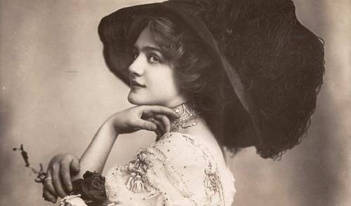
So, as I started to play around with elements for this tag, one of my Lily Elsie pictures (picked up on a Google image trawl, and printed out) rose to the surface and demanded a starring role in it.  From there, things just sort of fell into place.


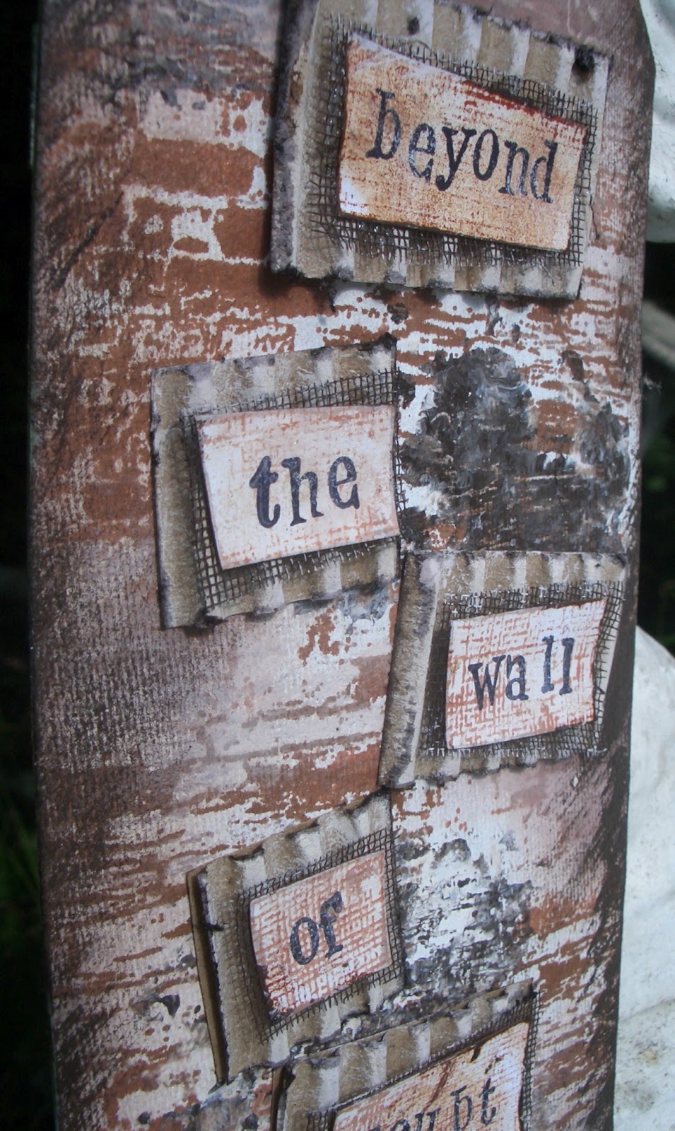
I love the background, which I made using the wrinkle-free distress technique ('Whose technique is that?', I hear you cry... well, there's this guy called Tim Holtz...), but with a few sprinkles of mica powder added, so that you get these fabulous spots of glamour within the texture.

Then I stamped the gorgeous music advert from the Pink Paislee London Market set, using the Tarnished Brass Metallic Distress Stain... I love its sheen.  I also added the music stamp from that same set, as well as the Kaisercraft music manuscript stamp, both done in Coffee Archival.


I used the concert advertisement again to create a piece of 'memorabilia', crumpling and distressing it, to get that vintage look.

And I used Gold and Ginger alcohol inks on one of Tim Holtz's word sticks to get a look that toned in with the warm golden background.


Once that had dried (almost immediately, in other words), I smeared some raw umber acrylic paint onto it with my finger to get it into the recessed letters, then wiped the surface clear to reveal the burnished metal once again.

Now the idea is to have a "musical" tag, so what could be better than adding a couple of the Funkie Junkie's deliciously rusted bells to the trimmings - now "she shall have music wherever she goes".


There's more music in the shape (literally) of the lovely treble clef die from Memory Box, cut from some music paper.  These dies are so delicate - they really delight me.

And this picture also gives quite a good chance to see the stamped metallic distress stains glowing in the (thank you, Universe) late Autumn sunlight.


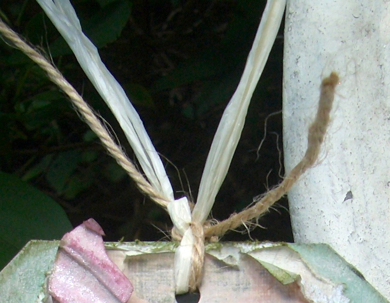
Mulberry paper roses form another little memento - a bouquet once delivered to the fragrant Miss Elsie?

And the metal button came out of the (seldom-opened) sewing box.  Its provenance and vintage are uncertain, but it must be at least 30 years old, and very probably double that.  To be honest, it was looking a little dull, so it got a little touch of the same alcohol inks as the word stick, and in my head, it came from one of Lily's favourite costumes - perhaps designed by 'Lucile' (see the quote at the end).


I played one of my favourite games with this piece of paper with the Pink Paislee music stamp on - just taking a piece of wooden dowelling and rolling it this way and that to get the lovely dimensional scrolling effect.

Another pen nib is at the ready to jot down any musical or lyrical thoughts which might be inspired by the presence of the muse.


I dyed some seam binding using various combinations of Distress Inks and Stains, including metallic on the darkest of the ribbons.


I'm not sure whether you can see the metallic sheen much, but they certainly seem to glow in the sunshine!

Miss Elsie, it's time for your close-up...  Your close-up, please, Miss Elsie!


I love taking these photographs out of the printer here in 2012, and getting to work to take them back a century or so: Vintage Photo DI (never so aptly used as in distressing 'vintage photos'), creasing, tearing - it gives me a real thrill to be able to create 'character' in a piece of paper this way.


So, I'm very grateful to my musical muse, Lily Elsie, as I think she's come up trumps - this tag really pleases me.  And I'm so delighted that we caught the sun this afternoon, so that I can share its warm golden glow of memory with you in all its proper glory!

Thank you so much for dropping in today.  I'm due a blog visiting catch up, so I hope I'll be dropping in on you in the next couple of days.  See you soon!

I have never known any woman who had the power of turning men's heads in the way that Lily Elsie did. During the years I knew her she had a perfect galaxy of suitors who used to shower presents upon her and wait at the stage door for hours on the chance of a few words from her before she left the theatre.  

She used to keep millionaires and foreign princes hanging about in the cold, draughty passages at Daly's while she and her mother shared a picnic supper of ham in her dressing room. She honestly preferred it to champagne at the Ritz.

From Discretions and Indiscretions by Lucy Duff Gordon (the theatrical costume designer known as Lucile, who dressed and coached Lily Elsie for her role in The Merry Widow)


I'm entering this in the following:
The Fashionable Stamping Challenge where they are inspiring us to get Musical
Frilly and Funkie's game of Tic Tac Toe - I'm playing metal, metallic distress stains, button(s)
With all the mementoes of an Edwardian career, I'm entering this in Try It On Tuesday's current challenge Memories
And with the rusty jingle bells from The Funkie Junkie Boutique (as well, I think, as my metallic distress stains, though I'd have to check that), I'm adding it to the Sunday Share at Frilly and Funkie as well

Friday, 10 August 2012

Secret Garden

Hello all!  I'm making time again, out of a busy schedule, to create and share a tag with you (yes, it's just one tag)... I think I'd go mad if I focused only on the wedding stuff!!  And I really, really wanted to find time to enter the House of Bears' inaugural challenge based on the Secret Garden (they're all going to be literary-related themes, gorgeous idea).  And given I'm learning and experimenting all the time, I didn't want to miss Simon Says Stamp and Show this week trying out different ways to Paint it Up.  (Both deadlines coincide with the wedding day!!)  So here's my (two-faced) tag for today:


The front                               
The back

I guess that like much of my recent work it's coming from the thing that's taking most of my time and effort at present - my brother's wedding preparations. 

I'm at that scary stage: full of doubt that we'll pull off the wedding transformation, and full of hope that we'll end up with a magical garden of a wedding venue.

And those two feelings are on opposite sides of this tag.


On the wall side, the background started with a coat of gesso (rubbed in well to get the chipboard texture coming through) and then I built up layers of stamping using the Tattered Angels Architectural set in Coffee and Sepia Archival.  

I stamped a few times with acrylic paints on the stamp, quite thickly to get some texture (as I've done before), and also with some bronze pigment ink onto which I swept some copper Perfect Pearls powder.  

I brushed over some areas with a bit of gesso again, and then edged it with the dark brown acrylic, quite dry on the brush so as to get the brush strokes visible.


The gorgeous, fine metal mesh comes from the fabulous Linda Coughlin's Funkie Junkie Boutique, and came wrapped in the corrugated card (which got a rough coat of sand acrylic just on the raised edges) - genius packaging going straight into action, and giving a lovely grungy bit of texture to the tag.


I stamped the words on some scrap paper where I'd been wiping my brushes and blending tools, also adding some textural stamping, using another of the Tattered Angels stamps, to match the mesh.


As you 'leap over the wall' - or turn it over! - pretty much everything changes... I wanted a complete and surprising contrast.


The background started with a coat of muted green acrylic, mixed with white.  I then put in some almost dry brush strokes of gesso all the way down and, once dry, added a coat of Rock Candy (clear) crackle paint, thicker in some places, non-existent in others.  I left it to 'do its thing' while I went off to do some more wedding chores...


On my return I blended in some Peeled Paint and Forest Moss to bring out the crackles, and edged the whole thing with the Forest Moss too.  


The papers are from K&Co and from Prima's Botanical, each given a coat of watered-down gesso to whitewash the colours.  I cut them to tag size and then ripped, rolled and edged them with Bundled Sage and Forest Moss, to create the framing dimensionality.

The words are stamped onto the 'whitewashed' K&Co paper using Aged Mahogany.  Rather than full strength, I used the second stamping, so that I got a paler cherry to match the roses in the paper.

Also in my Funkie Junkie parcel were a couple of lovely freebies, these corrugated die-cut butterflies amongst them, so they were put straight to use as well.  


I gave them a coat of Shell Pink with a Paint Dabber, then softened it with some Vintage Lace Fresco Paint from PaperArtsy.  


Using a paintbrush I stippled on some Aged Mahogany Distress Ink from the pad, and finished with a spritz of Perfect Pearls Mist in Pearl for that lovely sheen.


I had to work out something to act as my tag string which wouldn't look out of place on either side, so in the end I decided to keep it pretty simple.  The ivory raffia picks up the creamy colours in the tag on both sides, and you can't go wrong with a bit of neutral twine!


Thanks so much for stopping by today... I'm so grateful for your feedback and support.  Your lovely comments make my day!  I love Craftyblogland!!

I'm entering this in the following:
The House of Bears challenge, The Secret Garden
Simon Says Stamp and Show who would like us to Paint It Up
The Sunday Share over at Frilly and Funkie, having used my lovely new mesh, freebie extras and the packaging bits from the Funkie Junkie boutique
The Inspired by Stamping challenge - though they'll only be interested in one side of the tag! - with their lovely inspiration photo, Garden theme, and a request to use Pink, Green and Creams
And I'm joining the Bloggers Challenge bloghop again - hosted by Lisa Somerville - adding some Texture this week

If you look the right way, you can see the whole world is a garden.
from The Secret Garden, Frances Hodgson Burnett

Wednesday, 18 July 2012

Valentine's Day in July

I'm slightly disturbed by all the Christmas in July challenges around at the moment.  Amazing cards being created, but I simply can't get my head around thinking about all that just yet.  (I'm just not that organised - not quite shopping on Christmas Eve, but it's been close a couple of times.)  I promise you it's a complete accident that what I ended up with today was a Valentine's card.  

(I don't even like the modern St.Valentine's Day - co-opted by schlocky merchandising for already happily - or not?! - together couples, when what it's traditionally supposed to be is a chance to tell someone who doesn't already know it that you like them - anonymously... bitter rant over!)

So, honestly, I didn't mean to do it, but here it is:


Oof... this was tricky!  I was playing with the Colour Challenge over at Our Creative Corner, where they were after Navy + Pink, with an additional colour of your choice (black, white, cream, brown not to count as colours).  This was the inspiration photo...
... and while this is a lovely set of pictures, I found the choice of third colour really difficult.  Having laid out some possible blue and pale pink stuff on my work desk I tried putting every single Distress Ink pad in amongst it all, and various papers and all of it just made me think, "yuck"!

I played (struggled) for some time with using the gorgeous Students' Notebook cover from Tim Holtz's Crowded Attic Paper Stash as my background.  It wouldn't count as my extra colour, as it's brown, but it did somehow make it possible to start adding other accent colours without going "yuck" all the time, and I finally decided I quite liked the cherry red addition.


I struggled on, placing pieces, ripping bits of paper to shreds, trying to fit my embossed navy PostCard tag (an earlier experiment hanging around the workdesk, suddenly finding a project to get in on) to work on the cover.  Nothing seemed to work.  Closest I've come so far to just chucking in a project. 

Finally, light dawned... I removed the brown notebook cover (which had allowed me to get to this stage in the first place) and suddenly I didn't entirely hate the piece!

The other main element on the front, the pink embossed plate of LOVE words (Tim Holtz embossing folder, Valentine), was a bit of an experiment, but I'm very pleased with the result.  


I painted pale pink acrylic onto some Kraft cardstock and let it dry.  Then I inked patches of the embossing folder with the Victorian Velvet (yummy colour) Distress Marker, and ran it through the BigShot.  My hope was that the Kraft would show through at some of the embossed edges.  


Tiny bits did, but not enough, so I took an emery board to it and sanded away some more of the acrylic to get lovely Kraft accents.  The Victorian Velvet was providing some shading down in the valleys, but I still wanted a bit more definition.  I put some Aged Mahogany onto the edge of one of the spare blending sponges and swiped it very lightly over a few places to get those cherry red hints.

(Is it just me, or is Aged Mahogany the messiest of inks to work with?  Seems to get everywhere and stay there, unlike all the other colours which you can pretty much wipe away.  Pink fingertips all day even after scrubbing!)

The whole card is built on dark blue cardstock.  The blue paper with its sweet little white flecks is from Papermania's Persimmon collection, and the cherry swirly one is from K&Company's Best Of pack.  I resisted the urge to ink the torn edges as I liked the brilliant white (closest I'll ever get to a red, white and blue card I think, red, white, blue and pink...) against the dark blue of the card base.

Once I'd worked out that the PostCard tag had to live on the inside of the card, things started to look up even further.  

I wanted to pop some ribbons through the top, but none of the colours I had seemed right, and my usual trick of swiping the white gauze ribbon didn't come up with the goods either.  

I remembered, however, from another project, that the paper could actually do the job just as well - and that would certainly match!  Little ribbon-shaped snippings at the ends just pick them out.

The hearts are die-cut out of the reverse of one of the TH Crowded Attic papers using the Sizzix Primitive #3 Hearts die.  I gave it a rub of the Aged Mahogany too, just to get the shade a bit closer to what I wanted.  They're embossed with a little hearts folder also by Sizzix (not quite sure what, it came as part of my BigShot starter pack).

Once done, they got a little Chipped Sapphire inking round the edges, and a spritz or two of Perfect Pearls Mist in Pearl.


I had also worked out by now that what I basically had on my hands was a Valentine's Card, so I decided to yield to the inevitable and pick out the word Valentine for special attention, so I sliced it off the bottom of the word plaque, and gave it pride of place (well, nearly... it's at the bottom not the top, so that's something).


The inside now needed some attention, as the dark blue of the cardstock alone was slightly oppressive for a declaration of love.  I loved having the PostCard tag there, but needed to lift the space.  Besides, given that that is where the sentiment conventionally goes, why shouldn't it get some adornment too.


The pale pink paper is from Prima's En Francais 6x6 pad  (If you look closely you might catch the odd edge of an Eiffel Tower on it), and offers some space for adding a personal sentiment.


I created one of my mini 'vintage postcards' - urgh, Aged Mahogany again, and I always use it on the second stamping, the first one is far too colour-saturated for my liking!


I cut some letters from the same papers using the TH Alphabetical Decorative Strip die to add an extra little romantic thought to it. 

It's also embossed with one of the TH French Connection Texture Trades (cute little individual folders), inked with a bit of Chipped Sapphire.


The tag I incorporated was made from a Manila tag, inked with Chipped Sapphire Distress Ink, but leaving some places where the pale cream would still show through.  I embossed it using the Tim Holtz PostCard embossing folder, and really liked how that came out, with the cream on parts of the emboss.  


The curled paper I've mentioned above, while the lace was cut from very delicate paper ribbon using the TH Decorative Strip die Vintage Lace - so it has a very light, frothy look and feel.


Finally, because I really think a Valentine card should be anonymous, there's a little label from one of Prima's Botanical papers so that you could send your card under a nom-de-plume, to fool your loved one, or just add a little
? to the label for mystery!

So, there you have it... an unintentional Valentine's card and, in terms of early preparation, I'm beating all the Christmas in July lot by a good couple of months!!

I'm entering this in the following:
Our Creative Corner's crazily tricky Colour Challenge
The Inspiration Emporium's July Challenge Red, White and Blue (sorry about the pink!)
Crafty Creations who this week have a Tag theme (either on its own or incorporated into a card)
LEJ Designs current Anything Goes challenge
The Crazy Amigo Challenge who are having a Free theme
I'd like to make this another entry into That Craft Place's July Anything Goes challenge
And I'd also like to join in with Make it Monday's Linky Party

Thanks so much for dropping by and spending some time here at Words and Pictures.  Your comments and feedback are so valuable and encouraging, so thank you for contributing to this crafting journey.  Lovely followers - thank you for your continued support... I hope you're still enjoying yourselves as much as I am!


I don't understand why Cupid was chosen to represent Valentine's Day.  When I think about romance, the last thing on my mind is a short, tubby toddler coming at me with a weapon.
Anonymous


Romance has been elegantly described as the offspring of love and fiction.
Benjamin Disraeli


In romantic love you want the other person.  In real love you want the other person's good.
Margaret C Anderson


Thursday, 12 July 2012

Al Fresco

Hello, so glad you decided to drop by today.  I'm in the mood for a party... that's pretty rare for me!  I'm gazing out of the window at yet more gathering storm clouds, and wondering when the summer is going to arrive - or should that be 'if'?  My idea of summer is to be able to laze in the garden with a book, to swim (wish there was a pool in my garden!) when it gets really warm... but best of all, I like to eat al fresco, outdoors on a summer's afternoon or evening, with good friends, good wine, and good conversation.

Round our way it was always my job, on festive occasions, to "make the table look nice".  So for Our Creative Corner's challenge to come up with something for a party, and with the 'Summer' challenges around all over the place, I decided to create something for my ideal party on a summer's day:


I believe party crackers are not as common in the US as they are in the UK; and I'm afraid mine doesn't have a cracker in yet - it'll have to wait until I can source some, but there is room to slide it in when I do.

I used a toilet roll (yes, you see, they're not just good for albums!) and papers from Prima's Botanical collection - they're gorgeous in themselves, so that's a good bit of the job done right there.  I cut the overhanging edges into  strips so that I could bend and manipulate them to form the ends of the cracker.

I'm usually a paper-tearer, but this project required my paper-curling skills.  Of course, once I started to get curly, I realised I needed to do something with the reverse of the paper, so I blended on some Bundled Sage Distress Ink (Tim Holtz), and then stamped with my little Alla Prima Floral stamp (it's been getting quite a workout recently) in Aged Mahogany (but as a second printing, not full-on colour).

I cut some of another paper from the Botanical collection using the Tim Holtz Decorative Strip Die Vintage Lace to give me some additional detail for the body of the cracker, and then cut very thin strips of the same page to create the ribbons for the ends.


Again, I had to colour the reverse using Bundled Sage, and because I'd been doing some curling using the scissors, it gave it this great distress crackle look on the back... happy accidents - we love serendipity!


I used some of the paper doily left over from another project to create an extra little pleated flower within the end of the cracker, edging it with the Bundled Sage again to tie it in with the rest.


For the top, I made a flower using the first paper again.  This time, as well as Bundled Sage on the reverse, I used a spritz of my home-made Bundled Sage pearl mist, so that there'd be a bit of a gleaming lustre in the sunlight.


The ribbon was white gauze to start with so I played the mucky finger game I've played before, sliding it across the surface of an ink pad (you'll never guess which one...) until I had the depth of colour I wanted.


So now all I've got to do is make enough for everyone to have one... hmm, maybe I'll eat alone after all!


I'm entering this for the following:
The Party challenge at Our Creative Corner
Summer Days at Sugar Creek Hollow
Summer at Everybody Art
Paper Crafting Journey are also playing a Summer challenge
Totally Paper Crafts have one called Here Comes Summer - I do hope they're right!


I hope your summer weather is good enough to let you have at least the occasional meal out in the sunshine.  And I hope you're having a great day, whether the sun is shining or not.  Thank you so much for spending some of it here with me.  I'd love to know what you think... or what your favourite summer's day includes, so do leave a comment if you have some time to spare.

I always think food tastes so much better out of doors.
Said by Anne in almost every single one of Enid Blyton's Famous Five books!

Seating themselves on the greensward, they eat while the corks fly and there is talk, laughter and merriment, and perfect freedom, for the universe is their drawing room and the sun their lamp.  Besides, they have appetite, Nature's special gift, which lends to such a meal a vivacity unknown indoors, however beautiful the surroundings.
Jean-Anthelme Brillat-Savarin