I'm travelling into a new way of working, a new country, a new language, and a new hobby which I'm passionate about. Come with me for some of the journey...

Showing posts with label Papermania. Show all posts

Wednesday, 27 February 2013

Extra! Extra!

Welcome, welcome!  I think you'll be happy you stopped by today...  I'm so excited to be able to share with you the new Artistic Outpost release Paperboy.  The whole team has been creating projects to tempt you - and you'll find links to them all here at the Artistic Outpost blog - though for my part I think the stamps speak pretty much for themselves: it's a gorgeous set!

I've got several pieces to share with you and I'll spread them out over the next few posts, but I thought I'd give you a quick glimpse of them all to whet your appetites.

So, without more ado, I give you: Paperboy...


Here's what Robyn, designer and owner of Artistic Outpost has to say about them:

Amazing vintage photographs of "newsies" were used as the inspiration for Artistic Outpost's newest release, Paperboy.

This collection features iconic newsboys and girls from the early 1900's when children hocked the latest news on the street corners of America's busiest cities. Also included are a newsprint collage, a megaphone for announcing the latest and greatest, and sentiments professing that "you are the hero in your own story".

The collection is available in both unmounted sheets of red rubber for $14 or mounted on EZ Mount cling foam and pre-cut for you for $22.99. Mounted version comes with a cling card for easy storage.

Find the set here.


These stamps have such a fantastic vintage feel to them, and the characters have the trademark direct gaze of some of my favourite Artistic Outpost sets (Think and Wonder, Generation Redux).  These children capture you and hold you with their eyes, challenging you to engage, to look again.


I found myself drawn to a neutral palette with these stamps (with the occasional blue invasion) - probably influenced by the fact that old photographs and newspapers live in that colour world, so the stamps inhabit it very comfortably.

And I mostly kept it pretty simple to let the stamps do the work.

So the first one I'm going to share in detail is the one that sprang to mind immediately when I received the set.

The 3D frame structure seemed like a great "period" way to display the images, reminiscent of a turn of the century diorama. It was the first thing that came to me, since there seemed to be a natural progression of distances given the relative sizes of the images.  

(And if you saw yesterday's tiny "theatre", you'll see that the 3D thing infected me a little!)


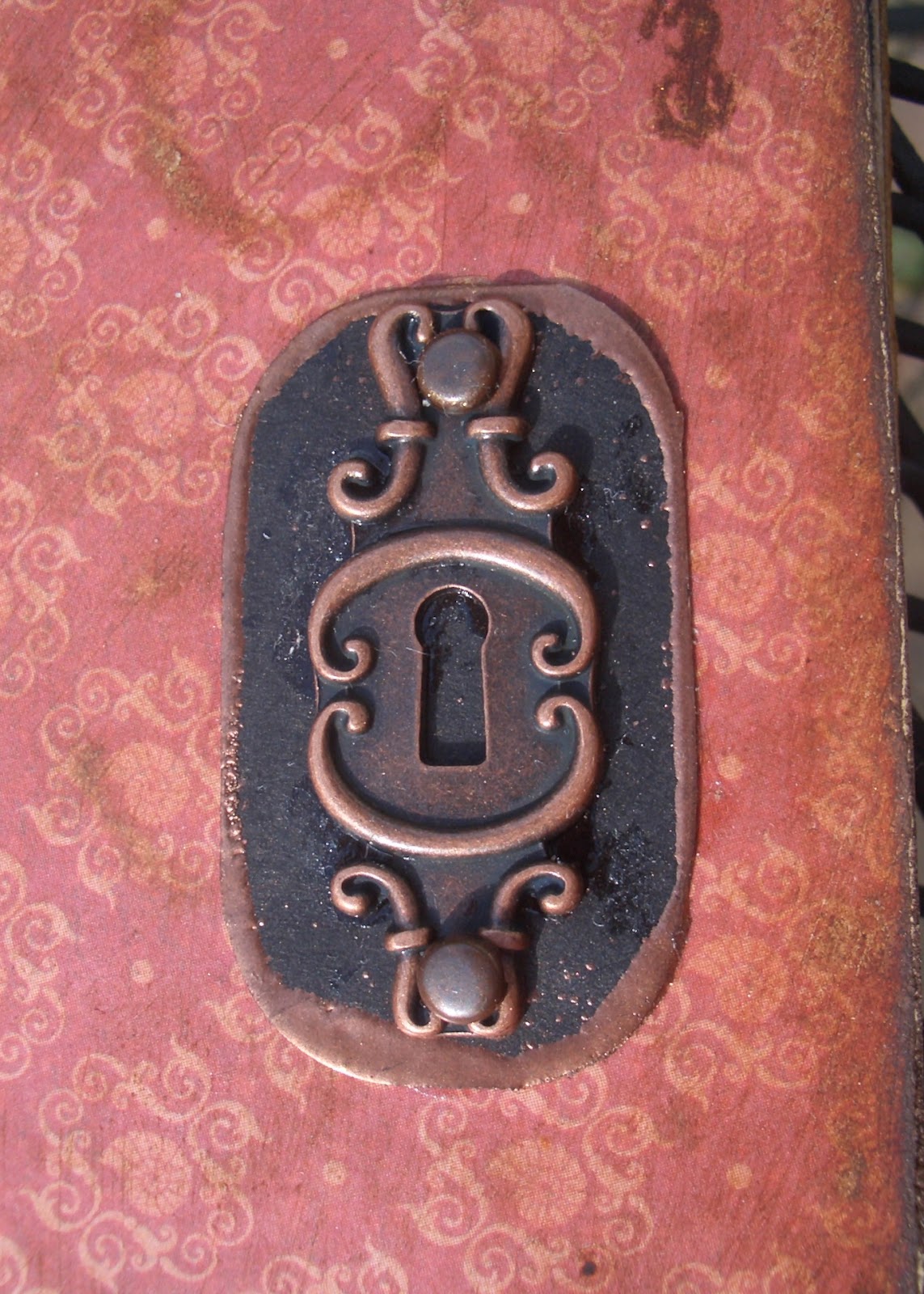
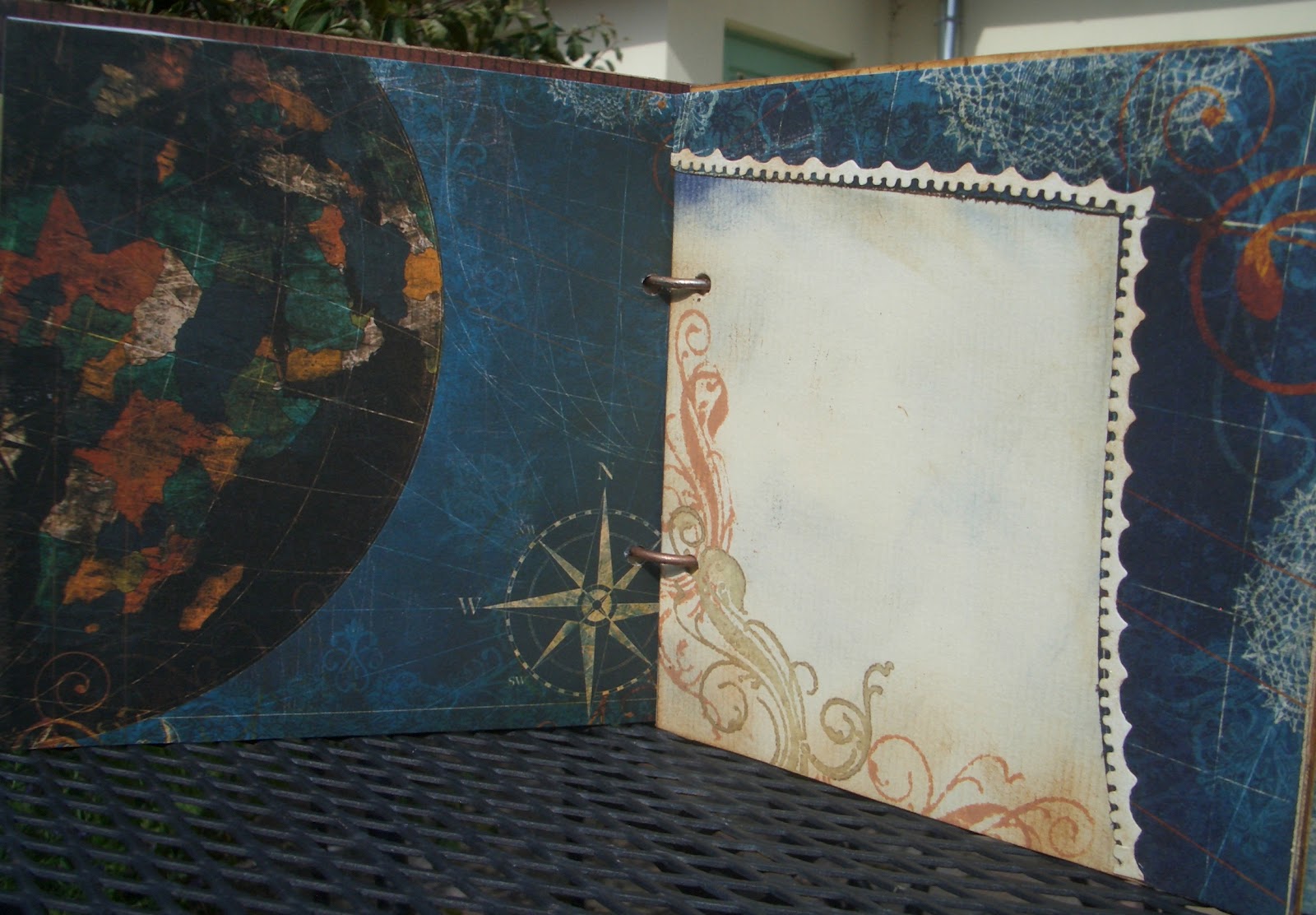
I stuck Tim Holtz text tissue wrap onto some strong chipboard and cut several frames and plaques using the Vintage Cabinet Card and mini-Cabinet card dies.  (These were to form the basis of a couple of my pieces.)


So the fabulous cityscape goes right in the background, the girls are in the middle-ground, and one of our two paperboys comes right into the foreground.


They're stamped in Archival Black.  I added some gentle shading with Antique Linen Distress Stain, applied with a waterbrush.


And what did I use to separate the frames, I hear you cry... the distance between them is far more than just some padded tape.


Yup, you're right.  Well, you know those bits of white foam that come in the bottom of the packaging when you buy a Texture Fade embossing folder... it's those, sliced in half lengthwise.  

I always knew they had to be useful for something, and I've finally found out what!


I added a few metal accents - including one of the lovely new Papermania Chronology clocks, and that was pretty much that.


I hope you'll be able to visit the rest of the team if you haven't already; they've really created some amazing projects... I think we've all been inspired by this great new stamp set.  See more by visiting...

Gerrie     Lisa     Suzanne    Tracy    Linda    Terry    Kate


For now, thanks so much for dropping in and I'll see you out there somewhere in Craftyblogland soon!


If you don't read the newspaper, you're uninformed. If you read the newspaper, you're mis-informed.
Mark Twain


Advertisements contain the only truths to be relied on in a newspaper.
Thomas Jefferson

Monday, 30 July 2012

A Proper Gent

Hello all... I've been drooling over the Vintage Gentleman Kit available at Vintage Page Designs for nearly a whole month now.  I'd finally decided to give in and go shopping, only to find that they were on holiday - thwarted again!

But I still wanted to enter the challenge over at their blog this month which is entitled simply 'Gentlemen'.  I've created a number of shabby chic albums (some of which you've seen, and some of which are still to be revealed), but mostly in gentle blues, greens and the occasional mauve/pink.  So what a good opportunity to go for something more manly.  I had done a toilet roll mini-album in browns and blues using the BoBunny Weekend Market collection of papers, but I wanted something on a slightly larger scale (it's a 6x6) - so here it is:

I'm imagining a smoking jacket, pipe, library kind of gentleman here... and definitely of a certain vintage!

For the cover I used a paper from the Papermania Persimmon collection, and distressed it to get a very old wallpaper look - the sort he might have in his study or library.

I sanded it with an emery board (nail files are very useful craft tools), and blended on some Vintage Photo Distress Ink.

The corners are adorned with the corner flourish from the Tim Holtz Journey collection, double stamped in Vintage Photo for extra dimension.
The tiny tabs, cut using the TH die Tiny Tabs and Tags, have Weekend Market papers front and back, sandwiched onto card for some dimension and UTEE'd (Ultra Thick Embossing Enamel) for strength.

The lock and key are from the BoBunny trinket set which is part of the WM array, and it's all strung on to the book ring using one of TH's ball chains.


I made a black backboard for the lock, and edged it with Copper embossing powder.  I used the same embossing powder to transform my silver book rings into copper ones, so that they'd suit the look of the album.

Throughout the album, I've used the Weekend Market papers combined with the Persimmon set, as well as adding music manuscript and plainer handmade papers of my own.  I'm always worried that I wouldn't want to cover the amazing designer papers with journalling or photographs, but I realise that's pretty much the whole point of an album... so I try to create other spaces for journalling or as photo mats which will allow the papers to still shine through.

Let's take a quick flick through the album...

I like to create each double page spread as a single 'whole' area, so that each time you turn a page you find a new environment.

The flourishes most of the way through the album are from Whimsy Stamps, a set called Lavish Flourishes.


Quite often, I've embossed them with copper embossing powder, to get a lovely burnished sheen.  Love the wooden rulers from the BoBunny papers, so I've created my own version on the reverse of the tags using TH's stamp from the Seamless Experience set.


I can certainly imagine that Sir Jasper (oh, look at that, he has a name...) has one of those glorious globes in his study, and probably an astronomical one too.  This next spread pays homage to that, with a photo pad or journalling space created within the gentle curves of lines of latitude and longitude.


The next spread has a large pull-out tab, one side of Weekend Market, and one of actual sheet music, stamped with flourishes and edged with Vintage Photo.  There are die-cut hearts to match, glazed with Rock Candy Distress Crackle Paint.


I'm sure that, if not a musician himself, Sir Jasper is a keen connoisseur of fine music - chamber music I think, or possibly opera... he might, in this pocket, keep mementos of performances he has attended... a ticket, a programme, the lace handkerchief of the young soprano from the chorus...?


The next one is a little ornate for a man you may think, but a gentleman of Sir Jasper's standing and character will always appreciate beauty in his surroundings.  A fine architectural flourish such as this one, provided by the TH Scrollwork On the Edge die would perhaps be reminiscent of the ironwork of his wrought iron gates.  And rather than lace, let us consider it the mouldings upon the very fine ceiling of his Great Hall.


This page
opens as well, to reveal a pocket in which Sir Jasper might keep records of his latest shooting party.


An elegant gold and brown affair here, a dark rich brown like the leather of Sir Jasper's favourite ottoman, or his favourite wingback chair, with the gold stud work.  (Additional flourishes provided by the Whimsy stamps and some gold acrylic paint.)


The stripes on this spread are a little rakish, like Sir Jasper's younger brother (hmm, let's see... Bertram?) who is, as the phrase has it, 'half flash, half foolish', but very fond of a dashing waistcoat.


There are copper-embossed flourishes, and tags with one of my favourite TH stamps, the pen nibs from the Curious Possibility set.


I shouldn't think Sir Jasper gets many letters written while Bertie is staying - unless they are bills of payment for the debts his brother has incurred.


A retreat to the music room, then, so tastefully wallpapered (BoBunny), there to listen dutifully to the daughters of his near neighbours, the Cottingtons, as they demonstrate their musical prowess... or lack of it.

Still a gentleman will always be attentive and complimentary to the gentler sex.


And then this last one, with much more delicate wallpaper that I love (Papermania), makes a return to the rulers and measures - some of my favourite vintage objects.


I work, in a very old-fashioned way, with a wooden ruler myself - not only that, it has a list of the Kings and Queens of England all the way down the back.


I feel sure that Sir Jasper would approve of my learning the history of the nation as I'm crafting!


Thank you for joining me for this little tour of Sir Jasper's domain - apologies, I think it's the Whimsy stamps that must have induced the whimsical approach... I've been infected by the Lavish Flourishes in my writing too.  Normal service will be resumed as soon as possible.  I hope you'll drop by again soon, just to check my pulse, perhaps?!

I'm entering this (though Sir Jasper would probably disapprove of vulgar competition - oh, hush now) in Vintage Page Designs' July challenge Gentlemen, played, of course, by Marquis of Queensberry Rules... okay, that's enough now - I'm going to bed!

He was the product of an English public school and university.  He was, moreover, a modern product of those seats of athletic exercise.  He had little education and highly developed muscles - that is to say, he was no scholar, but essentially a gentleman.
H. Seton Merriman

A gentleman is one who never hurts anyone's feelings unintentionally.
Oscar Wilde

Wednesday, 18 July 2012

Valentine's Day in July

I'm slightly disturbed by all the Christmas in July challenges around at the moment.  Amazing cards being created, but I simply can't get my head around thinking about all that just yet.  (I'm just not that organised - not quite shopping on Christmas Eve, but it's been close a couple of times.)  I promise you it's a complete accident that what I ended up with today was a Valentine's card.  

(I don't even like the modern St.Valentine's Day - co-opted by schlocky merchandising for already happily - or not?! - together couples, when what it's traditionally supposed to be is a chance to tell someone who doesn't already know it that you like them - anonymously... bitter rant over!)

So, honestly, I didn't mean to do it, but here it is:


Oof... this was tricky!  I was playing with the Colour Challenge over at Our Creative Corner, where they were after Navy + Pink, with an additional colour of your choice (black, white, cream, brown not to count as colours).  This was the inspiration photo...
... and while this is a lovely set of pictures, I found the choice of third colour really difficult.  Having laid out some possible blue and pale pink stuff on my work desk I tried putting every single Distress Ink pad in amongst it all, and various papers and all of it just made me think, "yuck"!

I played (struggled) for some time with using the gorgeous Students' Notebook cover from Tim Holtz's Crowded Attic Paper Stash as my background.  It wouldn't count as my extra colour, as it's brown, but it did somehow make it possible to start adding other accent colours without going "yuck" all the time, and I finally decided I quite liked the cherry red addition.


I struggled on, placing pieces, ripping bits of paper to shreds, trying to fit my embossed navy PostCard tag (an earlier experiment hanging around the workdesk, suddenly finding a project to get in on) to work on the cover.  Nothing seemed to work.  Closest I've come so far to just chucking in a project. 

Finally, light dawned... I removed the brown notebook cover (which had allowed me to get to this stage in the first place) and suddenly I didn't entirely hate the piece!

The other main element on the front, the pink embossed plate of LOVE words (Tim Holtz embossing folder, Valentine), was a bit of an experiment, but I'm very pleased with the result.  


I painted pale pink acrylic onto some Kraft cardstock and let it dry.  Then I inked patches of the embossing folder with the Victorian Velvet (yummy colour) Distress Marker, and ran it through the BigShot.  My hope was that the Kraft would show through at some of the embossed edges.  


Tiny bits did, but not enough, so I took an emery board to it and sanded away some more of the acrylic to get lovely Kraft accents.  The Victorian Velvet was providing some shading down in the valleys, but I still wanted a bit more definition.  I put some Aged Mahogany onto the edge of one of the spare blending sponges and swiped it very lightly over a few places to get those cherry red hints.

(Is it just me, or is Aged Mahogany the messiest of inks to work with?  Seems to get everywhere and stay there, unlike all the other colours which you can pretty much wipe away.  Pink fingertips all day even after scrubbing!)

The whole card is built on dark blue cardstock.  The blue paper with its sweet little white flecks is from Papermania's Persimmon collection, and the cherry swirly one is from K&Company's Best Of pack.  I resisted the urge to ink the torn edges as I liked the brilliant white (closest I'll ever get to a red, white and blue card I think, red, white, blue and pink...) against the dark blue of the card base.

Once I'd worked out that the PostCard tag had to live on the inside of the card, things started to look up even further.  

I wanted to pop some ribbons through the top, but none of the colours I had seemed right, and my usual trick of swiping the white gauze ribbon didn't come up with the goods either.  

I remembered, however, from another project, that the paper could actually do the job just as well - and that would certainly match!  Little ribbon-shaped snippings at the ends just pick them out.

The hearts are die-cut out of the reverse of one of the TH Crowded Attic papers using the Sizzix Primitive #3 Hearts die.  I gave it a rub of the Aged Mahogany too, just to get the shade a bit closer to what I wanted.  They're embossed with a little hearts folder also by Sizzix (not quite sure what, it came as part of my BigShot starter pack).

Once done, they got a little Chipped Sapphire inking round the edges, and a spritz or two of Perfect Pearls Mist in Pearl.


I had also worked out by now that what I basically had on my hands was a Valentine's Card, so I decided to yield to the inevitable and pick out the word Valentine for special attention, so I sliced it off the bottom of the word plaque, and gave it pride of place (well, nearly... it's at the bottom not the top, so that's something).


The inside now needed some attention, as the dark blue of the cardstock alone was slightly oppressive for a declaration of love.  I loved having the PostCard tag there, but needed to lift the space.  Besides, given that that is where the sentiment conventionally goes, why shouldn't it get some adornment too.


The pale pink paper is from Prima's En Francais 6x6 pad  (If you look closely you might catch the odd edge of an Eiffel Tower on it), and offers some space for adding a personal sentiment.


I created one of my mini 'vintage postcards' - urgh, Aged Mahogany again, and I always use it on the second stamping, the first one is far too colour-saturated for my liking!


I cut some letters from the same papers using the TH Alphabetical Decorative Strip die to add an extra little romantic thought to it. 

It's also embossed with one of the TH French Connection Texture Trades (cute little individual folders), inked with a bit of Chipped Sapphire.


The tag I incorporated was made from a Manila tag, inked with Chipped Sapphire Distress Ink, but leaving some places where the pale cream would still show through.  I embossed it using the Tim Holtz PostCard embossing folder, and really liked how that came out, with the cream on parts of the emboss.  


The curled paper I've mentioned above, while the lace was cut from very delicate paper ribbon using the TH Decorative Strip die Vintage Lace - so it has a very light, frothy look and feel.


Finally, because I really think a Valentine card should be anonymous, there's a little label from one of Prima's Botanical papers so that you could send your card under a nom-de-plume, to fool your loved one, or just add a little
? to the label for mystery!

So, there you have it... an unintentional Valentine's card and, in terms of early preparation, I'm beating all the Christmas in July lot by a good couple of months!!

I'm entering this in the following:
Our Creative Corner's crazily tricky Colour Challenge
The Inspiration Emporium's July Challenge Red, White and Blue (sorry about the pink!)
Crafty Creations who this week have a Tag theme (either on its own or incorporated into a card)
LEJ Designs current Anything Goes challenge
The Crazy Amigo Challenge who are having a Free theme
I'd like to make this another entry into That Craft Place's July Anything Goes challenge
And I'd also like to join in with Make it Monday's Linky Party

Thanks so much for dropping by and spending some time here at Words and Pictures.  Your comments and feedback are so valuable and encouraging, so thank you for contributing to this crafting journey.  Lovely followers - thank you for your continued support... I hope you're still enjoying yourselves as much as I am!


I don't understand why Cupid was chosen to represent Valentine's Day.  When I think about romance, the last thing on my mind is a short, tubby toddler coming at me with a weapon.
Anonymous


Romance has been elegantly described as the offspring of love and fiction.
Benjamin Disraeli


In romantic love you want the other person.  In real love you want the other person's good.
Margaret C Anderson