I'm travelling into a new way of working, a new country, a new language, and a new hobby which I'm passionate about. Come with me for some of the journey...

Showing posts with label wax paper. Show all posts

Thursday, 10 September 2015

Hot Picks Halloween

Hello all!  I'm back again... this time with the PaperArtsy Hot Picks Halloween creations.  If you missed the how-to details of the Christmas ones you'll find them at A PaperArtsy Christmas.  I know you all saw these on the original release post on Monday.  I'm really just popping these posts on for anyone who's curious about how they were made - don't feel you have to comment again!

It also gives me a chance for a couple more close-ups.  The Christmas samples were a) a bit too early for me and b) a bit pink-and-purple for my personal taste, but I really loved creating these Halloween bits and bobs.  I do love a good skull (the Yorick connection?) and a good vintage label too.


As I mentioned, the colour palette Leandra gave us had the most delicious names!  Toffee, Caramel, Vanilla, Granny Smith (and Brown Shed and Teresa Green too, but they're less tasty... if only the old Cinnamon colour hadn't been discontinued we would have had the perfect pudding!).


Let me start with the bottles, as that's where my imagination started.  I used the Tim Holtz Apothecary Bottles die to cut my basic shapes.

They're cut in fairly sturdy card (I knew these samples would have to survive going on the road) which had a smooth white surface on one side.  An old card envelope I'd hoarded... 


The green bottles are painted in shades of Teresa Green and Granny Smith (loving these new Limited Edition greens) with a coat of Gloss Glaze over the top, and the brown ones have a glaze of Brown Shed mixed with Gloss Glaze and painted on.  Brown Shed is already only semi-opaque, so you get a really translucent glow once it's mixed as a glaze.


The white labels are stamped on Smoothy card, and then I stamped the others on the PaperArtsy kraft coloured waxed tissue paper.  It's almost see-through by the time it's got glue on the back, so you get great variation according to the colour of bottle it's stuck on.


Crackle backgrounds (of course)...


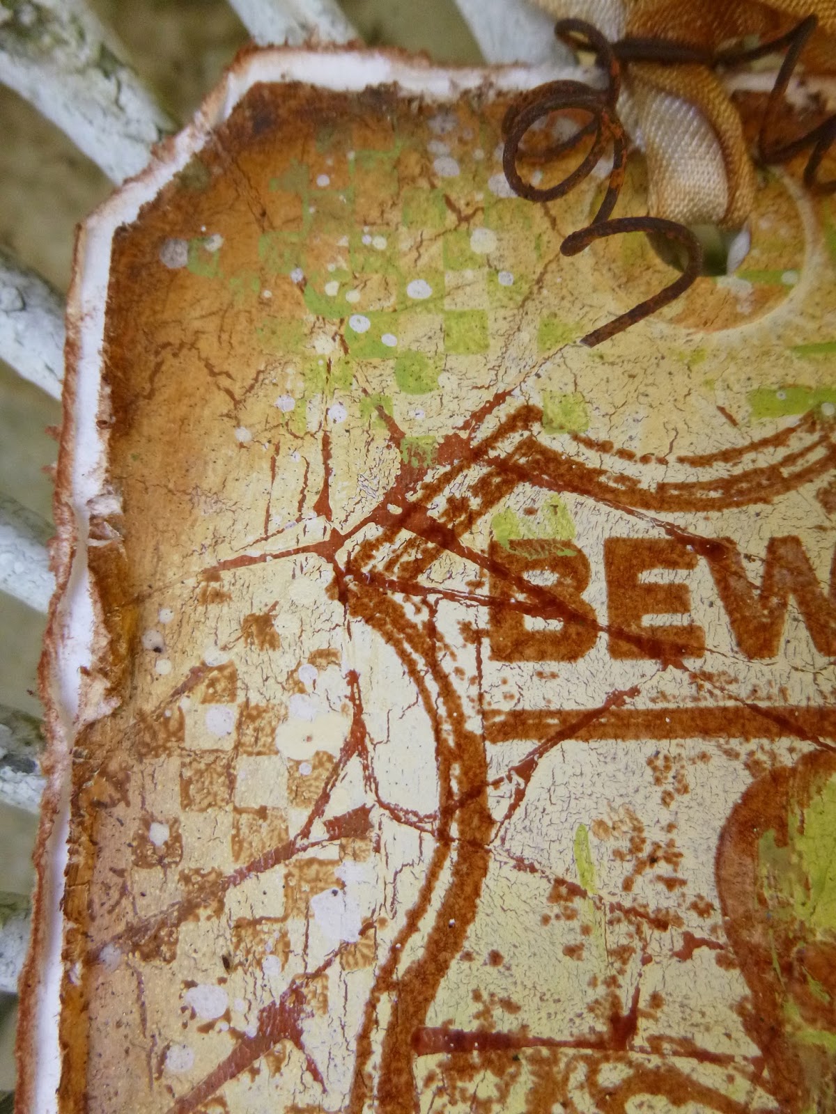
... with the fabulous Beware label and some checkerboard stamping, rusty wire and we're done.


Here's the 5x7 panel, again playing with the idea of labels, but this time without the need for bottles.


For the background, I brayered the neutral paint from the palette on to the card from the lightest to the darkest and then some Vanilla back on top, so that gets you some pretty good layers to start with.  I gave it another one with Brown Shed through the Tim Holtz Shatter stencil (hmm... you say "shatter", I say "cobweb").


I added the Danger stamp, stamped in Sepia and clear-embossed, and then I sprinkled some grains of black embossing powder in places and re-heated.  I loved the look so I added more granules in other places!


The labels are stamped in Jet Black onto Crunchy Wax Craft Paper, and I added clear-embossing powder before heating to melt the image into the wax.  I stuck them on plain white card so they would show well, and mounted them on padded tape for a pop of dimension.


This fantastic Arsenic collage stamp has also been embossed.  I have a feeling that this time I used Versamark and some Detail Black embossing powder rather than stamping in black and clear-embossing.


Same thing for the Beware label.  And Leandra wanted green accents, so she got them - some delicate shading around the skull (with Granny Smith mixed with water to make a wash - otherwise my background would disappear as all the new paints are opaque), and of course the green glass bottle in the other image.


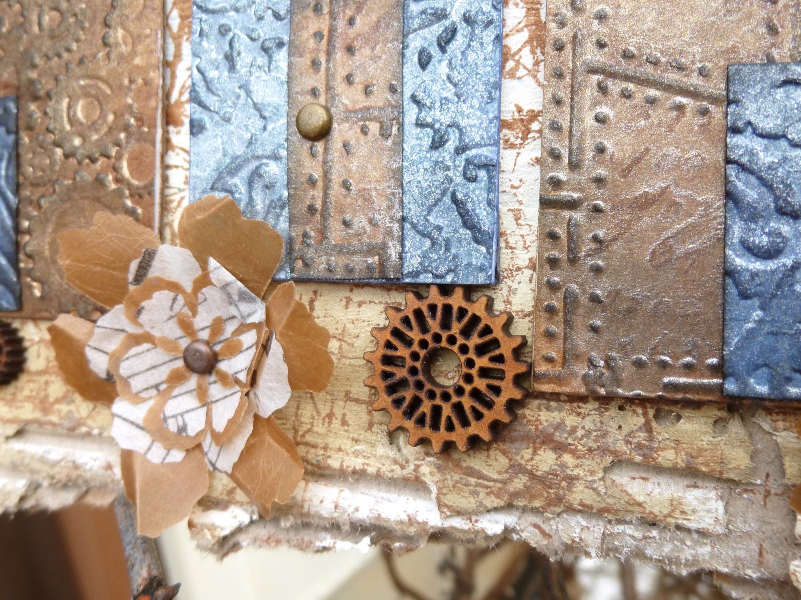
I added the Idea-ology metal bits also with a hint of bilious green added (hmm... been eating too much Granny Smith Toffee pudding!), and attached with good old rusty wire.  You can see some more of those black embossing powder "splatters" here too.


I really wanted to see what the skulls would look like in more of a bone white colour, so for this pair of tags I embossed with Vanilla White embossing powder, and I love it!


We're over a background of torn bookpage strips, painted Vanilla and with the Tim Holtz cobweb stencilled over in Brown Shed.  There's some more of the checkerboard to add another layer of interest too.


The Vanilla White embossing gives you not only the bone colour but also a lovely knobbly texture.


The labels were made in the same way as the ones for the panel, but this time I left a border of the white card around the edge to make them pop.


I do love how the book pages can be seen in the cranium of this skull!

All these creations were mounted onto thick white card to finish them off.  I really like the shabby borders, plus it also gives them just that bit more sturdiness for when they're on tour.


A bit more rusty wire around the centre of the tags as well as up at the top to hold the seam binding in place, and that's two more ready for the off.


Finally, we come to a pair of tags with maybe my favourite background of the lot.


I painted the tags in Brown Shed, applied a layer of Crackle Glaze and allowed it to dry.  Then I applied my Vanilla paint through the cobweb stencil, and I love the effect.


I've used the checkerboard and Danger stamps again to create more background layers, and used a blender to apply Sepia Archival ink around the edges.  (It's Archival for all the edging - again if they're going off in an envelope or boxes and going up on the wall, there's a chance they could get wet, so Distress would be vulnerable.)


The main images are stamped in Sepia with some Coffee blended onto the stamp too, and then clear-embossed.


I'm not obsessed - I just think it's a good way to get an image to pop over a busy background.


I got up to my credit card tricks again, adding some accents of Granny Smith...


There's even some Granny Smith checkerboarding this time (somehow I feel sure she always wins).


... and the Idea-ology Muse Tokens were altered with Teakwood alcohol ink to warm their tone a little.


Curled rusty wire at the top of the tags finishes us off, and we're (finally!) done.


It's a tough call to pick my favourite stamp from this set, they're all fantastic.  And they seem to complement each other so well... I think that's why I ended up working in tag pairs - the stamps wanted to talk to each other.  (Don't mind me - it's been a bit full on round here lately so I may be losing it slightly.)

So there's some behind the scenes details for those who want to try out something similar or are just plain nosy.  Be my guest!  It's process rather than results which always fascinates me, so I'm happy to share.  It also reminds me in the future if I ever want to reproduce the effects... 

'Tis now the very witching time of night,
When churchyards yawn and hell itself breathes out
Contagion to this world.
~William Shakespeare

Hold on, man. We don't go anywhere with "scary," "spooky," "haunted," or "forbidden" in the title.
From Scooby-Doo

Things are still cooking over at PaperArtsy - Hot Picks on Monday, Clare Lloyd Eclectica³ on Tuesday, Emma Godfrey Eclectica³ last night... who will it be tonight at 7pm?  You'll just have to wait and see.

Wednesday, 1 January 2014

Doubly Challenging

Happy New Year!  A very warm welcome to Words and Pictures, with an especially big welcome to the newest followers - delighted to have you with us for 2014!!


I'm starting off the year with a double-duty project, inviting you to join not one but two challenges this month...

First up, there's the Artistic Stamper challenge for January which is Love Is In The Air, while over at Our Creative Corner we'd like you to reveal your Shopping Sins.  

You know the ones... those crafty purchases which then sit proudly in their packaging awaiting the right moment or the right project, and somehow never get to come out and play!  You'll find all the challenge details and rules by clicking on the appropriate links.

And if you haven't yet heard all the exciting Our Creative Corner news, you definitely need to check this out - in addition to our Top Talent and Top 3 picks, there's now a prize on offer each month too.

Anyway, enough of the business - on to the project!


One of my 2014 crafty resolutions is to do more exploring via art journalling, and that's what this started out as.  But once the twigs turned up, it was clear I'd never be able to close it in a book, so I ended up mounting it on a canvas instead... Ah well, it's art journalling Words-and-Pictures-style!!


I knew the shopping sin I wanted to expiate was the beeswax I'd bought ages ago and had always put off using - "too fiddly, too messy, maybe I'll get a cheap melting pot on ebay and that'll make it easier" - until I saw a youtube clip of someone melting it right on the project with a heat tool.  Okay, no more excuses!


I didn't really have much more in my head than that when I set off - "use beeswax"... but the Artistic Stamper prompt was really helpful, and suddenly I had butterfly hearts fluttering around in my head.


I started with a piece of A4 paper from Finnabair's Sunrise Sunset paper pad by Prima.  I've been watching lots of France Papillon's art journalling videos, so I was planning to create in landscape and then cut the paper in half to stick it into the journal.


I stuck down strips of book pages and handmade paper to vary the textures and used my fingers to add gesso to most of it.


Next step was to add some colour with washes of Distress Stain... it was no more precise than "sky" and "earth" at this point.


I had the start of the words hovering in my mind by this point, so I wanted the sense of lightness and being airborne - so bubbles were the natural way to go.


I had lots of fun creating my bubbles - first with the Artistic Stamper Large Sequin Waste mask, and then adding smaller bubbles with the Large Random Dots background stamp.

I stencilled and stamped with paint and added shading to the little bubbles with a PITT Big Brush Pen.


And I suppose the idea is that the hearts/butterflies are being wafted away amongst the bubbles...


I stamped one of the Calligraphic Mats onto some tissue paper (as well as adding it as texture stamping around the "earth") and cut out some hearts using Tim Holtz's Movers and Shapers die.


With no Melt Pot, I popped my wax pellets into a disposable little metal tart tin and used my heat tool to melt them (holding the tin with some plyers).

There was plenty of "melt time" to dip in a couple of butterflies and fish them out with tweezers, and perfectly easy to re-melt whenever necessary.


Not only does the wax give this fantastic parchment finish and wonderful sheen, but it strengthens the tissue paper as well as making it mould-able.

I also used a dab of melted wax to "glue" the tiny bits of twig body on (though the twig idea only came up as a side-effect of putting the twig trees on - so that came first!).


Somehow the shape of the paper strips in the bottom corner turned into trees in my head, so I added a bit of stronger colour and texture in the form of corrugated cardboard, leftover wax paper from some bread and the twigs that were lying around on my table.


Once they were in place, I just scattered some more wax over the earth and trees and used the heat tool to melt/glue them.  Again, I think the sheen is very cool - hard to capture in a photo, mind!


The words had, by now, formed themselves into the finished phrases, so I stamped them on some more of the handmade paper, inked them and distributed them around the sky and the earth: when love takes flight, open your heart and fly too.


Much as I love the twigs, they are the reason this page will never be part of my art journal.  At least that gave me the freedom to stick my butterflies wherever I like, rather than worrying about where I'd be cutting the page in half!

Instead, I grabbed an A4 canvas and gave it a rough coat of French Roast Fresco paint around the edges, topping that with some Sepia Archival ink, applied directly from the ink pad.


And once glued down, I had the chance to do lots of tattering of the page edges for extra texture and dimension!


So, I hope this will inspire you to join in with at least one of these two challenges, if not both!  Remember: at Our Creative Corner, we'll need to see and hear about the Shopping Sins you've used on your piece; or for the Artistic Stamper challenge, show us how Love Is In The Air for you (I don't think you have to take it quite as literally as I did!!).


I hope that 2014 brings you health, happiness and all good things.  I'm looking forward to whatever's next!

We will open the book. Its pages are blank. We are going to put words on them ourselves. The book is called Opportunity and its first chapter is New Year's Day.
Edith Lovejoy Pierce

Sunday, 7 April 2013

Where the heart is...

Hello all!  Hope you're all having a good weekend, with plenty of crafting, or time for whatever else it is you enjoy doing...

Today, I'm delighted to be offering Guest Design project for the April Stamping Sensations challenge Special Occasions (other than birthdays).  I was lucky enough to win there recently, and - along with some fabulous sticky candy - this is my reward.

Because it's uppermost in my mind as a theme (what with ongoing house sales as well as dollshouse renovations), I ended up with Moving House/New Home as my special occasion, and this is the corrugated hanging which arrived on my craft mat...


Once again, I ripped up a cardboard box to get my substrate (I think this one was from my mother's new log basket!), and tore off some of one paper layer to get at the fabulous texture underneath.  This time, though, I did leave quite a solid "canvas" of smooth surface in the centre, so that I could paint and stamp on it.  It's about 12.5 x 8 inches in size.


I had great fun creating the background with Distress Paints - they do blend really deliciously with a spritz or two of water - over an initial coat of gesso.

Of course I made sure to leave lots of corrugated card still showing round the edges for a good shabby chic look.


I've got limited DP colours at the moment, but I've started out with my favourite blues and browns - as well, of course, as the vital Picket Fence - so they work well for sky and ground!

I added some stamping with Tim Holtz texture stamps from the Ultimate Grunge set - bubbly dots to the sky, gridwork to the ground.


I also had a lovely time playing with lots of inks, sprays and my embossing folders to create my little houses.

There's even some stamping on some of them...


Since we were on blues and browns I stuck with those colours, inking up cardstock with Distress Inks before running it through the BigShot with various embossing folders.

I inked again to highlight the emboss, and then I did lots of spritzing with Perfect Pearls Mists to get a metallic patina on the surface.


You can see the sheen in some of the photos, but the day was pretty overcast sadly - if we ever get any sunshine ever again, I might update with a nice sparkly, sunny photograph!


The houses are cut, of course, with Tim Holtz's Artful Dwellings die.  And I hand cut the doors with some of the leftovers.  The tiny door handles are, of course, Idea-ology fasteners - they turned out to be just the right size!


At this point, everything sat there for a few days while I tried to work out what else was needed.


I knew I wanted some shabby chic lettering: New Home seemed appropriate... so I cut some more
of the corrugated card with the WordPlay die, and then gave the letters a good layer of Picket Fence Crackle Paint.

Once they were good and dry, I added some inky definition to the cracks.


Then I started toying with embellishments and some Tattered Flower die-cuts and gradually all the extras took their places.

I used alcohol inks to re-colour some of the metal gears, so that they'd fit in with the palette of the piece.


And I added some of the lovely little wooden cogs I got a while back on ebay.


The flowers are layered wax paper and tissue wrap (you've seen similar ones here - those were the leftovers from this, but they ended up posted in a different order!) with some more fasteners at the centre.


I added some Creative Expressions skeleton leaves, moulding them slightly for extra dimension.


There was still something missing, and that's when I reached for possibly my favourite stamp set, the Silhouette Blossoms by Stampology.  I added some "trees" - thorny but beautiful - between each of the houses... love these stamps!


The final touch was to make sure that Home really is where the Heart is...

I used the alcohol inks again (Gold and Hazelnut mainly) to alter one of my silver heart charms.


I bought quite a few of these for a song on ebay, so they're ripe for altering to match anything else that's going on.


A bit of hole-punching, some Distress Stained twine to hang the whole thing up by, and we're done.

I had such fun creating this... I had a lot of notice of the challenge theme from the lovely Brenda, so I was able to let it all bubble along nice and slowly - returning to play about with it whenever I had a spare few minutes, and overall I'm very happy with how it has turned out.

I hope you'll pop over to have a look at the fabulous inspiration from Brenda and the rest of the Design Team at Stamping Sensations, and perhaps play along.  You'll find all the challenge details here.

For now, I'll wish you all a great week to come and, if we're lucky, Spring may finally arrive!


May your home always be too small to hold all of your friends.
Anonymous

Home is the nicest word there is.
Laura Ingalls Wilder

He is the happiest, be he king or peasant, who finds peace in his home.
Johann Wolfgang von Goethe

I'd like to enter this in the following:
At Try It On Tuesday they are playing a Recycling theme - I'm back on the cardboard boxes!
Tando Creative Challenges are looking for New Beginnings this month
At the Stampotique Designers Challenge they are looking for Flowers, stamped or 3D - how about a bit of both?!
At Unruly Paper Arts, Reader Art Quest 2 is for Gears
Ah, go on then... one more for the Very Strict Challenge at Simon Says Stamp and Show