I'm travelling into a new way of working, a new country, a new language, and a new hobby which I'm passionate about. Come with me for some of the journey...

Showing posts with label Ferro. Show all posts

Monday, 4 February 2013

Rabbit, Rabbit, Rabbit

Hello all, and welcome (back) to Words and Pictures, and an especially big welcome to the new followers - thank you so much for joining the journey.  And I'd also like to say a really big thank you to you all for taking the time to visit my butterfly mobile at The Artistic Stamper - and for saying such nice things about it!!

I'm sharing a Design Team piece today, a triptych inspired by the wonderful images from Nicecrane Designs, and since it's also inspired by a story I grew up on, happily it should fit right in with Simon Says Stamp and Show's new challenge, Ever After.  The timing of that challenge coming out particularly pleases me, since when I made the frames weeks ago I said at the time that they felt like Fairy Tale frames to me... I just didn't know what went inside them at that point!


This triptych uses images from the Always Peter Rabbit set which you can find here.  I've only used three of them, but the set includes eight beautiful reproductions from The Tale of Peter Rabbit.  Or you can go for the Peter Rabbit Save Pack, which gets you lots more pictures for your money.

Sadly, you won't be able to purchase the Beatrix Potter images if you are in the UK because of copyright issues, but everyone else in the world is allowed to.

But there are thousands of other gorgeous images available at Nicecrane, so you'll be sure to find something lovely to play with.


I'm a huge Beatrix Potter fan.  I grew up on the Tales, particularly loving the illustrations.  And if you've never seen the enchanting film of the Royal Ballet version of the tales, with extraordinary masks and costumes to die for, then I can only suggest that you hunt it down immediately!  I've found you a little taster to tempt you.


I only found out much later that she was also a respected naturalist, gaining recognition from the scientific establishment for her work on fungi - not only for her mycological illustrations but also her research into how fungi reproduce (no mean feat for a 'mere' woman in the 19th century).

Some of you may remember these Cabinet die frames from my workdesk a few WOYWWs ago...  They've been hanging around ever since, waiting for the right project to form around them.


The colours in these illustrations seemed to be the perfect fit - though looking at them next to the Nicecrane preview, it seems my printer may have been having a slightly green day!

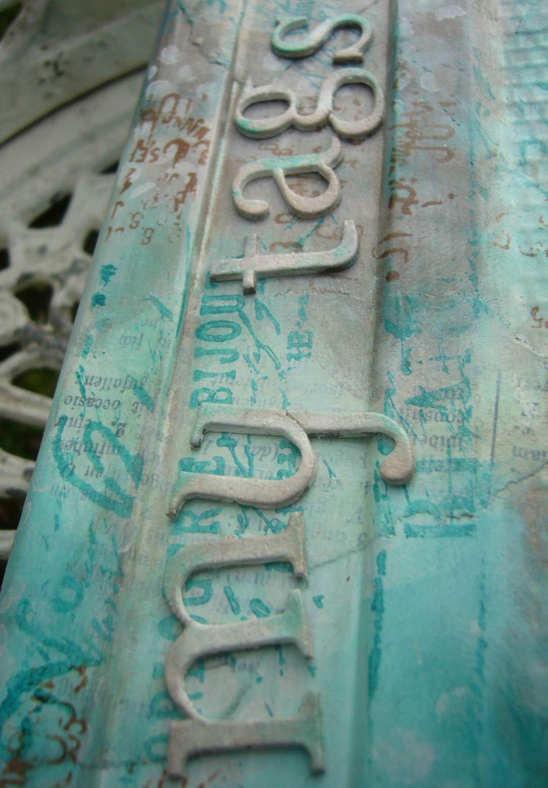
The frames first had a layer of Ferro texture paint, roughly applied, and then coats of paint and ink and Treasure Gold.  I used one of the small stamps from Tim Holtz's Nature's Elements set to add some ivy/mossy texture over all my other layers.  I'm quite pleased with the stony look of them.


I cut another three large Cabinet cards out of chipboard and gave them a coat of acrylic paint, sand and white mixed together straight onto the chipboard.

I used one of the lovely grasses from the same stamp set to add some detail to these panels, stamping in Coffee and Sepia Archival.


On the reverse, I stamped some woodgrain using one of the brilliant Kaisercraft stamps, tapping the same two Archival inks onto the stamp so that the colour varies across the panels, and blended on some Gathered Twigs DI for a more rustic look.

I cut two hinges from the Hardware Findings die out of Grungeboard, and inked them up with a mixture of Gathered Twigs and Vintage Photo inks and stains.


The beauty of Grungeboard is that it is flexible and mouldable, making it perfect for doing duty where there's going to be movement involved.

I used Pesto alcohol ink to colour a few of the Idea-ology fasteners and attached the hinges.

I even remembered to make sure that the attachers would be coming through behind the illustrations, so that they wouldn't be showing on the other side!  And, of course, that had to be done before sticking down the images.


And then I began to assemble my triptych.

There are twiggy hearts and mulberry paper flowers, and some more of my favourite wooden flourishes from Crafty Emblies.

It took some juggling to arrange them all to my satisfaction, but eventually I got out the Glossy Accents and glued everything in place.


The illustrations are mounted on padded tape, both to give them extra prominence and to keep them clear of the ends of the attachers which are coming through from behind.


I deliberately selected images where the rabbits aren't dressed in clothing, because I wanted to stick to the natural colour palette, but I know I'll be coming back to this set for another go - it's so lovely to work with.

And Nicecrane Designs also has several fabulous Beatrix Potter clipart sets, where you get a whole variety of characters from the Tales to play with - you may well see some of those soon too!

Since they're digital sets, you get them immediately, so you could use them to join in a few of the challenges I'm entering with this project - lots of furry themes have fortuitously all bobbed up this week!


For now, thank you so much for your company - so much appreciated - and I hope to see you again soon, either here or elsewhere in Craftyblogland.

I'm entering this in the following:
Simon Says Stamp and Show are looking for inspiration from stories and tales in Ever After
PanPastel UK are looking for Animals
Stamping Sensations are playing with Fur and Feathers for the whole of February
Hels Sheridan is offering Animal as the prompt for the Sunday Stampers over at Ink On My Fingers
And I don't know whether it's the done thing for a Guest Designer to enter the monthly challenge at the same time, but at the risk of being disqualified, I'd like to enter it for the Hearts and Flowers challenge at The Artistic Stamper too!


I cannot rest, I must draw, however poor the result, and when I have a bad time come over me it is a stronger desire than ever.

There is something delicious about writing the first words of a story. You never quite know where they'll take you.

For quiet, solitary and observant children create their own world and live in it, nourishing their imaginations on the material at hand.

Beatrix Potter

Thursday, 17 January 2013

Beautiful things

Hello all and welcome to Words and Pictures... I'm so happy you've stopped by.  As promised, I'm following up with my second "lacy" altered box... and this is the one I'm really happy with.  The idea arrived as part of a DT project for which I needed to use particular papers, but even as I was making it I knew that this one had to happen, so here it is:


And for anyone who'd like a quick "before" shot...

This huge cigar box (13 x 8 x 2.5 inches) has been around for I don't know how many years, as you can probably see from its slightly battered state.  (Cuban cigars, and according to the label on the bottom it came from Selfridges - can you imagine how much that must have cost?!)


Anyway, as I said yesterday, I'd been mulling over ideas for the Simon Says Stamp and Show challenge which, this week, is Lace Love.  I'd already thought of using the Tim Holtz Vintage Lace Decorative Strip Die, which was one of the very first dies I bought, and is still one of my absolute favourites.

I was also working on a DT piece for the new eclectic Paperie challenge which is Altered Boxes, and the two just sort of collided.

And as soon as I'd finished the tiny box with coloured lace, I moved straight on to this.


I seem to be on a stash storage kick - not surprising, given the house clearing I'm really supposed to be doing at the moment - but honestly, this is helping!

After last week's altered tag tin, this week I've created storage for my "beautiful things" - lace, special ribons and flowers.


I already have great boxes that all my metal and wooden bits and pieces are sorted into, and I do have a small box for ribbon reels, but all the "soft" stuff has just been in various carrier bags and baskets, so it was time they had a home.

So here's how it came together.


I gathered some papers from the Kaisercraft Timeless collection with delicate motifs in neutral colours - text, music, flowers - as well as some plain white cardstock, and set to work with my trusty BigShot.  Here's the lacy chaos which ensued!

Then I had to painstakingly sit with my tweezers making sure that all the punched holes had been fully punched - for once, I actually had the television on whilst crafting... but this really didn't require much brainpower or mindfulness!


Next, it was out with the Vintage Photo DI and the blending tool.  Every strip got a touch of inky distressing.

Once that was done, I spent quite a long time arranging the strips in a sequence that worked to show them off to the best possible advantage.


(For anyone who cares about such things it's a strict rotation of the three lace patterns; alternating white/pattern; and making sure it's not the same pattern twice in a row.)

Obviously I then made sure they weren't going to get mixed up again while I got busy with the rest of the altering!


The first stage was a good coat of paint, of course, then I could start to play...

For the exterior walls of the box, I decided to use my "laciest" stencil to do some textured lace around the base.

So I started applying Ferro through the Crafty Individuals Beautiful Border mask, but I hadn't gone very far when it became clear that it was a bit too stiff and unwieldy for such a delicate design.  I switched to the DecoArt Decorating Paste, and that was much easier to apply.


I did two sides and then read the label to see how soon I could do the rest, and it said 4-12 hours drying time - well, blow that for a lark!  No patience, me, I'm afraid - so I very gently used the heat tool, and that seemed to do the trick with no problems.  I was careful not to overheat each area, so as not to get the puffy blistered effect - not what I wanted today!

Once it was dry, I went over the whole box with Snowflake Fresco paint.  You can't beat the shabby, chalky effect the Fresco paints give you, and it's also great for stamping on which, as anyone who knows me will tell you, is pretty likely to happen at some stage of a project!


Next up, Vintage Photo DI again... blended onto the textured areas, and around the corners and edges to distress them.  I love that the slightly battered, worn look of the box is accentuated by the inking.

And I did indeed do some stamping, using my favourite script stamp from the TH Apothecary set, stamped in Frayed Burlap DI.

Leftover strips of lace were pressed into action along the top edges, and that was that for the walls.


The most time-consuming part of the whole process was the sticking down of the lace strips on the lid... trying to keep them straight, trying to get them the perfect distance apart so that they overlap but are still showing off their best bits and so on.


I used the Studio Extra Time Slow-Drying multi medium - it gives you lots of time to lift and replace so that you can make sure your alignment and positioning is exactly how you want it.

I used it to give a couple of coats over the top of the whole lot to give it some durability, and a bit of protection to the lacy edges.  But the long drying time also meant that, even after those coats, I was able to run a knife under the tips to lift them for the dimensionality and movement I wanted to create.

And, I have to say, as you do the first few rows it doesn't look like anything very much, but in then end I think it's absolutely worth the hassle!


I added a twist of crinkle ribbon (uncrinkled), attached to the inside of the lid using some spare lace, so that there would be a tag to get the lid open easily.


Even though I didn't crinkle it, it got a little sweep of Vintage Photo DI, of course!


I wanted some dividers for the interior, so I took some more of the same Kaisercraft papers and covered pieces of cardboard (old packaging) which I'd measured and cut to the required sizes.

I decided not to repaint most of the inside, as it's already got a soft, weathered paper lining.


But I did add a bit of matching trim to the top of the back wall.  I thought of doing that to the side walls again, but realised that it might well interfere with the closing of the lid.

Then it was time to decide what to do with the inside of the lid...


This had an embossed label, like the one on top, and I was delighted to see that, even after my shabby chic coats of paint, there was still some of the embossing showing through - so I had to take advantage of it!


I buffed over the whole area with some Vintage Photo DI, and then used Treasure Gold in White Fire to highlight some of the raised areas.


I used the script stamp again, and added my favourite Stampology floral corner in Coffee Archival, but there was still something missing.


Ah... words... and it didn't take long to find the perfect Tim Holtz sentiment - what could be better for a box of beautiful things?!

And, of course, one of the best things is that I was able to provide very precisely for my storage needs... the right size and shape compartments.


I do realise it means I have to use some of it before I can buy any more, but I think that's probably all to the good!

For now, I'm just happy to have it all out of the random plastic bags and in one place where I can find it and access it easily.  That it all looks so pretty is simply a lovely bonus...

Do check out the Altered Boxes challenge at eclectic Paperie, hosted by Marjie Kemper, and with a great prize on offer!


Thank you so much for spending some time here today - I'm so grateful for your company and your feedback, and I look forward to seeing you again soon - either here, or elsewhere in Craftyblogland!


I'm entering this in the following:
Simon Says Stamp and Show who are playing Lace Love
Our Creative Corner have a Shabby Chic theme
At Happy Daze they would like us to Recycle It 
At the Allsorts Challenge they are asking to see Dies and Punches


Have nothing in your house that you do not know to be useful, or believe to be beautiful.
William Morris

Sunday, 13 January 2013

Upcycling and Repurposing

Hello all, and a very happy Sunday to you...  I'm sure those at CHA will be having a very happy time browsing all those amazing new goodies we've been seeing the sneak peeks of!!

In the meantime, back home, and saving up pennies to be able to get hold of some of them, I've been doing some recycling or upcycling or repurposing or whatever the heck we're supposed to call it now - turning something old and unwanted into something useful and, I think, beautiful.

When I met up with the fabulous Buttons at the NEC, I loved her little travelling container she had for her tag samples, and I've been meaning to sort one out for myself for some time.  I decided that rather than buy something, I'd convert something instead - so I grabbed an old biscuit tin that had been lying around at work not doing anything for anybody.  It was in the shape of a transistor radio, so I decided to embrace the possibilities of this unused and, in my opinion, rather ugly tin... and so here's my new tag storage:


Oh, and in case you were wondering, here's a quick before and after:


The transformation was inspired by the glorious work Leandra does with the PaperArtsy Fresco paints... lots of layers and blending and stamping to create the new look.


I started by giving the whole thing a coat of gesso, to give it some tooth, and then tore up some book pages and applied them randomly over the surface.


I love the Gothic typeface in older German books, and since I'm lucky enough to have friends over there, I'd roped them into the search for some Gothic print books I could rip up in the service of crafting.


The next step was to apply some Ferro through the lovely vines of the Leaf Swirl Border mask from Imagination Crafts, and dry it with the heat tool to make it puff up.


This was another tip of Leandra's at the NEC; what's actually happening is that the paste is blistering slightly, but it gives a fabulous additional dimensionality and shape to the leaves.


Then I started in with building my layers of paint.  Rather than a brush, I used squares of Cut'n'Dry foam to apply my colours, layering and blending until I ended up somewhere I was reasonably happy with.


Still on my turquoise kick as you can see... but this time blended with some of my more traditional neutral browns.

I used Versamagic Chalk inks as well as the Fresco paints to create the highlights on the vines.


Even though some of the paints are translucent, this many layers meant that the book text was getting pretty obscured, so I took a baby wipe and rubbed back a little to re-reveal my lovely Gothic font.


Next step was stamping.  I started with the Tim Holtz dots from the Ultimate Grunge set with some Snowflake Fresco paint and randomly dotted it around the tin (well, they're dots, they should be dotted around, don't you think?).


Then, the gorgeous French script from the Papillon set - and that I chose to stamp in the Inky Pool Fresco paint.  This is a much stronger colour, but it's also slightly translucent, so it gives a gorgeous clarity to the script without necessarily obscuring what lies beneath.


The final bit of stamping was the numbers, again from the Ultimate Grunge set, stamped in Coffee Archival, to pick up and echo the brown tones from the background.


On the base of the tin, I did a complete book page collage to cover the space efficiently without using too much of my precious Fresco paint!


The lettering is from the Grungeboard minis, though I had to make my own Y by adding together a trimmed U and a trimmed J, as I'd already used both the Ys ages ago.  Anybody remember Only You?  Well, there you go, two Ys used up right there in the title...


The letters also got the painty chalky treatment, and then I played around for a while with the placement, before deciding it was silly not to make the most of the shape of the tin by using the "tuning" bar as the place for the main title.  I couldn't go over the top with embellishing as the plan is for it to go in and out of bags - it has to be practical - so I left it at that.


In these pictures, you can also see the lovely texture from the original tin casing coming through... the honeycomb of the radio "loudspeaker".


So that's my old unwanted biscuit tin, now a very useful travelling case for samples, and highly desirable... to me at least - which is fine, as I'm the one who'll be using it!

Since it's intended to travel around with me, I thought I should probably seal it so that it has some protection when I'm on the move.  It did slightly alter the rather lovely chalky look of the thing, but I'd rather that than have it gradually chip off, which would be very sad!


Sorry that it's been another long post... I really do try to keep it down, but there's always stuff I want to share with you - as well as keep a record for myself of how I've done what I've done, so I do thank you for bearing with me.  I wish you a lovely rest-of-Sunday, and hope that you have a great week out there in Craftyblogland!

I'm entering this in the following:
Simon Says Stamp and Show want us to Embrace the Old - I've embraced it and made it all new again
Happy Daze are inviting us to Recycle It for the whole of January
Our Creative Corner are looking for projects which are Shabby Chic Style - I think it is?
Unruly Paper Arts are looking for some Joie de Vivre - keeping my tags in this tin as my "gloat box" will certainly be joyous, but most important is the joy which crafting has brought into my life.  And for a little Gallic touch... well the Papillon script stamp should do

Joy is not in things; it is in us.
Richard Wagner