Pages

Monday, 27 June 2016

Tic Tac Toe with Simon Says Stamp

Hello all!  It's time for my final project in the Designer Spotlight at the Simon Says Stamp Monday Challenge this month.


It's been an honour and a pleasure to play alongside the fabulous SSS Design Team.  Many thanks to Lols and all of them for having me - I've had an absolute ball!  So to reveal the final challenge theme of June...


... and I'm very happy to say it's a Tic Tac Toe board - one of my favourite crafty games to play.


As you can imagine, there's a wide variety of inspiration on display over at the Monday Challenge blog, depending on what line everyone has chosen.  I played with the diagonal Spray/Stencil/Stamp, and here is the journalling spread I came up with.


I played in one of my favourite journals - an altered book made in the class I took with France Papillon ages ago (which it suddenly occurs to me I haven't shared with you at any point, so I'll try to do that some time soon!).


I started by putting some texture paste through the Tim Holtz Blossom Layering Stencil, and then added Vanilla White Embossing Powder while it was still wet.

I heat dried it to get it to emboss and bubble with the paste underneath for lots of funky texture.  It also has quite a glossy shine to it.


I spritzed Tumbled Glass and Stormy Sky Distress Stain Sprays around the cloudy blossoms (or billowy clouds - I still can't decide whether they're blossoms or clouds, to be honest!).


I also unscrewed the spray lids and used the inner tubes to flick some inky colour around - Broken China was added to the mix at this point too.


So, I've already got two out of my three Tic Tac Toe ingredients in play... time for some stamping!


Lots and lots of layers of wildflower and meadow grasses using two of my wood-mounted Tim Holtz stamps - Twigs and Dried Flower.  I used the same designs in the small clear stamp version too.


You'll see that under all that Olive and Leaf Green Archival stamping, there's also another stencil in action - the Tim Holtz Wildflowers done in Peeled Paint Distress Ink.


Now that I'd fulfilled the Tic Tac Toe rules, I was free to go in any direction with the rest of the pages.  The Layered Dragonfly seemed like the perfect inhabitant of such a summery meadow.


I made the first cut out of plain card, and dipped him into Peeled Paint and Mowed Lawn Distress Stain on the mat.


Once the body was done, I added Tumbled Glass, Broken China, Stormy Sky, a hint of Wilted Violet and a little more of the greens to the wings.

The top layer was cut out of leftover acetate packaging and run through the accompanying embossing folder.


I didn't want to lose my lovely inky splotches and blotches when I glued down the acetate, so I sealed the inky dragonfly with Micro Glaze and let it dry before adding my Glossy Accents to attach the top layer.

I love how he catches the light, shimmering in and out of view. 


I used a wire stem cut from a paper flower to give him his lovely curly antennae.


The fabulous Wildflower Thinlits are here again... very simply done.

They're cut from plain white card and I used the same Vanilla White embossing powder as on the clouds of blossom at the top of the page.


It gives them a shimmering gleam in the light, perfect for attracting the eye.


I had some trouble figuring out what else belonged on the page, but while idly flicking through the Found Relatives Occasions vintage photos, I found these children playing in a meadow full of wild flowers and grasses... sold!


I distressed the photo edges with my distressing tool, and added some Vintage Photo DI (of course).

There's also some Vintage Photo around the very edges of the pages to give an aged look and draw the eye inwards.


Perched right on the edge of the photo is a butterfly made in the same way as the large dragonfly, only he was cut using the TH Large Butterfly Punch.


I wanted the inky colours to echo across the two pages, and I love the dimension from the fluttering wings.  (You have to pay attention when you're shutting the book, but it can be done!)


And this is Words and Pictures so there have to be some words... back to the fabulous Small Talk Stickers for those...

(And some Tissue Tape adds detail and movement underneath.)


I think the two girls definitely believe.  I'm not so sure about the boy... but I hope he'll get there.


I do hope you've had a relaxing time wandering through my summer meadow, and maybe even found some magic along the way.  I had a really lovely time creating it.  If you fancy following some of my footsteps, you can click on any of the links in the text to go shopping straightaway!  One final shot of the flash of sunlight as the dragonfly darts past... I love how much light dances around these pages.


I'm sure the Tic Tac Toe board will fire your creative juices too, and I look forward to seeing what you come up with over at the Simon Says Stamp Monday Challenge.  As always, there's a generous prize voucher on offer from Simon Says Stamp.


Simon Says Stamp

So thank you again to SSS for having me.  I've really enjoyed the June challenges, and I hope you have too.  Happy crafting all!

And above all watch with glittering eyes the whole world around you because the greatest secrets are always hidden in the most unlikely places.  Those who don't believe in magic will never find it.
Roald Dahl

The world is full of magic things, patiently waiting for our senses to grow sharper.
W.B. Yeats

Monday, 20 June 2016

Wallflower Dreams for Simon Says Stamp

Hello all!  Monday again, and time for another project in my month in the Designer Spotlight at the Simon Says Stamp Monday Challenge.

I'm afraid there's not much going on other than these Designer Spotlight projects, though I do hope you'll come and celebrate my fourth blog birthday with me.  But now it's time for the new theme for this week...


We're playing with Patterned Paper this week.  Like many crafters, I have a large stash of beautiful papers - much-loved, often-stroked and sighed over, but seldom used in my crafting.  Last week's Travel Journal was the exception rather than the rule.  But it's great to be nudged into using them so I got out my Tim Holtz Wallflower Paper Stash - one of my absolute favourites - and created this mini-album.


You've seen variations on this construction here at Words and Pictures before (you may remember The Business of Men).  All those lovely pocket pages are less glamorous than they might appear... the basic structure is made out of empty toilet rolls.


I did have a "before" of them all squashed flat and ready to be covered but it seems to have disappeared so you're just going to have to believe me!  And I'm sorry but you'll need your cups of coffee/glasses of wine at the ready for another photo-heavy journey I'm afraid.


I had to create the binding and covers for my toilet roll pages, and I did that using strong kraft card folded to hold the pages with another piece of the same card folded around that as the base of the covers.


I then cut some really sturdy card for the front and back and glued it all together to give the album some real strength and heft.


Then came the lovely business of choosing papers to cover it all.  Since each toilet roll pocket has a tab cut to go inside it, you have lots and lots of surfaces to deal with.  Here are the inserts - one side...


... and the other.  These papers are from the brilliant pages at the back of the stash where there are ATC-sized pieces ready to go.  Since the inserts are pretty much exactly ATC-sized, that made life pretty simple!


Since I wanted each open page spread to have some continuity I had to pay attention to my fronts and backs.  And the inner covers needed to match the respective first and last pages.


But let's not get ahead of ourselves.  First, I'll show you the cover, and then we'll make our way through the album.


The cover has one of Tim Holtz's Idea-ology Timepieces, altered with Pitch Black alcohol ink and Treasure Gold in Florentine.


I also added one of my much-loved WordBands and a vintage pen nib over some sticky-backed linen ribbon (I think the new Textile Surfaces would probably be very similar), which I think has the right sort of elegance to go with this beautiful paper.


That linen ribbon goes all the way around to the back.


It's all one piece of paper, it's just that the design on that particular page changes around here which I rather love.

Now, to the inside...


So let us meet the first of our women, chosen for their "off-camera" looks - not a direct gaze, but each looking at or towards something out of our sight.


You can probably guess how much the continuity from the inside front cover pleases me here!

The dreamy look in her eye seemed to fit the words.


The collages are essentially very simple - there's the Photobooth photo, a punched butterfly or two, a couple of paper snippets, and various love letters, postcards or envelopes cut from the incredibly useful Idea-ology Pocket Cards.


Next page has the butterfly motif in the backing paper, and a slightly different atmosphere though the collaging follows the same pattern.


And since we now have a double page spread, there's a small echoing collage on the opposite side.


There's a slightly forced quality to this woman's smile, I think.  Those teeth look slightly gritted... perhaps with determination to keep moving forward, or perhaps she just shares my wariness of photographs being taken.


The next page is warmer and more colourful, with an optimistic young woman looking forward to whatever is ahead.


I even yielded to pink(ish) butterflies.   (Well, I have been embracing pink lately...)


Oh, each collage has a couple of metal elements too... I forgot about those in the list above.

There's the odd Philosophy Tag or Muse Token, some skeleton leaves.  Most of the metal was in the Antique Brass finish, the golden toned one, but I added some Florentine Treasure Gold for an extra warm glow.


I love this woman with the gentle gaze in her eye and the determined look to her lips!


The papers here were in very delicate neutral tones, but you'll see I did a bit of Peeled Paint Distress Stain shading around the elements.  I think it helps draw the eye in, and it also ties the pages together.


She's clearly been receiving a lot of love letters lately, and I think she's definitely ready to follow her heart.


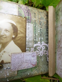
I'm particularly fond of the woman on the final page - there's a light in her eyes which makes me think she'd be fun to have a conversation with.


She's got a keyhole from the Locket Keys set as her metal element, and a Purchaser's Receipt tucked away - what's she keeping hidden?


Here she is with the inside back cover opened out, also with a bit of Peeled Paint added to make it tone in better.


Another thing I forgot... each page has a strip of "lace", cut with the Lace Thinlits dies out of other papers from the Wallflower stash.


Oh, except one of them is cut with the Vintage Lace Decorative Strip Die.  The snippet had been sitting around on my craft table for months so I thought it was time it was pressed into service.


The words for each woman are Small Talk stickers, of course... strong affirmations to go with these strong women.


Can you tell I'm not up to my usual post-writing self? .  Sorry I keep forgetting things, and I'm sorry if it's not as coherent as usual... there's just too much going on at the moment!


All the page and insert edges are inked with Frayed Burlap - a colour which tones with these papers just perfectly.


I didn't particularly pay attention to which insert went with which page...


It's only on this one that I made a conscious effort to get the pink tab inside the pinkish-toned page.


It's a happy accident that we discover what (or should I say who) might have put the smile on the face of our final woman!


The File Tabs on each of the inserts come in a nickel silver finish originally, so I spent some time with PaperArtsy Fresco Finish Paints in Old Gold, White Fire and Little Black Dress to change them to a more brass/gold look.


The final touch was to add some Florentine Treasure Gold, helping them tone in with the other metal accents in the album.


So I think I've covered everything... though given how much I forgot on the way, there's bound to be something I've left out.  I know they're very long posts at the moment, but since it's only one a week, I'm hoping you'll forgive me.


I hope my Patterned Paper mini-album will inspire you to come along and play this week at the Simon Says Stamp Monday Challenge.  If you're in need of more inspiration just check out the amazing projects from the Design Team, and the usual generous prize voucher from Simon Says Stamp should add the final nudge if you're still reluctant to break into that paper stash!


Simon Says Stamp

Thanks so much for stopping by today.  Believe it or not, I'm back in NYC this week, so I'll try to do some visiting in between workshops.  Hope to see you soon!

Maybe she was a wallflower.  There was no shame in that.  Especially if one enjoyed being a wallflower.
From The Secrets of Sir Richard Kenworthy by Julia Quinn