Pages

Friday, 29 May 2015

Alcoholic Butterfly


Hello everyone!  No, no, don't panic, this isn't some kind of soul-baring post... it's not me but the butterfly on the tag who's an alcoholic - made with alcohol ink, that is to say!

It's a long month this month, so we've time to squeeze in a Tag Friday of inspiration for you over at A Vintage Journey.  You'll find a wealth of Tim Holtz-inspired tags created by my amazing team-mates if you hop over there, but before you go here's what I'm offering up for you.

You'll notice it carries on the variations on a theme which I was obsessed with a few weeks back.  Well, given a bit of free playtime, it turns out I'm still obsessed!  I really didn't plan on the tag going in this direction, but suddenly there I was.


It's those Harlequins that get me - and the blue green shades of course - can't seem to get off that particular ride, unless it's to go neutral.

(I am starting to be tempted out of my comfort zones though - as you'll see if you check out my new Colour board on Pinterest.  It gives me huge delight just to scroll up and down through the rainbow of possibilities there... maybe one day!)


And I find myself heading for translucence and reflectivity too - there's something about how things catch the light that I find endlessly mesmerising (witness my new Glass board on Pinterest too!), so there is plenty of clear-embossing involved, as well as Glossy Accents to highlight some of the Harlequins.


In fact, clear-embossing was almost the first layer.  I sponged Versamark ink through the new Tim Holtz Typo stencil (love this grungy alphabet) onto some Distress-inked watercolour paper and used clear embossing powder.


Then I gave the whole thing a wash of white paint, wiping the clear resist letters clean as I went.

When I cut it with the tag die I was a bit careless about the positioning of the die, so I ended up with a slightly off-centre alphabet.


No problem - I grabbed the tiny hearts from the Watercolour set and inked them up for the first time.

I used blue and green Distress Ink shades and again clear-embossed them for a touch of sparkle.


I created a second tag in colours to complement the first so that I'd have something to play with when I got to the Harlequin cutting, and eventually layered the two together.


I cut some extra diamonds out of the bit of the underneath tag that you can't see, so that I could layer additional pieces in the gaps.  And then, as I say, I got busy with the Glossy Accents.

So, the tags were going well, but I needed a focal point... so here comes the butterfly.


I cut and embossed the Butterfly Duo in Clearly for Art Whiteout, and then had great fun dripping alcohol inks onto the surface.  (I cut both butterflies, so I had one to practice on.)


This is definitely one of the most psychedelic butterflies I've ever created, but I do think he's rather splendid!  Love how the alcohol inks pool and resist and blend... great fun.


And he gleams rather nicely in the sunlight too.


I can't think what we did before these wonderful Thinlit word dies came along - they're just perfect to add a word or two to a tag.  (These are cut out of a bit of card leftover from some previous blue-green project.)


I wanted a touch more stamping detail so I added some ornate flourishes, just to give the sense of a swirl of movement, maybe from the butterfly alighting.

Plus you have the gleam reflecting off the original stencilled, clear-embossed lettering, which means everything shimmers as you move the tag around.


Thanks so much for stopping by today, and for all your lovely comments on the sudden flurry of projects over the last week or so... it's certainly been busy here at Words and Pictures.  Do go for a quick scroll as some of it was a bit "blink and you'll miss it"!


And do hop over and check out the fabulous tags created for this Tag Friday by my team-mates at A Vintage Journey.  We hope you'll enjoy all the extra inspiration.

I'm about to head into technical rehearsals for the show I'm working on, so I'll be inside the theatre pretty much all hours of the day (I expect that means the rest of you are due some gloriously sunny weather - sod's law!), but I'll hope to do some visiting now and then.  In the meantime, have a lovely weekend and I'll see you soon.


In any field, find the strangest thing and then explore it.
John Archibald Wheeler

When she turned into a butterfly, the caterpillars spoke not of her beauty, but of her weirdness.  They wanted her to change back into what she always had been.  But she had wings.
Dean Jackson

Wednesday, 27 May 2015

Getting in a spin over Katzelkraft

Hello all!  Thanks so much for dropping in, and an especially big welcome to the newest followers - on Bloglovin' too - it's lovely to have you on board for the journey.  I'm in blue-and-brown mode today, but if you missed my flurry of spring colour, Butterfly Moments, check it out over at the Calico Craft Parts blog.

Today I've got some journalling pages for you, using some of the amazing Katzelkraft stamps. I was thrilled to be invited by the lovely Béatrice of Katzelkraft to play with some of her designs, and this is the first of the projects which I'm ready to share.


I was inspired by the wonderful spiral clock collage stamp, and it just seemed to want some rusty wire to echo those fabulous swirls of time.


The pages started with some book text and tissue tape, layered with a gesso base.


And then I did my stamping, using Coffee and Sepia Archival inks.

The Clock Collage forms the main image for the left-hand page, and the Baby Collage for the right hand page, and then I repeat stamped the flock of birds from the top of the clock, fluttering out into the world in all directions.


Then I had great fun spritzing with some of the Lindy's Stamp Gang sprays I bought last spring, and have finally got around to mixing up with water!

They have a fabulous shimmer to them... 


I found myself adding some Enamel Accents to the harlequins within the image to accent them.


And from there it was a short trip to adding some enamel harlequins to the opposite page.


The Idea-ology clock echos the image opposite, and I added another swirl of rusty wire to that too.


The die-cut words got a good spritzing of Distress Sprays, including the metallics, so that they have a sheen to complement the shimmer of the background.


I added some shading underneath with Distress Ink and pastel pencils...


... and carried on the shading into the Harlequins to give some depth to them.

The tea/coffee stained book page fragments create clouds streaking across the blue sky.


And the wooden arrows offer an accent to take the eye around the page.


Perhaps they're there to help the baby decide which direction to go in life...


... to help him choose in which direction to fly.


There are so many original and fascinating stamp designs at Katzelkraft - I really recommend a visit if you've never been, but don't blame me if you end up with a basketful!


A circle is the reflection of eternity.  It has no beginning and it has no end - and if you put several circles over each other, then you get a spiral.
Maynard James Keenan

I'd like to share this in the final ever challenge over at Artful Times - where they are celebrating rather than mourning with a Party Party Au Revoir Anything Goes theme.  With the artful swirls of time in my coiled clocks this seems the perfect page spread to say a fond farewell to Artful Times with... it will be a slightly less "beautiful world" without you.

Monday, 25 May 2015

Butterfly Moments at Calico

Hello all, and welcome.  After a very quiet start to May, the posts just keep coming at the moment.  I was over at PaperArtsy with some word tags a couple of nights ago, then sending a scenic postcard for Country View Challenges, and now it's time for another sneak peek.  I've been playing with the Calico Craft Parts again, and you can see the results over at the Calico Craft Parts blog today.


It's a springtime make (what with all these April showers we still seem to be having) - blossom, blue skies and butterflies.  I hope you'll find time to pop over and check it out, and I'll be round to catch up with you all soon.  Happy Crafting all!

The living self has one purpose only: to come into its own fullness of being, as a tree comes into full blossom, or a bird into spring beauty...
D.H. Lawrence

Saturday, 23 May 2015

Dawn Chorus

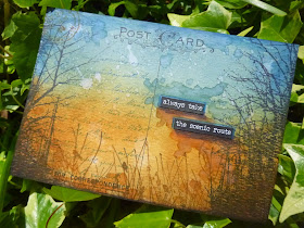
Hello all... After a quiet start to the month, it's hotting up around here now.  I was over at PaperArtsy last night (I hope you'll check out my Word Tags if you missed them), and today it's a Magpie Day of inspiration over at Country View Challenges.  I wasn't able to be part of the main Simply Scenic inspiration this month, so I'm really happy that I was able to squeeze in a scenic postcard for this.


I've kept it simple with some of my favourite Distress Ink colours and various stamps combined to create a dawn chorus scene.  Did anybody catch the marvellous "slow season" on BBC4?  There was a two hour canal trip, glass-blowing, furniture making and an hour of the dawn chorus - all without soundtrack or voiceover - magical!


Well, this postcard probably qualifies for a similar world of simplicity... some ink, some stamps and some water.

I blended Faded Jeans, Rusty Hinge and Vintage Photo Distress Inks on to a textured postcard, and spritzed water at them with my new T.H. water spray bottle... Yes, I know, I gave in, but looking at this I'm already glad that I did!


The tree silhouettes are formed by the two halves of a Penny Black stamp (used in one of my favourite journalling pages from earlier this year).  It's actually a narrow avenue of trees, but by inking up one half at a time you can have the trees as far apart as you need them!


Along the ground in between I used one of the PaperArtsy Hot Picks birds & grasses images, stamped in a combination of Jet Black Archival and Rusty Hinge, just to get a slightly burnished tone of early morning sunshine on the birds.


The "Postcard" at the top is a Darkroom Door stamp, and I drew the dividing line with a PITT pen.


Another Darkroom Door stamp provides the writing on the postcard, stamped in Faded Jeans so that it would fade into the background.


The words from the Small Talk sticker set seemed about perfect for the theme, and I added shading around them, first of all with Inktense pencils, and then with Faded Jeans and Rusty Hinge Distress Stains, applied with a water brush.


I liked the effect so much I repeated it around the edges of the card to give a bit of extra texture.  So now there are splatters of removed ink and splatters of extra ink.

I thought that was that... but then it occurred to me that I maybe wanted to preserve the colours a bit.  Don't get me wrong, I adore Distress Inks, but over time the colours can fade a little if they're out on display.


So I decided to clear emboss the whole thing.  I tapped the Versamark ink pad all over the postcard and applied the powder, and I love the result.  Not only are the colours more vivid (because of light getting refracted and so intensifying the colour spectrum - or something like that!), but there's a delicious enamelled texture to it.


And of course it catches the light which, as you know, I love as an effect.  Most of the photos in this post are of the plain ink version... just the first and the last photos give you the embossed effect.

So there's my Simply Scenic postcard for you.  I hope you'll hop over to Country View Challenges to check out the Magpie inspiration from the rest of my fabulous team-mates, and I'll see you again soon.

Each time dawn appears, the mystery is there in its entirety.
René Daumal

I'd like to enter this in the Vintage Garden theme over at the new Anything But Cute Challenge.  I hope with the inks, pencils, staining and embossing it's mixed media enough to qualify!
And at A Sprinkle of Imagination it's an Anything Goes theme, as long as you use at least one product available in the store - the Distress Inks and Stains are all there.


Friday, 22 May 2015

Layers of Meaning at PaperArtsy

Hello all!  I'm delighted to be over at PaperArtsy this evening, sharing a pair of tags as part of the Words theme.  As you'll read if you hop over there, I've been playing with layers of paint and ink to reflect the layers of meaning I love to unpick in language.  It's not always what's on the surface with words... sometimes you have to look beneath.


I hope the sneak peek will tempt you to take a look at what I've been up to over there, and for now I'll wish you a very lovely weekend, and hope to see you soon.  (In fact, I'll be back almost before you know it!)

Words are but the vague shadows of the volumes we mean.  Little audible links they are, chaining together great inaudible feelings and purposes.
Theodore Dreiser

Monday, 18 May 2015

Extraordinary Things


Hello all!  Thank you so much for the lovely feedback on the Dollshouse Book - I'm glad you enjoyed it as much as I loved making it.

I'm here today with my take on Tim Holtz's delicious May tag... another wealth of inspiration from the master, and quite a lot of improvising in my version!

I don't have the burlap sheets, but I do have plenty of burlap, and as I was fishing it out of the fabric box I found some cream coloured pieces which I rather fancied playing with.

After I'd glued it to some card and cut the tag, I then gave it a rough coat of gesso to make it even paler, and that led me to this rather delicately toned vintage piece.


I gathered paper offcuts as well as bits of ephemera, including some pieces of vellum, to layer into the design, and then started sorting through the Photobooth characters to see who wanted to come out to play.

It was love at first sight when I saw this woman - and she started to tell me her story almost straight away...


Though she's been overlooked amongst the debutantes of her first season, those glasses hide a first class mind.  She hadn't even considered a university education - not really the thing for girls, don't you know?


But a friend of her uncle's, seated next to her at a dinner party by chance, quickly spotted her potential and invited her to come and take a test down at a place in the country where he was working - a country house, Bletchley Park.


Since passing with flying colours, she's been working night and day on the top secret code-breaking project which will eventually contribute significantly to the defeat of the Nazis in World War II.


Though the decoding work is obviously the main concern (scribbled handwritten notes in a moment of inspiration have to be typed up into reports to be shared), she has suddenly found that it is, after all, easy to speak to men...

... when you have a common interest of importance about which to talk, of course.  Tedious small talk is a thing of the past.


And from being left on the sidelines at dances and at parties, she's now sought out by her male colleagues who admire her mind, her wit and not least her beauty, now that they've taken the time to look at her more than once.

These are only a few of the flowers she's now accustomed to receiving.  (Pre-made, I'm afraid... flower-making is something that only happens occasionally around here.)


So, this former wallflower is blossoming, finding stimulation and fulfilment in her work, and laughter and love with her colleagues.  You could even say she's becoming something of a social butterfly!


No wonder there's a gentle blush in her cheeks, echoing the soft pink tints of her clothes (very delicately done with Tattered Rose and Victorian Velvet).  And is that a hint of lipstick she's taken to wearing?  Or perhaps it's the bruising of a passionate kiss...


I can only hope that she will find somewhere to deploy her considerable talents and intellect once the war is over... or that if she marries one of these intelligent young men, they won't suddenly expect her to become "the little woman" at home.

I'd hate to see her dwindle again, having come into her own with such grace.  The butterfly should never have to turn back into a caterpillar.


In the meantime, let's leave her doing extraordinary things, and finding her way to being anything but ordinary.


Thank you so much, Tim, for the inspiration which tickled this young woman into existence - I'm so glad I got to meet her.  And thanks to all of you for stopping by.  It's always a joy to hear your thoughts... it makes this whole journey come alive.

I'd like to enter this as my May tag in Tim Holtz's 12 Tags of 2015.

Live a life less ordinary.
Benedict Cumberbatch

In the Autumn of 1943, the Government called up all girls aged 17½ ... to work in munitions or hospitals, the Women’s Services being at that time closed for recruitment. It was with some trepidation that I went for my interview at the Labour Exchange ... fortunately I had a Credit in Maths on my School Certificate, and the official thought I should go for an interview at the Foreign Office. Within a month I was on my way to Bletchley Park. My first impression was a lecture on the utmost secrecy the work entailed, and a signing of the Official Secrets Act.
Hilary Pownall (nee Law) Hut 8, Block D