An experiment today... Yesterday, as I was trawling the amazing, enthralling and occasionally overwhelming numbers of crafty blogs out there, one of my clicks led me to Less Is More, a blog devoted to CAS - that's Clean And Simple - card creation. I'd encountered the term in my travels, but hadn't really spent any time exploring it, but I was so impressed by the work I saw there and clicking onwards from there.
They've got a challenge on this week which is a One Layer challenge... (The added theme for this One Layer challenge is the number 3.) You can only have one layer, stamping directly onto the card stock, minimal embellishments, and then you're done. Pretty much the opposite of the shabby chic I've been playing with recently! But I thought, well, you're a newbie to all this stuff, you should give it a go, so I set out on a whole new kind of challenge...
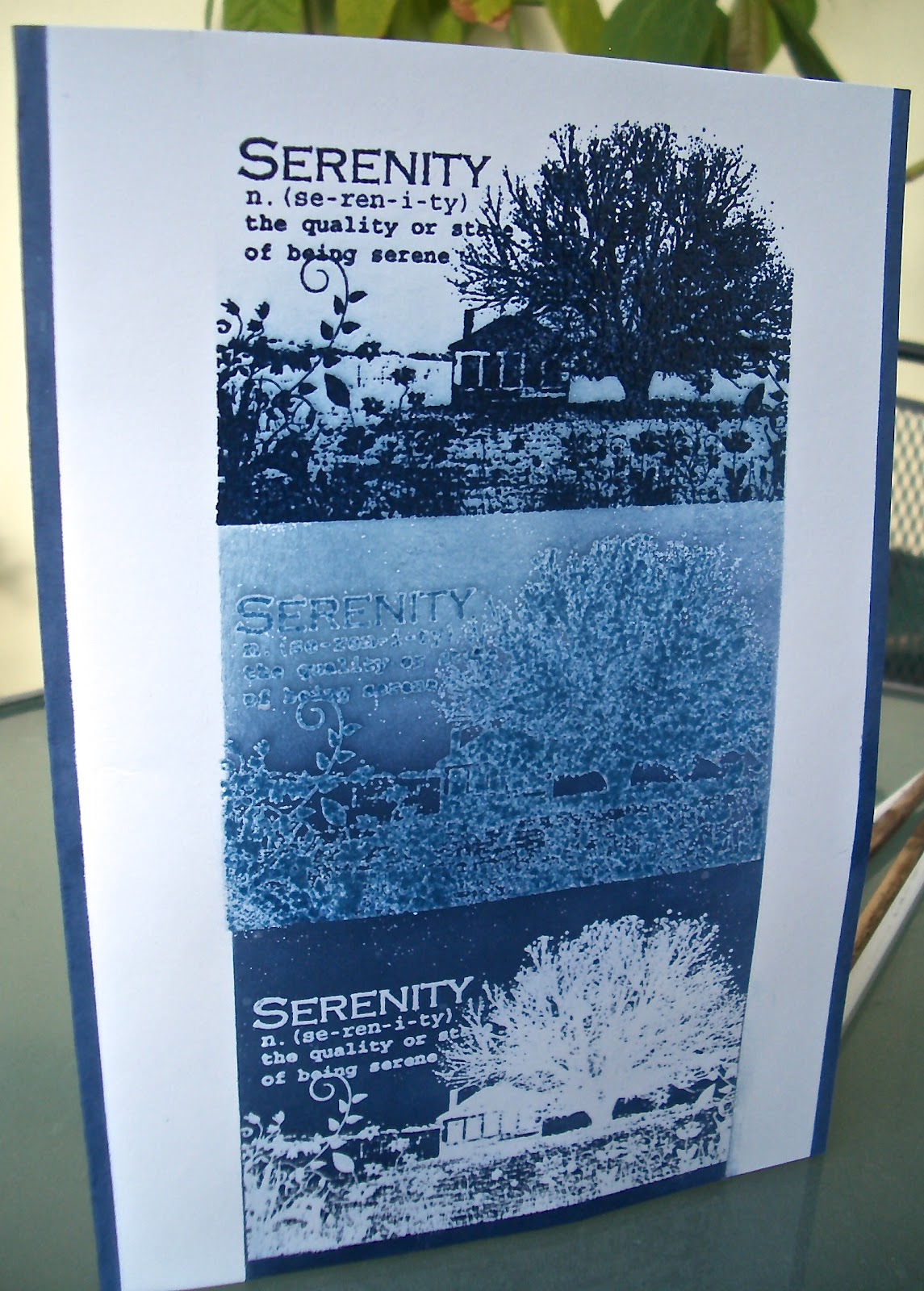
I can tell you one thing, despite the glorious stamp from Artistic Outpost, the last thing I was feeling while making this card was serene! Looking at the work on Less is More, it was clear that execution is everything with cardmaking like this - when it's this Clear and Simple, it has to be done with a perfectionist streak of the strongest kind... this was actually the THIRD go at the idea I had! The plan was to have this beautiful image stamped three times over, each time getting paler, as the background behind it got darker.
When you're doing shabby chic or grungy or layered stuff and something goes a bit wrong, you can add something or tweak something. With this, if you go wrong, it's over!


At the bottom of the card, the stamp is stamped with the Versamark Watermark pad, and embossed with Stampendous Clear Detail powder (for very fine embossing work).

 On the right I've tried to get pictures which show the glossy and raised embossing.
 The middle image is stamped in Faded Jeans + Stormy Weather (and there was a bit of Versamark left on the stamp, which after the first two attempts, I hoped would help to get a good emboss on it).
The image at the top of the card is stamped in Cobalt Archival with some Chipped Sapphire Distress Ink added to the stamp. All three are done with the Detail Clear Embossing powder.
The inked background starts with Chipped Sapphire at the bottom, and moves through Stormy Sky, paling to the pure white of the cardstock itself at the top.
I do like how it's turned out to resemble a photograph and its negative, with the strange ghostly darkroom version somewhere in the middle. Finally, the two upright edges of the card are inked with Chipped Sapphire using a blending tool.
(I'm interested that it seems to have made me make this post very symmetrical too for a change... normal service about to be restored!)
There were several inspirations and ideas swirling around in my head already at the point when I found the Less is More site, and gradually they began to coalesce into one project.
For starters, there was a challenge afoot at The Cheerful Stamp Pad to play with Silhouettes, and the colour Blue is the inspiration at Addicted to Stamps. I'm also still exploring my lovely new Artistic Outpost stamps, so if a project turns out well, there's always the possibility of offering it up for their July Anything Goes challenge.

 I'd been playing with this superb Serenity stamp just to see what would come up.
 It will come as no surprise to long-term followers that the colours I was playing with were blue and brown!
(I'd made an inky background by swooshing the paper through puddles of Stormy Sky + Weathered Wood DIs and Picket Fence Distress Stain on my craft mat, and then tried out the stamp in various colours of Distress and Archival Inks.)
 It's pretty clear to see where the kernel of the card idea arrived from! I even toyed with the idea of sticking three of these onto the card, but that would have been more than one layer - so no good! What it did allow me to do was to have a little play around - I discovered that three images one above the other would fit perfectly on A5, so a folded piece of PaperArtsy's A4 Smoothy card would be ideal.
One of the main tenets of the CAS style is not to be afraid of white space. So I decided to mask the sides of the card while I did the stamping and inking to keep it beautifully pristine.
It was all going very well, until I tried to peel the masking tape off... disaster!

So, here we go then, right back to the start...
Second go round, the middle image simply didn't emboss well enough with just the inks. I tried to do an overstamp (always a risky proposition!) using the embossing ink, but I didn't get it placed perfectly, so ended up with a white shadow where the embossing resisted the background ink colours... Back to the start again! (And hence my addition of the Versamark to the stamp the next time around.)

Well, appropriately for a challenge about the number 3, it was third time lucky (or, rather than lucky, in fact simply ridiculously cautious!). I made it through the inking of the central column by holding a piece of paper very firmly in place as I blended the ink up one side, and then again at the other side, filling in the middle at the end.
I did the same to get the sharp edges up each side.
I'll tell you something else - it ain't that easy to get a good photograph of a CAS card! And for once the sun refused to do its usual half hour of shining at about 4 o'clock, so I'm a bit disappointed in the pictures.

Still, despite all the hiccups, I did enjoy working with my favourite colour in such depth.
I love the glossy, dimensional embossing...
...and I do really like the graduated background ink going up the card.
And I'm happy to say the finished card does make me feel quite serene!
 But I am more than ever full of admiration for those who work the CAS way... the patience and precision requires a really Zen-like calm, I think - which is not quite where I am just now.
 On the other hand, obsessive perfectionism is definitely part of my make-up, so I suspect there's a journey for me somewhere down the line into the minimalism of Less Is More.
Thanks so much for examining the results of my experiment. If you've time to leave a comment, I'd love to know what you make of it, and whether you've CAS'd in your crafting time. Do drop in again soon, and enjoy your time until then however you're spending it.
I'm entering this for:
Less Is More's One Layer challenge, Three
Artistic Outpost's July challenge Anything Goes (with AO stamps, naturally)
LEJ Designs are also having an Anything Goes challenge
The Cheerful Stamp Pad's challenge this fortnight - Silhouettes
Addicted to Stamps challenge for this week which is to be Addicted to Blue - yup, that would be me!
Stamp N Plus who are having an Anything Goes challenge, free for any stamps this time
Crafty Creations, who are having a Free For All this week, so this goes there too, with grateful thanks for the win for Only you!
It seems appropriate to have three quotes today:
Boredom is the feeling that everything is a waste of time; serenity, that nothing is.
Thomas Szasz
They say a person needs just three things in this world: someone to love, something to do, and something to hope for.
Tom Bodett
I have just three things to teach: simplicity, patience, compassion. These three are your greatest treasures.
Lao-Tzu
29 comments:
This card is amazing. Welcome to Addicted to Stamps! The idea you had with the 3 stamps getting lighter and the embossing is terrific. Thanks so much for playing along at ATS xx
Wow - this is stunning, enjoyed reading our post too. Thanks for joining in this week at ATS - Jacqueline xx
This is just beautiful!
Marrigje
Love your stamping getting lighter and it's certainly blue!Fab card and thanks for playing along with us at ATS this week. Love the Bodett quote:)
Val x
Stunning card - it's a great stamp and I love all the shades of blue!
Fabulous card - very striking
Kathyk
Love the way you explore your stamps and the various techniques, the result is amazing! Thank you for playing along with the Cheerful Stamp Pad.
Well, it might have taken three attempts but it was absolutely worth the effort!!! This is a showstopper of a card. I do know what you mean about your first journey into CAS... I have learned loads from taking part in Less is More, stuff which has also helped my non-CAS cards as well... things like being more aware of card layout, proportion, where your eye goes to, etc. So I hope you will have many more forays into the world of CAS... and do share them with us along the way, won't you?!
Thanks so much for joining us at Addicted to Stamps this week :)
I'm so glad you found us!
This is an amazing effect and still manages to retain some white space at the edges of your card.
The change of shading is so subtle and the overall effect is stunning!
I hope you'll be a regular contributor to our challenges in future.
If you could visit a few other participants and leave a friendly comment that would be wonderful!
Thanks so much!
Chrissie
"Less is More"
Gorgeous card, I love the colour and those images are fab
Lindsay xx
Hi there, Yes CAS is so tricky, definitely nowhere to hide if you make a mistake !!!! It took me months to pluck up the courage to make CAS cards and they always take much longer than any other style. Your work is beautiful and the effect you have achieved is amazing. A gorgeous card and so well thought out. Thank you for sharing with us at Addicted to stamps lovely to see you here.
Marie
this is simply beautiful. thank you for joining our "silhouette" challenge at the cheerful stamp pad! xo
This is really lovely , and love the idea behind it too ,it certainly works!( and can sympathise with the amount of tries it took !) hope to see you again x
How beautiful this is - gorgeous idea of layering the stamp and the embossing was inspired!
Amazing card and well worth all the effort. Thanks for posting to the Stamp N Plus challenge.
Stunning card great stamand stamping xxxxxxxxxxxx thank you for joining us at LEJ and good luuck xxxxxx
This maybe took you a few goes to get right but the end result is fabulous. It's such a clever design. Big congrats on your Addicted to Stamps win and thanks for coming to visit me. Blogger just tries my patience sometimes! and re the CAS thing, I find the opposite really challenging - I just can't seem to do layering, embellishments etc, I'm a clean & simple kinda girl! xx
Wow, this is beautiful! I hear you on simplicity being complicated! :D But this is a stunner of a result.
Absolutely great how you showed all 3 differences here...it's amazing how a variation in a hue makes a remarkable difference! Fabulous work!
This card turned out stunning. I can definitely see more CAS cards in your future. Thanks for joining us in our Anything Goes challenge at Stamp N Plus.
Wow! Stunning card Alison. The changes in colour give an amazing effect.
Regards Florence xx
Hi again, thanks for entering this in to the LEJ Designs challenge, please can you make sure you add a link to challenge blog to ensure that you are included in the prize draw.
Thanks
Lindsay xx
This is just stunning love the design and the effect you created~ Awesome!
Welcome to LEss is More Alison
Your card is sensational
Hope to see you every week
Thanks very much
mandi
"Less is More"
Thank you for the visit - your first LIM card is sensational, I love your blues - it was well worth the effort!
I so enjoyed reading through your post, each and every step! It was all worth it because your card is really fabulous and very different!
I really like how you played with the embossing and inks, and also the different colours!
I lean towards CAS, and I admire people who do the Shabby chic with loads of flowers & goodies...and I'm not a perfectionist...LOL, more laid back I think!
You will see me around again!
Thanks for joining us at The Cheerful Stamp Pad!
Hope you will join us again!
Hugs
Rene
That's very cool. Love the different ways of stamping that you brought to this card. Thanks for joining us at Stamp N Plus.
Beautiful use of the AO image - wonderful post! Thanks for playing along with us at Artistic Outpost!
A gorgeous card. Thanks for joining us at The Cheerful Stamp Pad.
Post a Comment